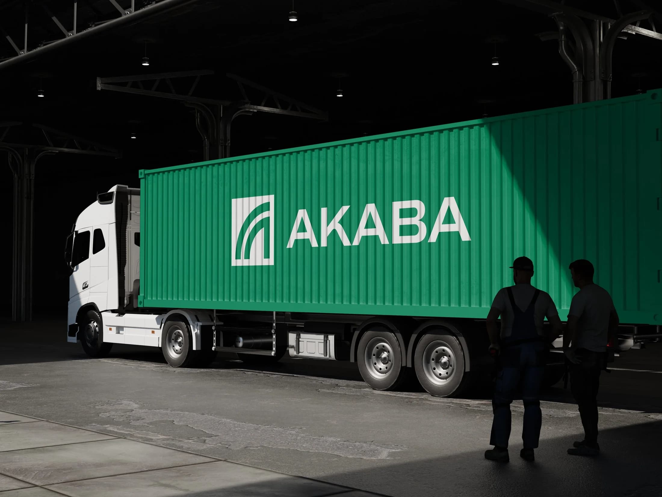
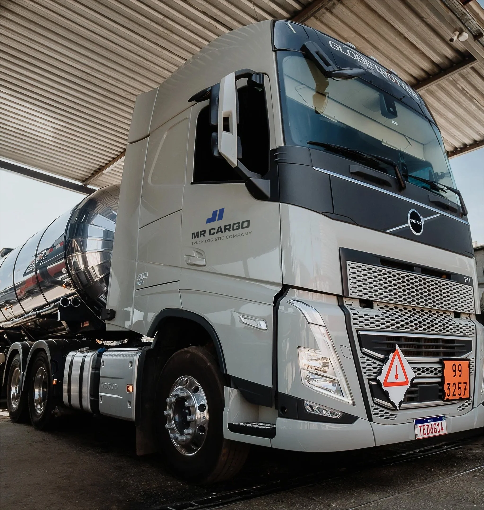
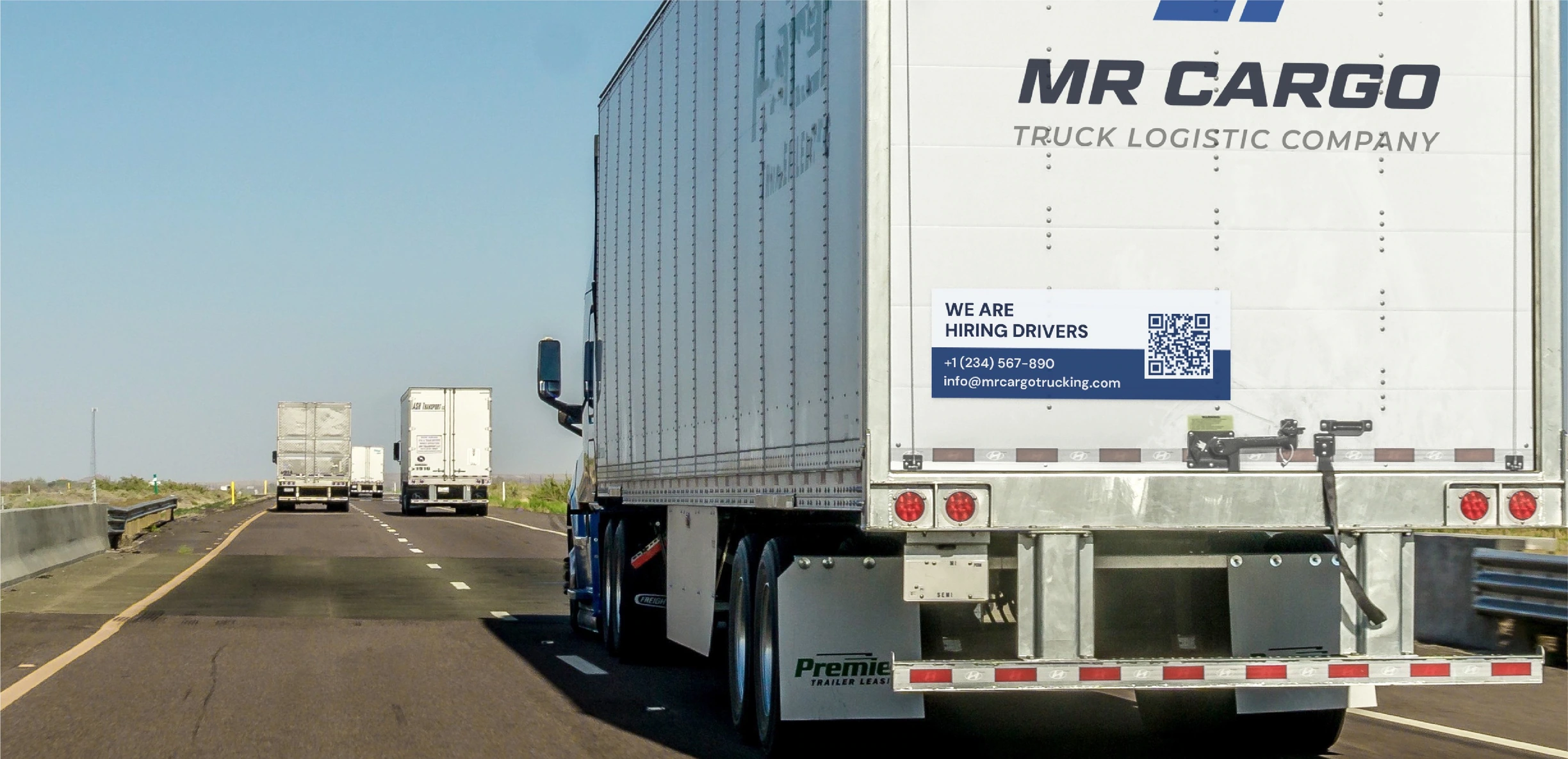
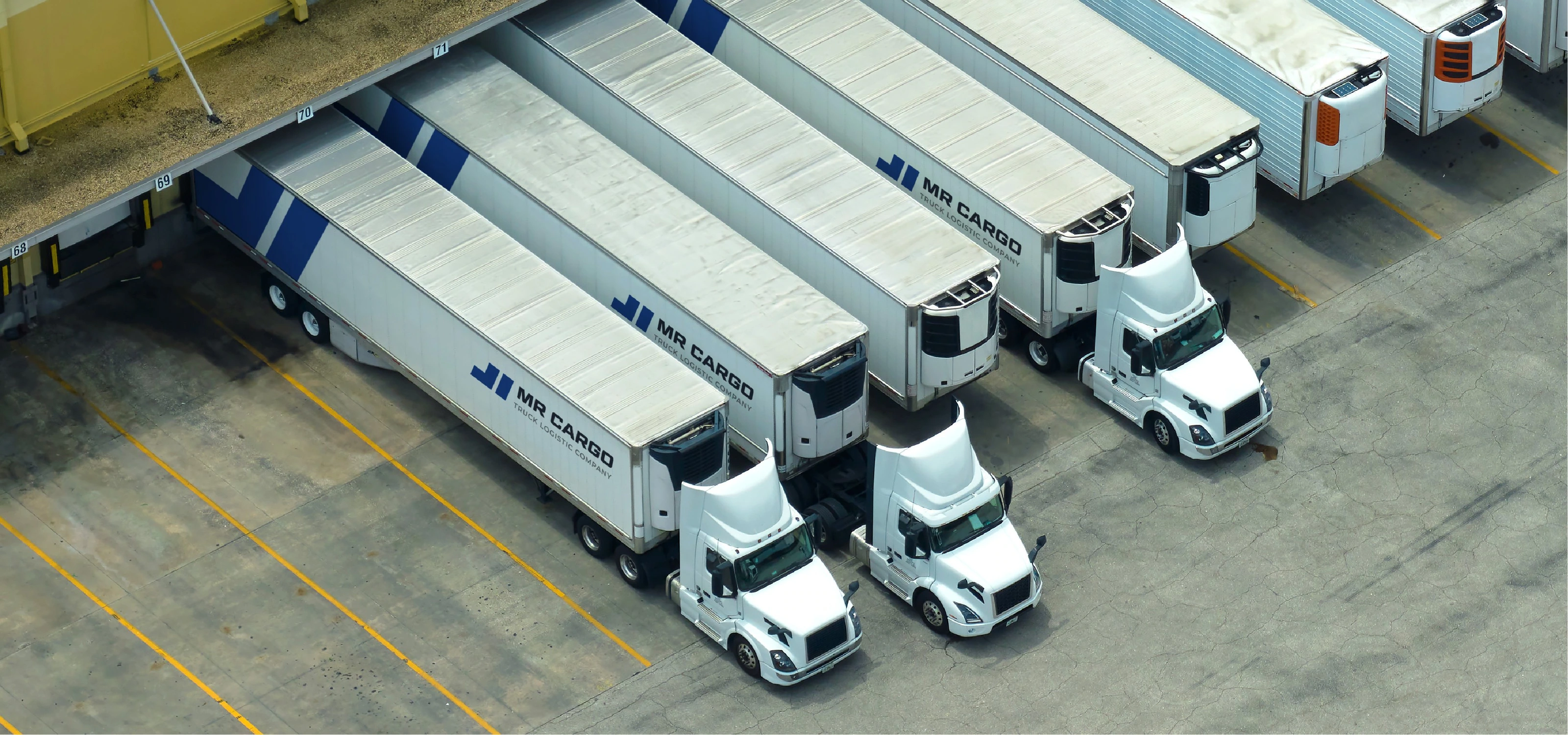
MR Cargo is a professional transportation company built on disciplined operations, strong fleet capacity, and unwavering accountability. By combining strict operational control with the determination to overcome any challenge on the road, we ensure every shipment is moved safely, efficiently, and on time.

YOU ARE IN PROFESSIONAL HANDS

ARCHETYPES
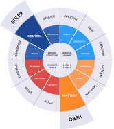
While the foundational framework of modern branding relies on the 12 classic archetypes to build a distinct psychological connection with audiences, we have strategically positioned MRCargo at the powerful intersection of the Ruler and the Hero archetypes.
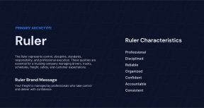

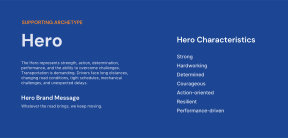
INSPIRED KEYWORDS


INSPIRED IMAGES

BRANDMARK SKETCHES

TYPOGRAPHY SKETCHES

BRANDMARK


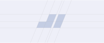
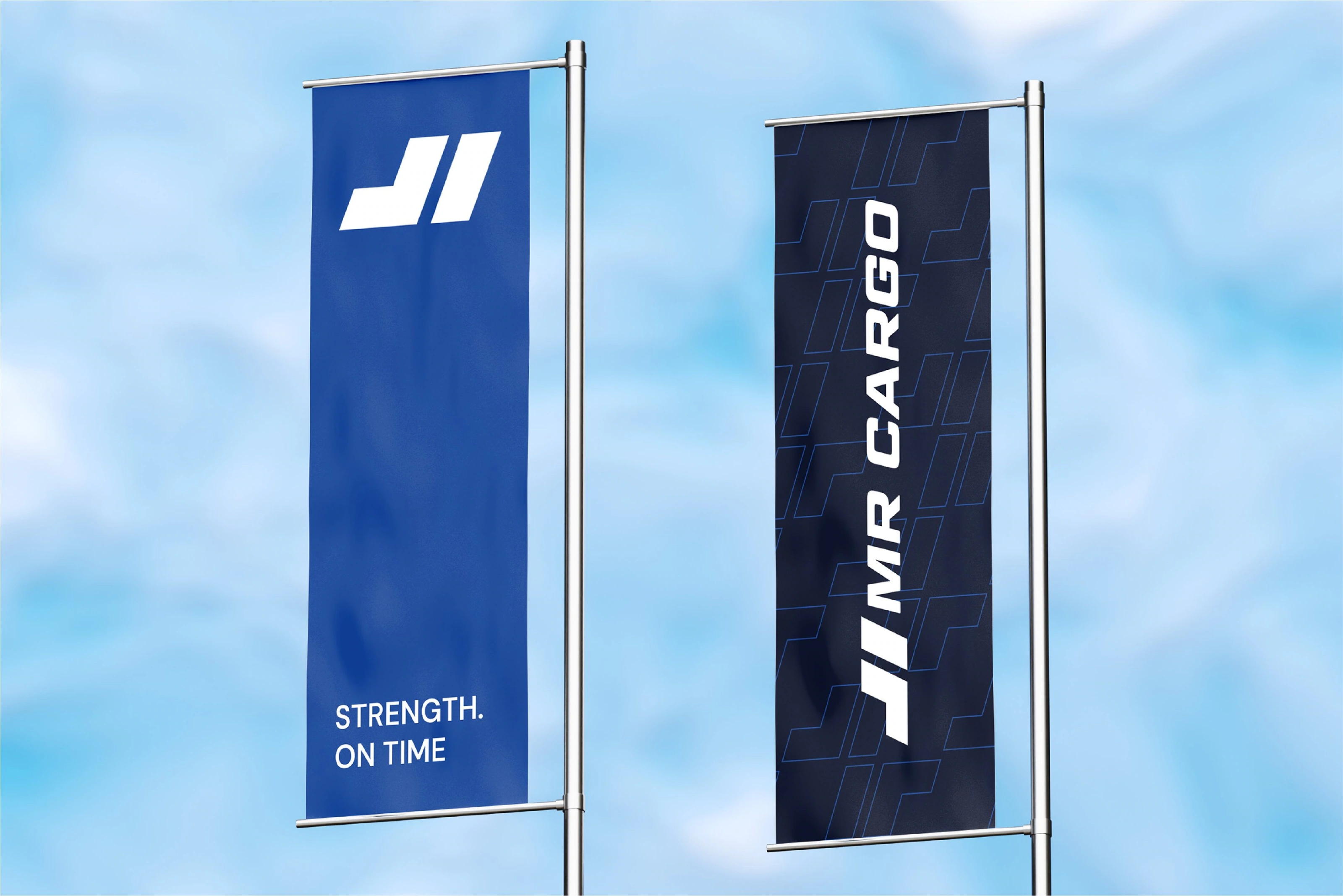
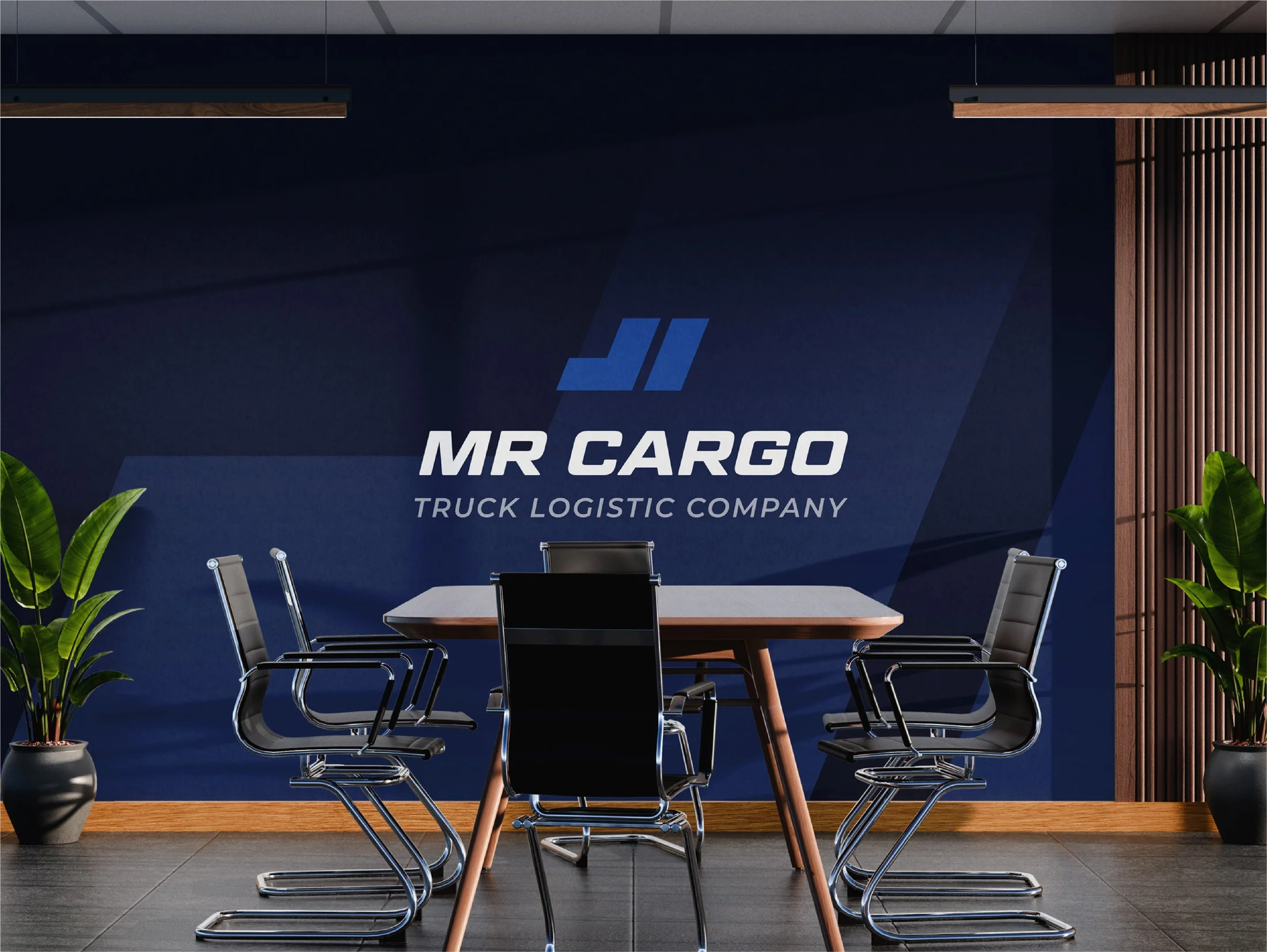
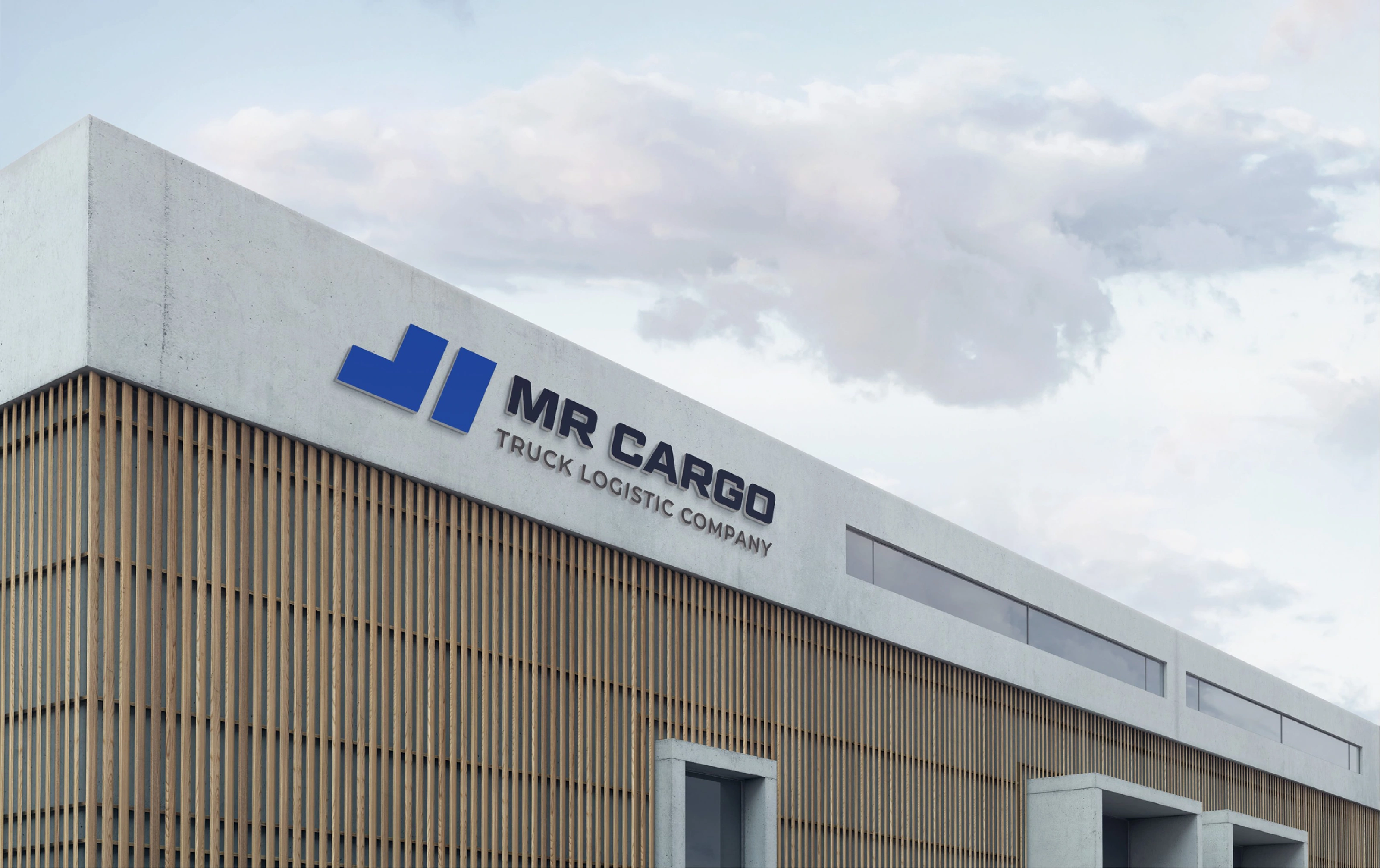
Bold, substantial geometric forms to instantly project an aura of unwavering trust and reliability. Its heavy, solid blue blocks anchor the design, suggesting a strong foundation and unshakeable structural integrity that clients can depend on.
WORDMARK

The MR CARGO wordmark is engineered with heavy, wide-set geometric letterforms that instantly project authority, physical strength, and structural stability. Its forward-leaning slant introduces dynamic energy and continuous momentum, perfectly balancing the Ruler’s disciplined control with the Hero’s action-oriented drive.

LOGO GUIDES
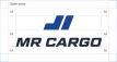
Using the logo correctly ensures a consistent and professional brand presence, making it easily recognizable and protecting its value by preventing distortions or misuse that could weaken its impact.
LOGO MISUSE
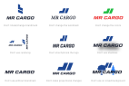
Maintaining logo integrity is essential misuse can undermine brand recognition. This section emphasizes correct usage to protect the brand's consistent image.

LOGO SYSTEM


COLOR PALETTE
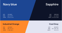
Navy Blue and Sapphire anchor the brand as its primary foundational tones, instilling immediate trust, security, and operational discipline. Industrial Orange acts as a dynamic accent, injecting action-oriented energy, and safety awareness into the visual identity. Cool Gray serves as the foundational neutral within the palette, representing clarity, and precision.
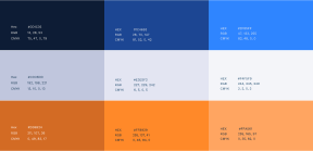
COLOR SHADES
BRAND PATTERNS




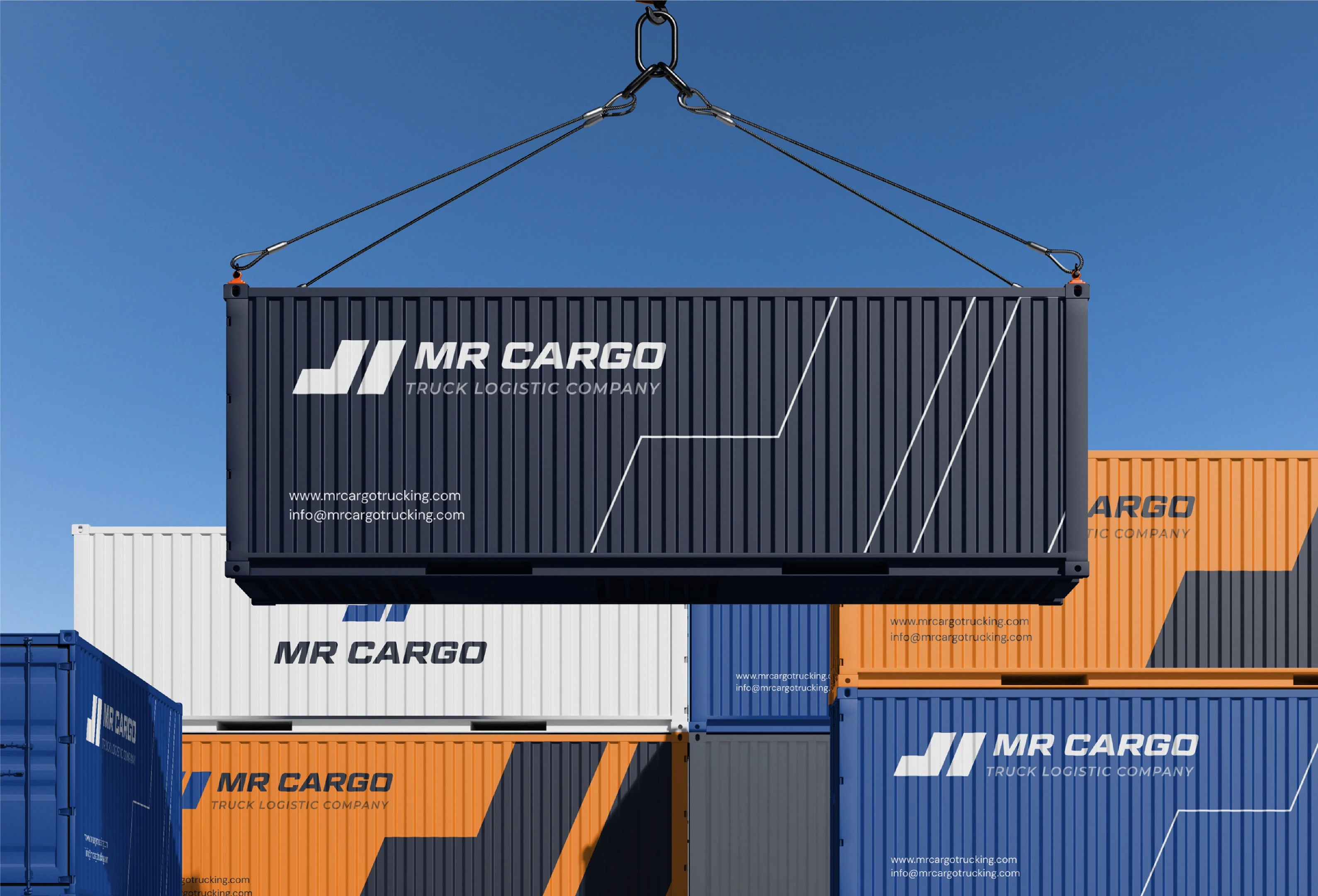
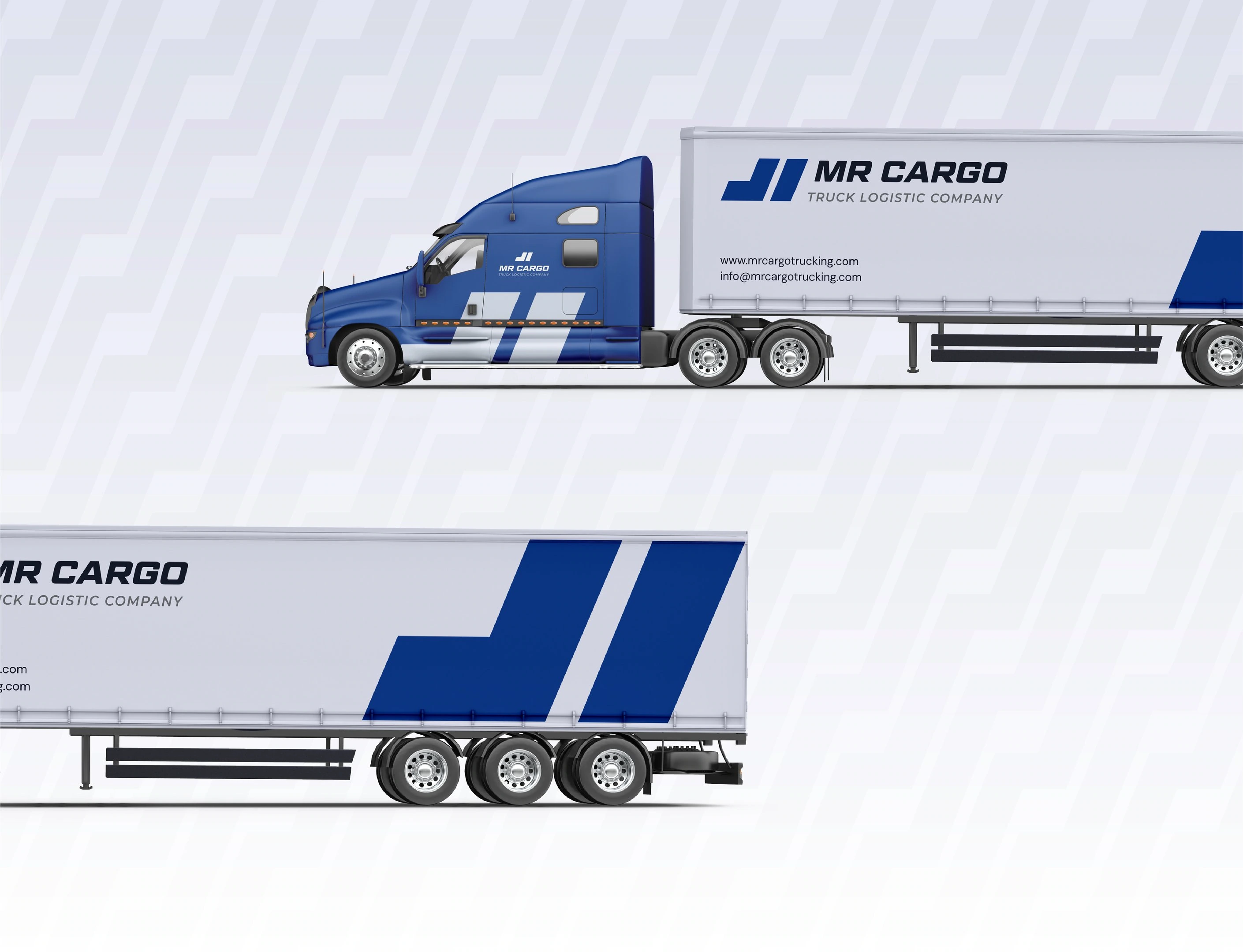
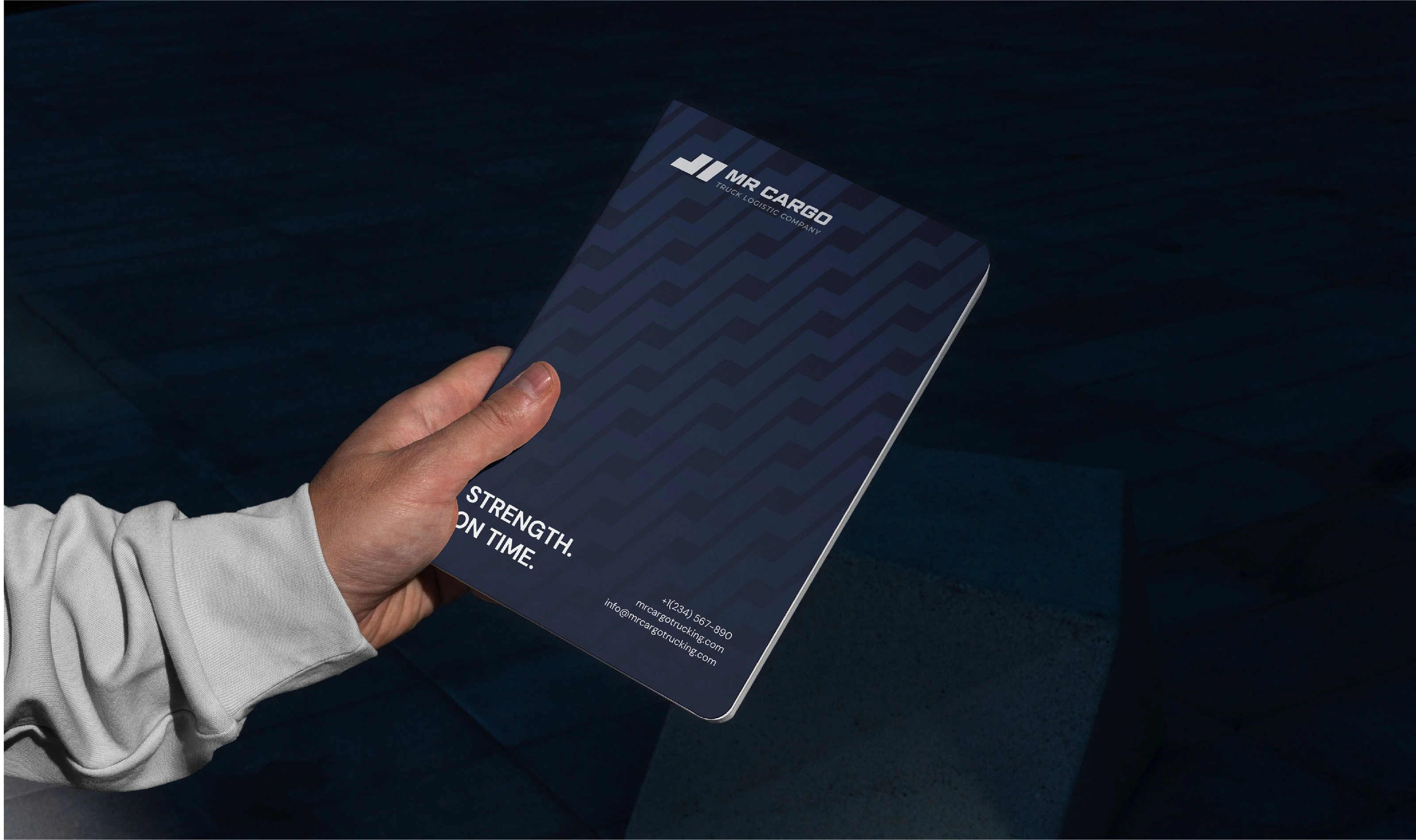
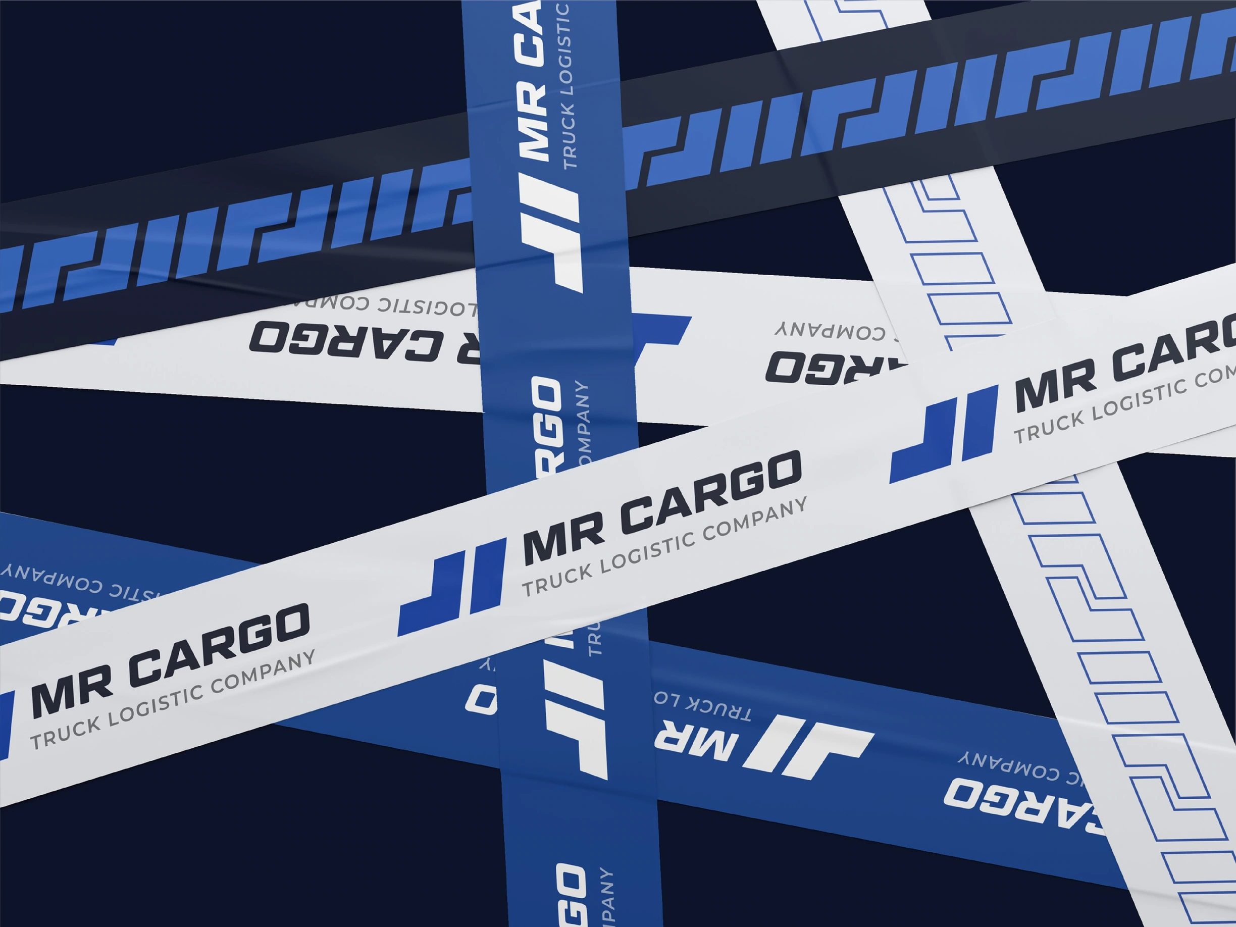
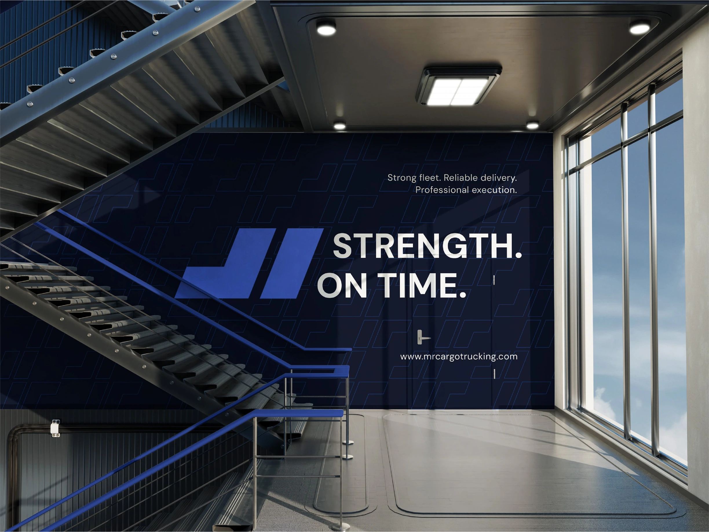
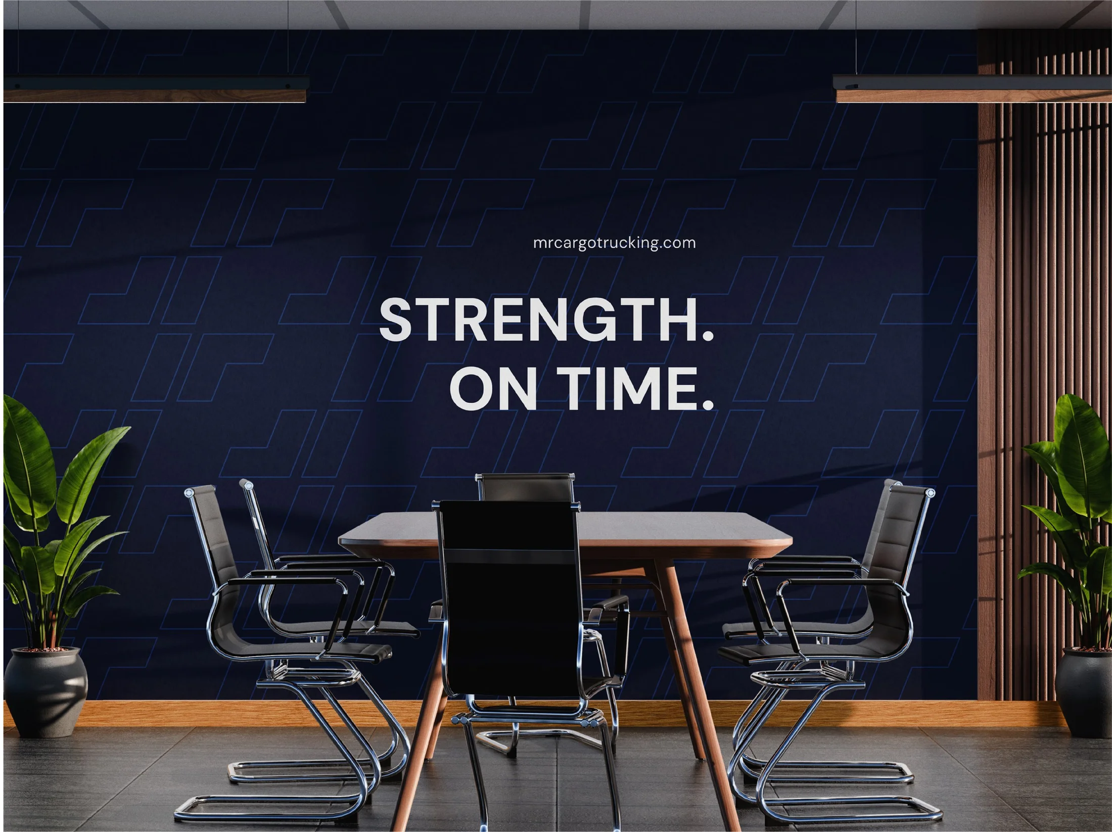
Brand patterns are engineered directly from the sharp angles and modular geometry of the logomark, representing structured efficiency, cargo coordination, and continuous forward momentum.

SLOGAN

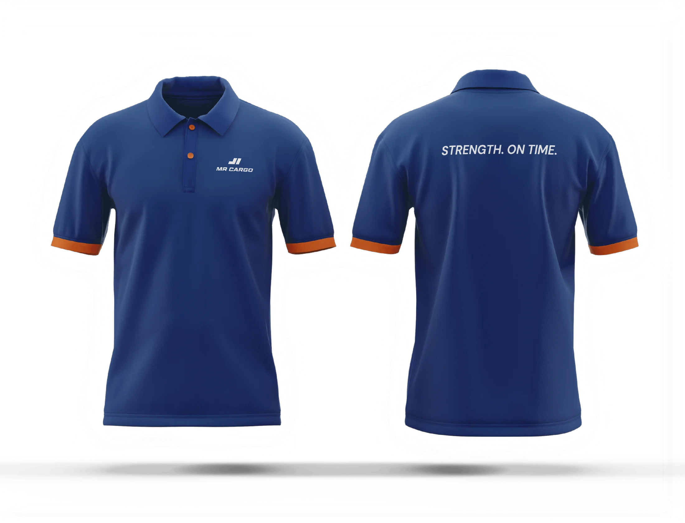
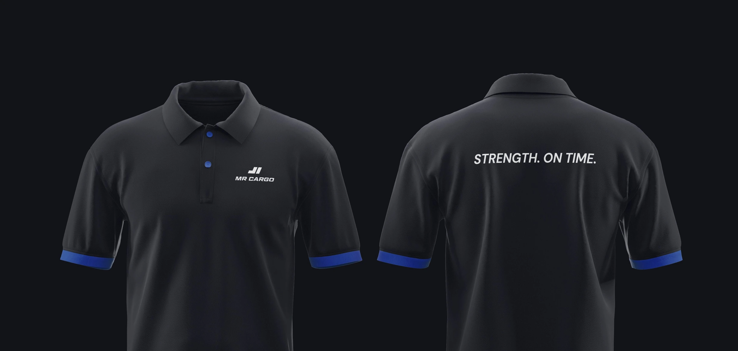
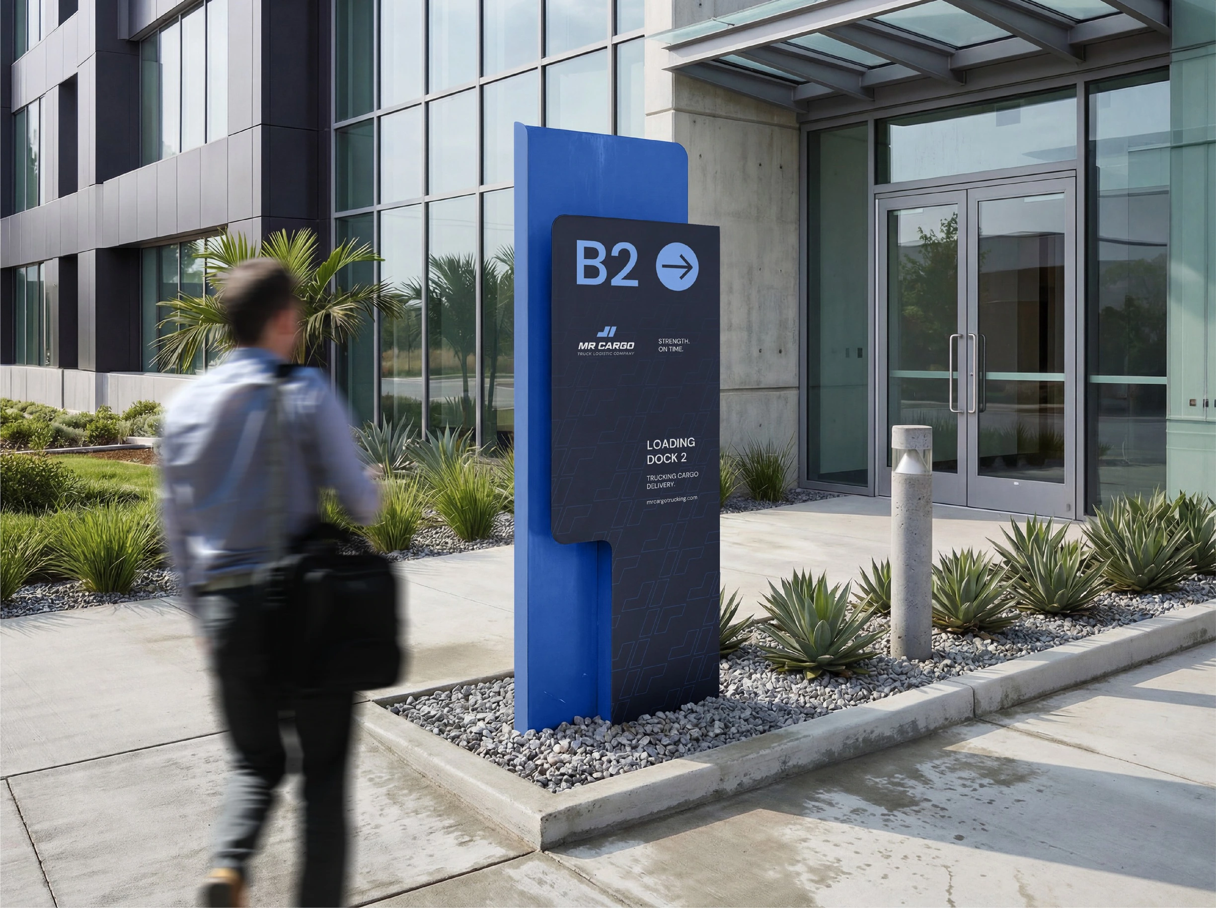
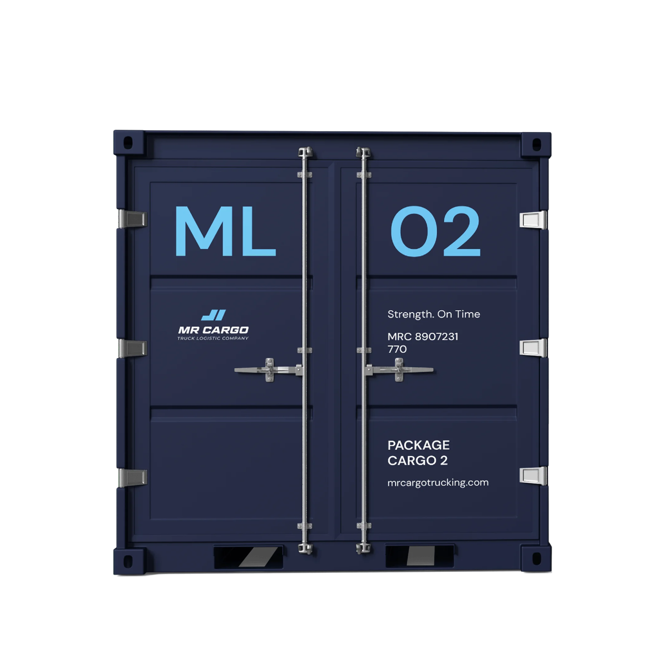
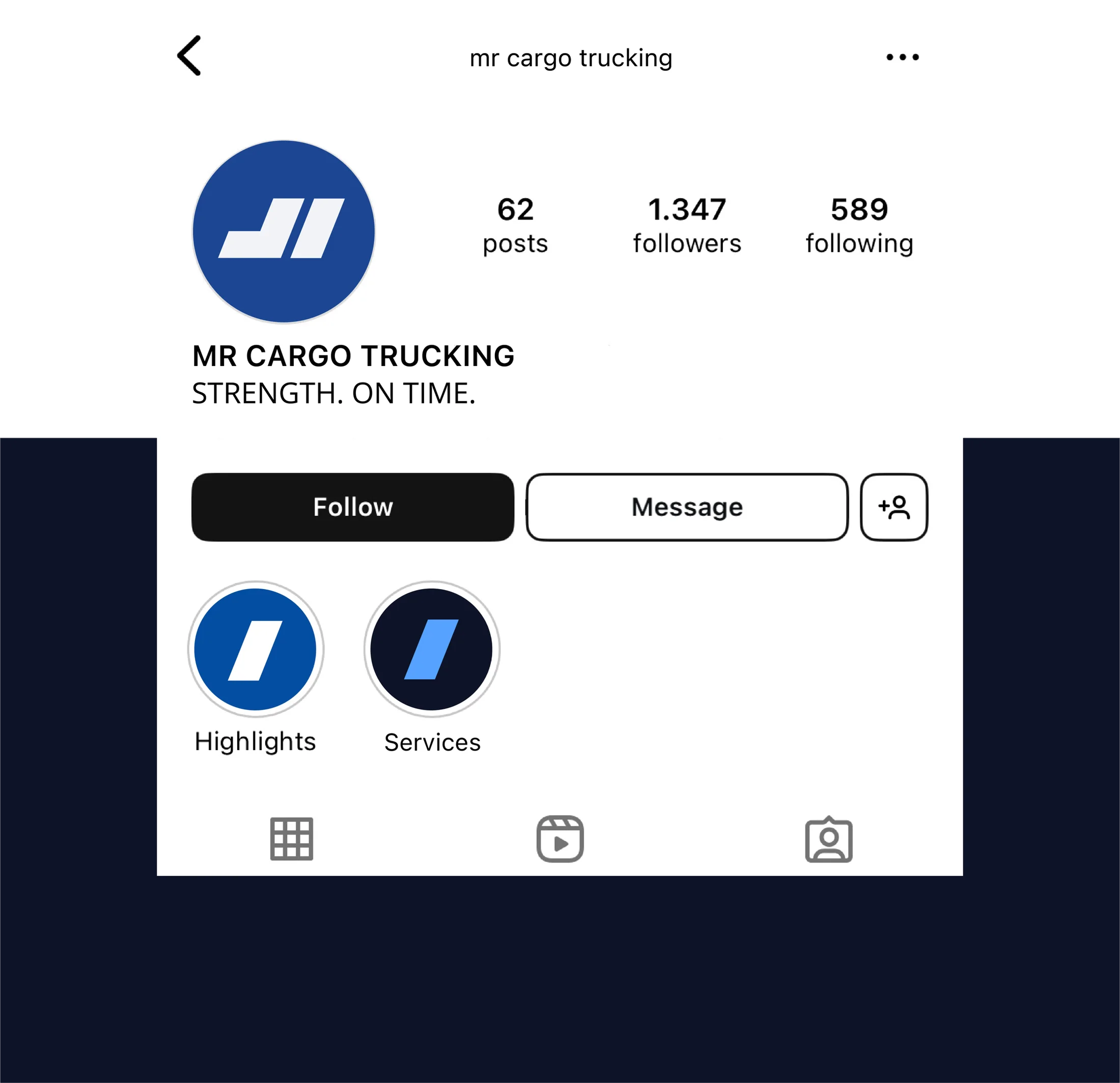
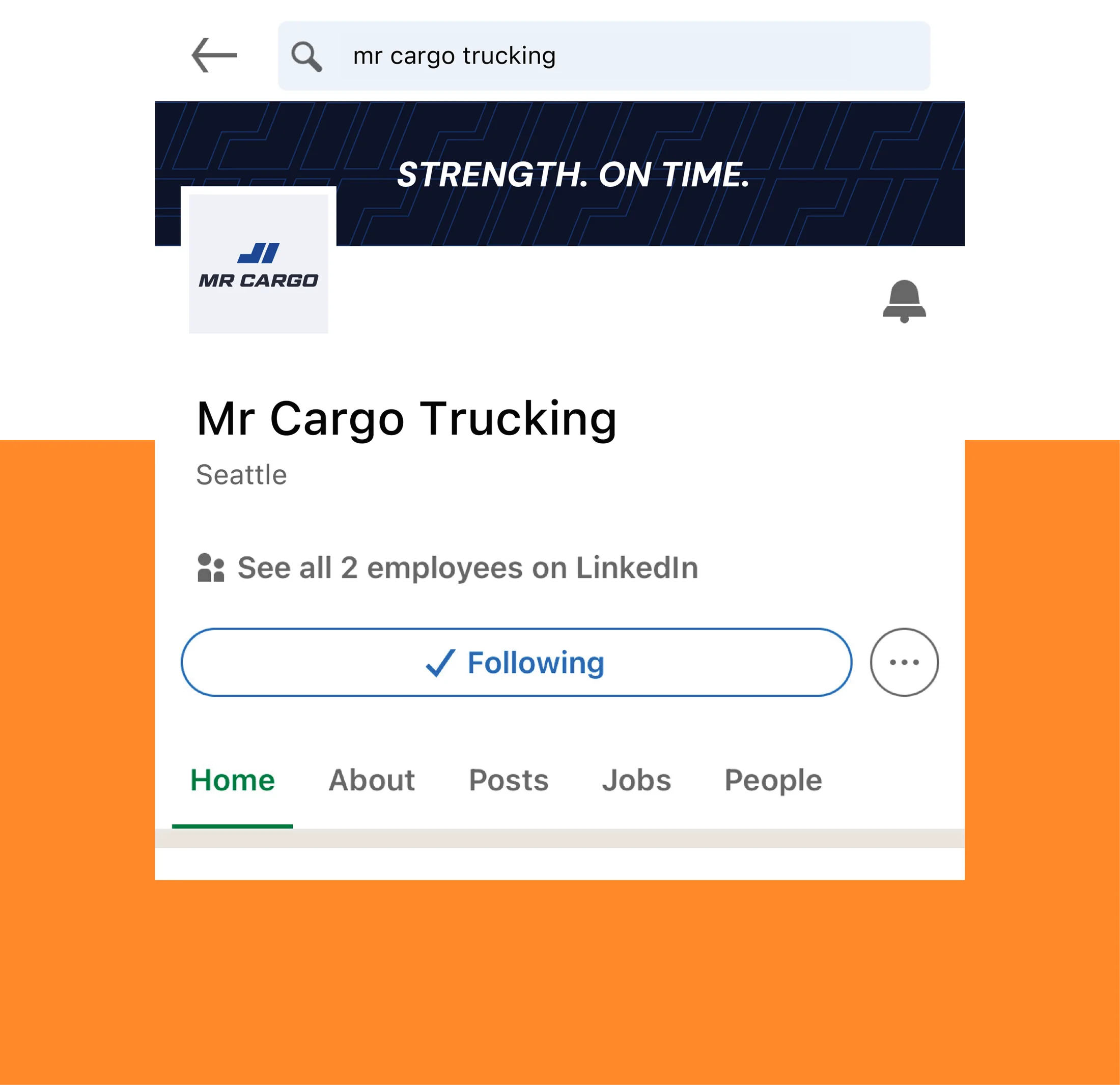
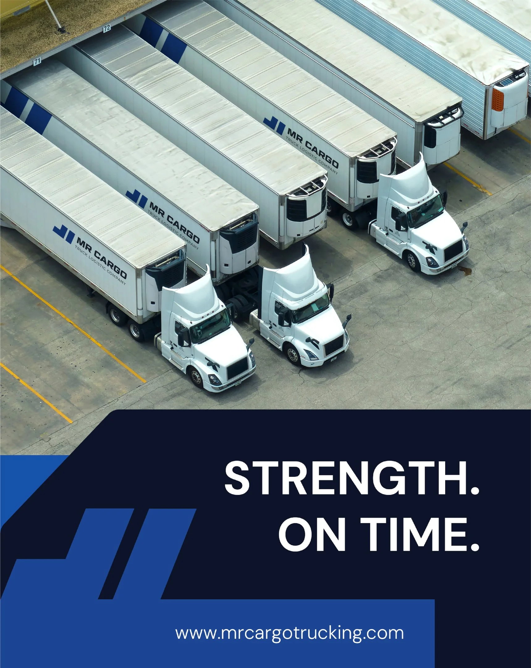
Guided by core promise - "Strength. On Time." - MR CARGO delivers freight solutions capable of handling most complex shipments. By combining a heavy-duty fleet and secure handling (Strength) with streamlined routing and meticulous scheduling (On Time), MR CARGO eliminates the stress of supply chain logistics.




CORE BRAND MESSAGE








BRAND PROMISE


Logo vs Brand
Have you ever wondered what exactly separates logo design from brand design? It's a common mix-up, so let's clear things up.