Kakajan Owezow is a visual storyteller who merges emotion, aesthetic, and authenticity to craft cinematic photography and films that resonate deeply and stand out in a fast-paced, shallow digital world.
YOU ARE IN PROFESSIONAL HANDS

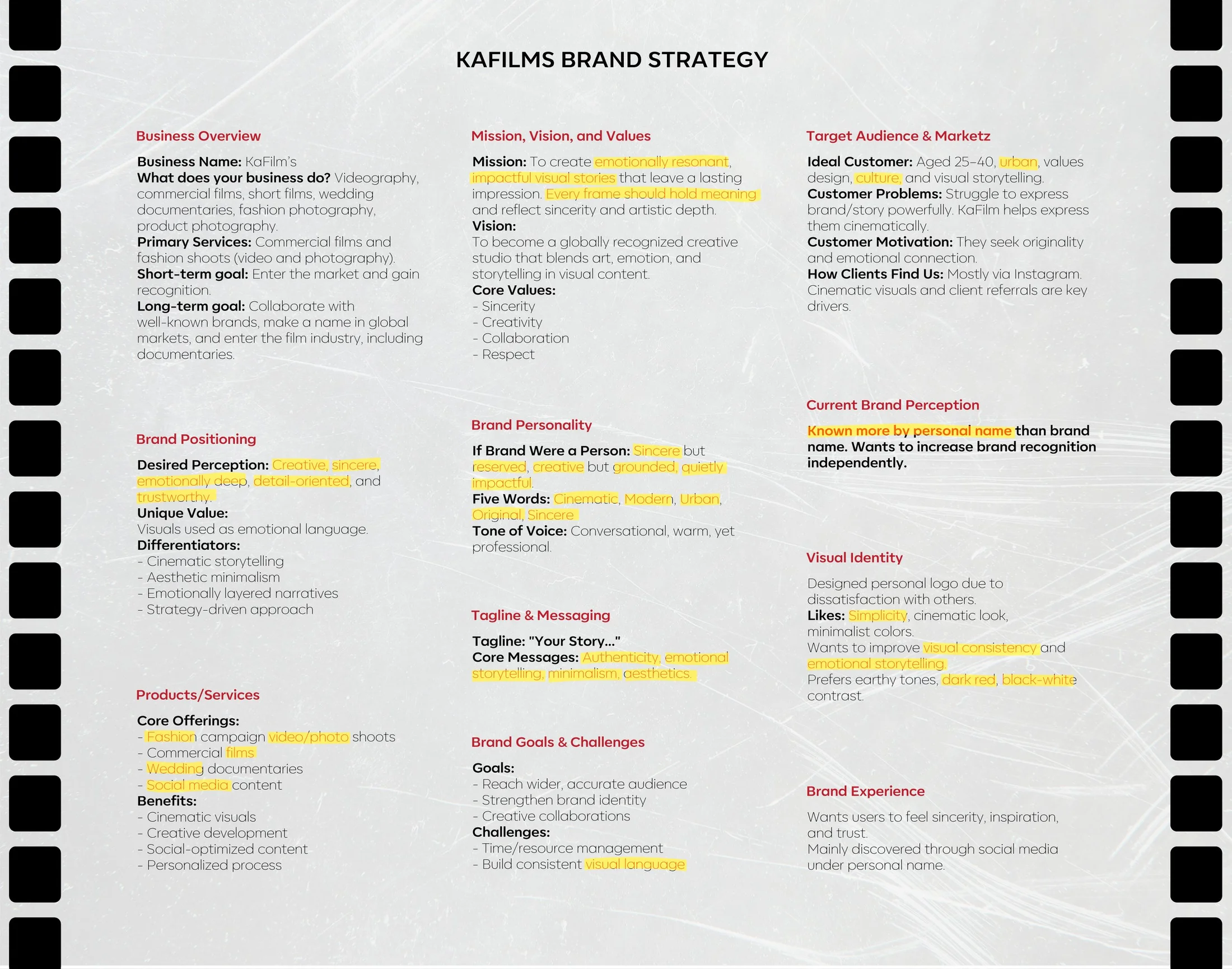
Keywords - Text
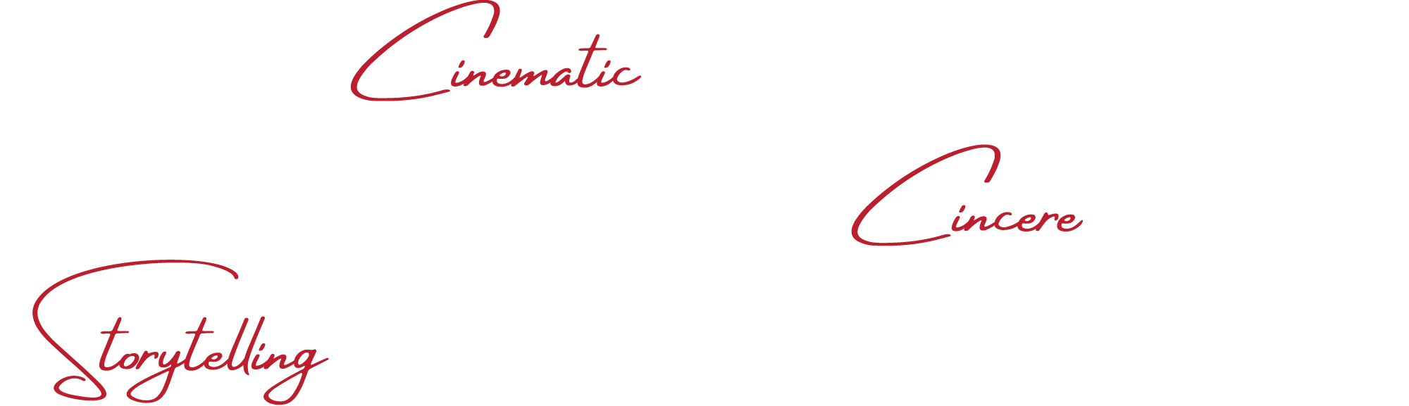
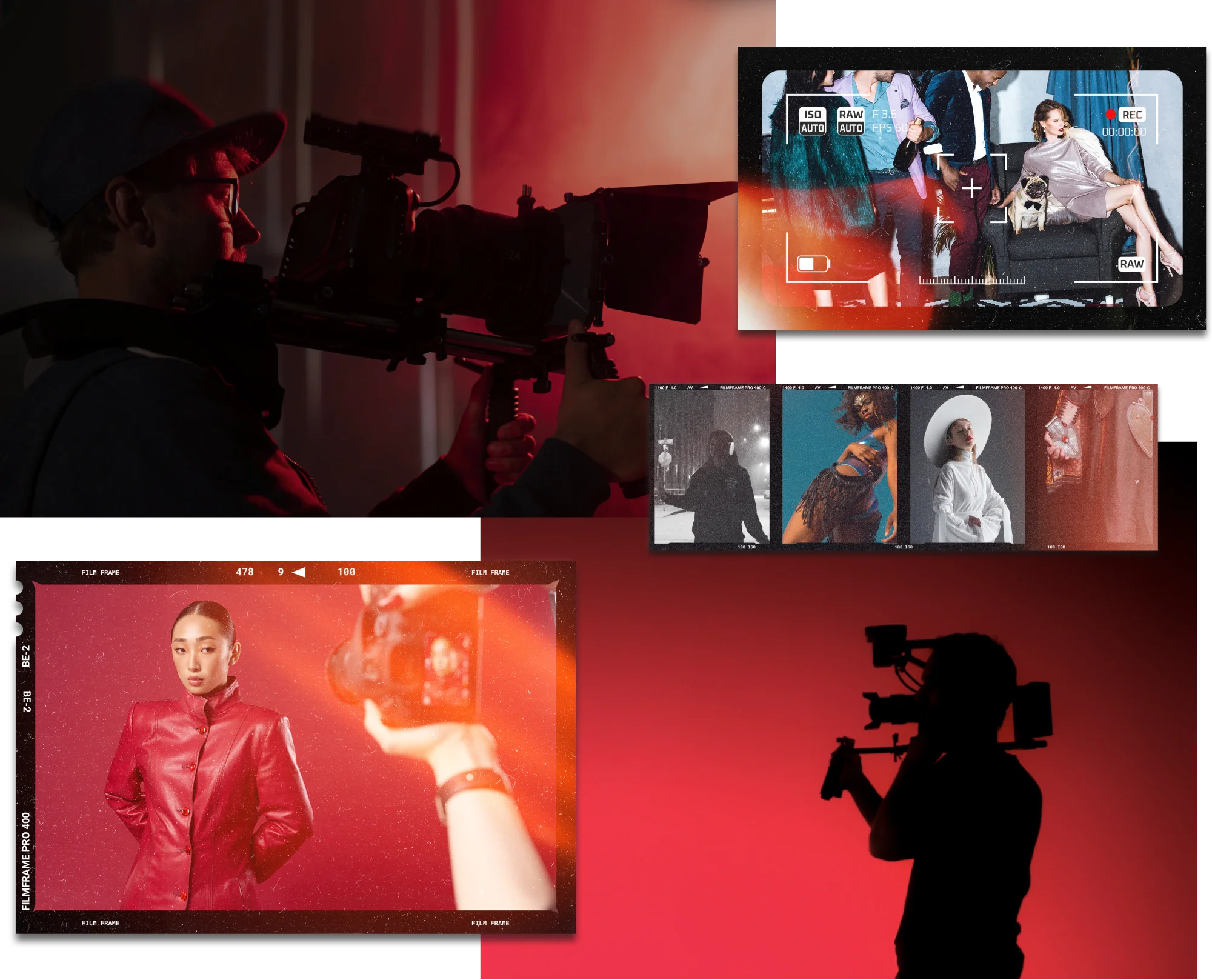
Keywords - Visual
Before arriving at the final logotype, the Kafilms brand underwent a careful visual exploration process. Early directions tested various approaches to typography, tone, and emotional weight — each aiming to capture the brand’s cinematic essence without relying on obvious symbols. The focus was on building a visual identity that could quietly express depth, intention, and timelessness.
Throughout this process, the design team prioritized clarity, distinctiveness, and emotional resonance.


REBRANDING EVALUATION:
OLD VS. NEW LOGO

The new Kafilms logo presents a major shift in tone and visual identity.
What improved:
- The serif font adds a premium, editorial look, evoking classic cinema and storytelling.
- Letterforms feel more intentional and expressive.
- Spacing and rhythm are more refined, enhancing legibility.
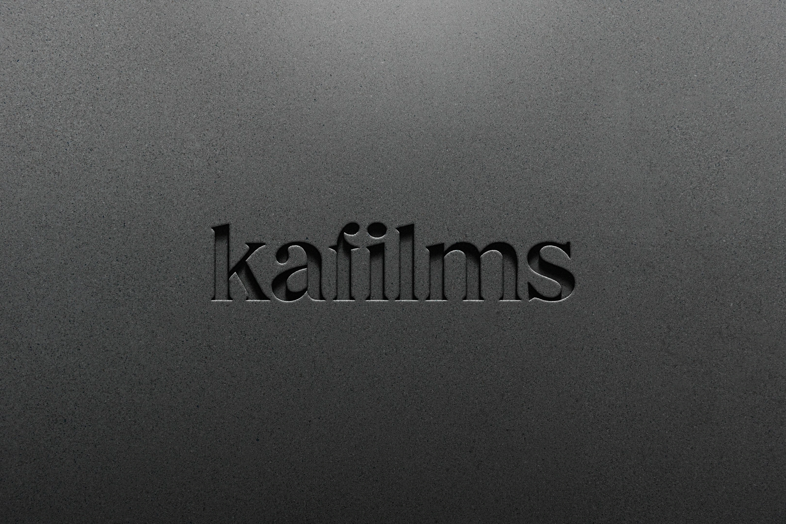
The Kafilms logo began with a strong typographic foundation: the Honest Bold typeface — chosen for its structural clarity, modern integrity, and subtle classic undertones. From there, our team engaged in a meticulous refinement process to transform a solid typeface into a unique and ownable brand signature.
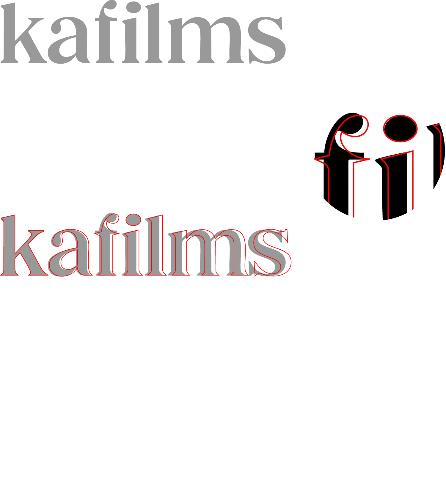
We carefully adjusted the kerning to establish a balanced rhythm across the wordmark, ensuring that every letter carries equal visual weight and presence. Special attention was given to the relationship between the letters “f” and “i”, a delicate junction refined to achieve both harmony and distinction.
The original serifs were redrawn and subtly exaggerated, enhancing the logo’s character while reinforcing legibility and elegance. These crafted details allow the wordmark to evoke a cinematic sensibility — quiet yet expressive, minimal yet emotionally rich.
Logo Guide
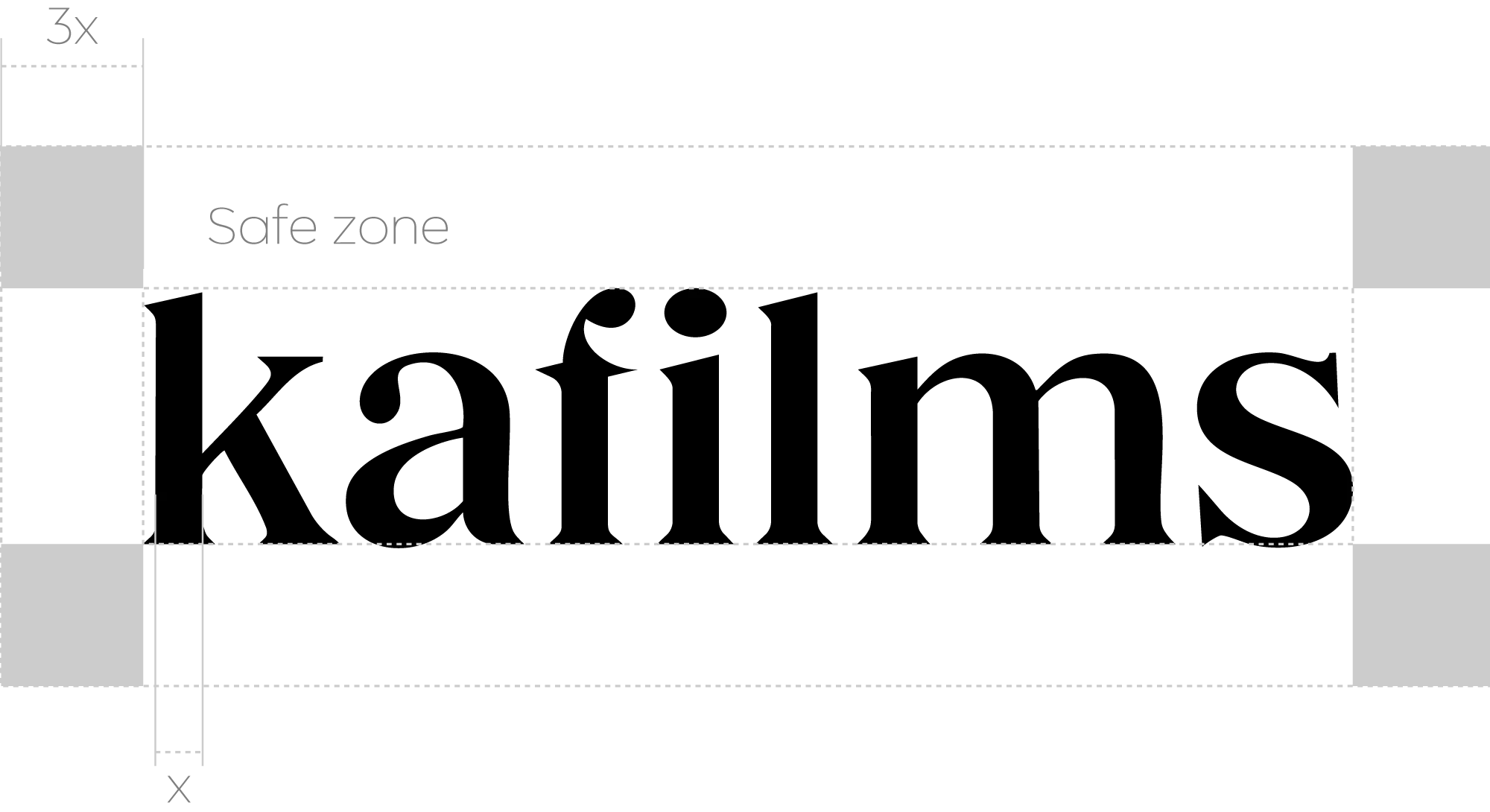
Using the logo correctly ensures a consistent and professional brand presence, enhances recognition, and protects its value by preventing distortion or misuse that could weaken its impact.
SYMBOL AS VISUAL LANGUAGE
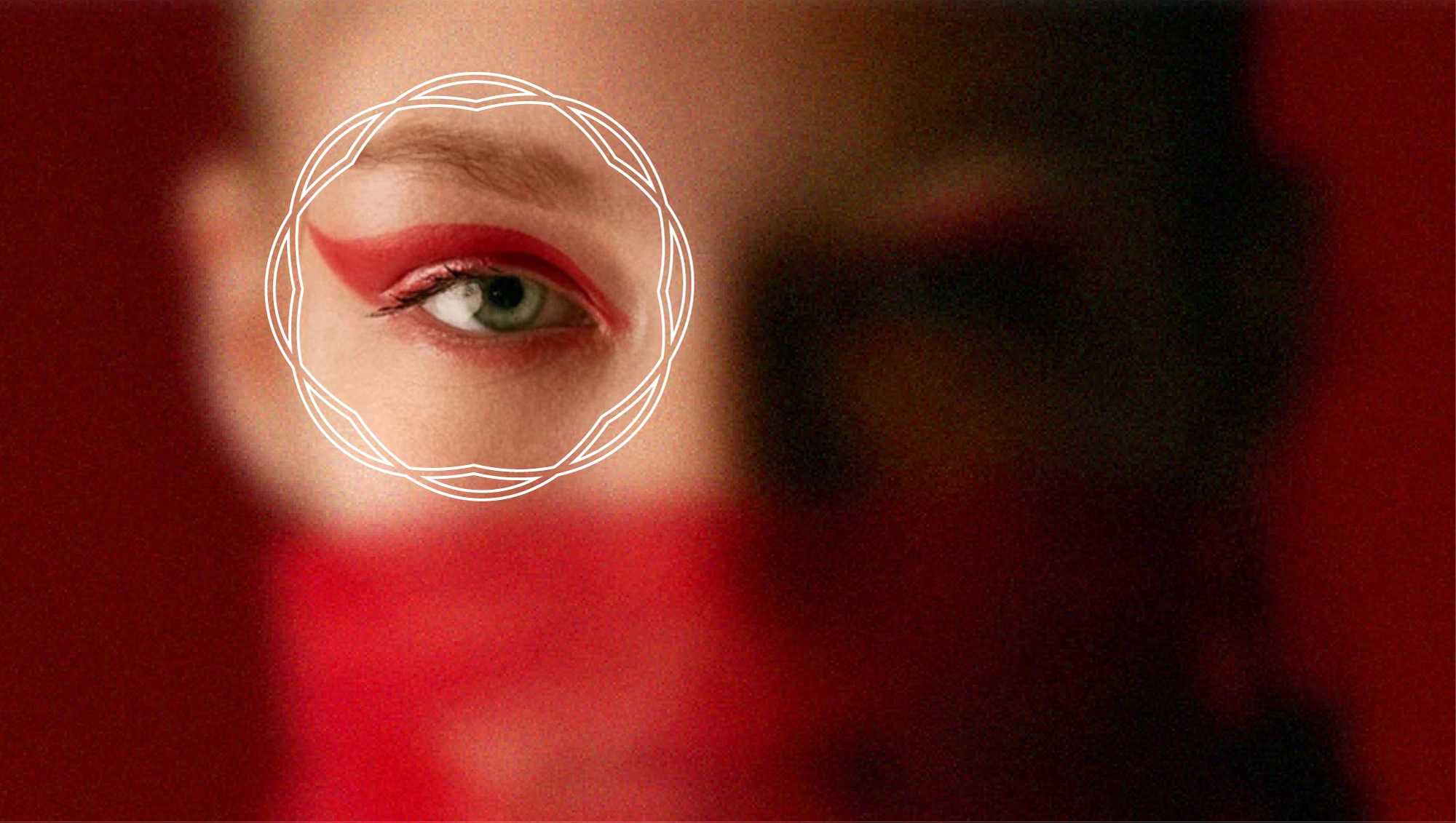
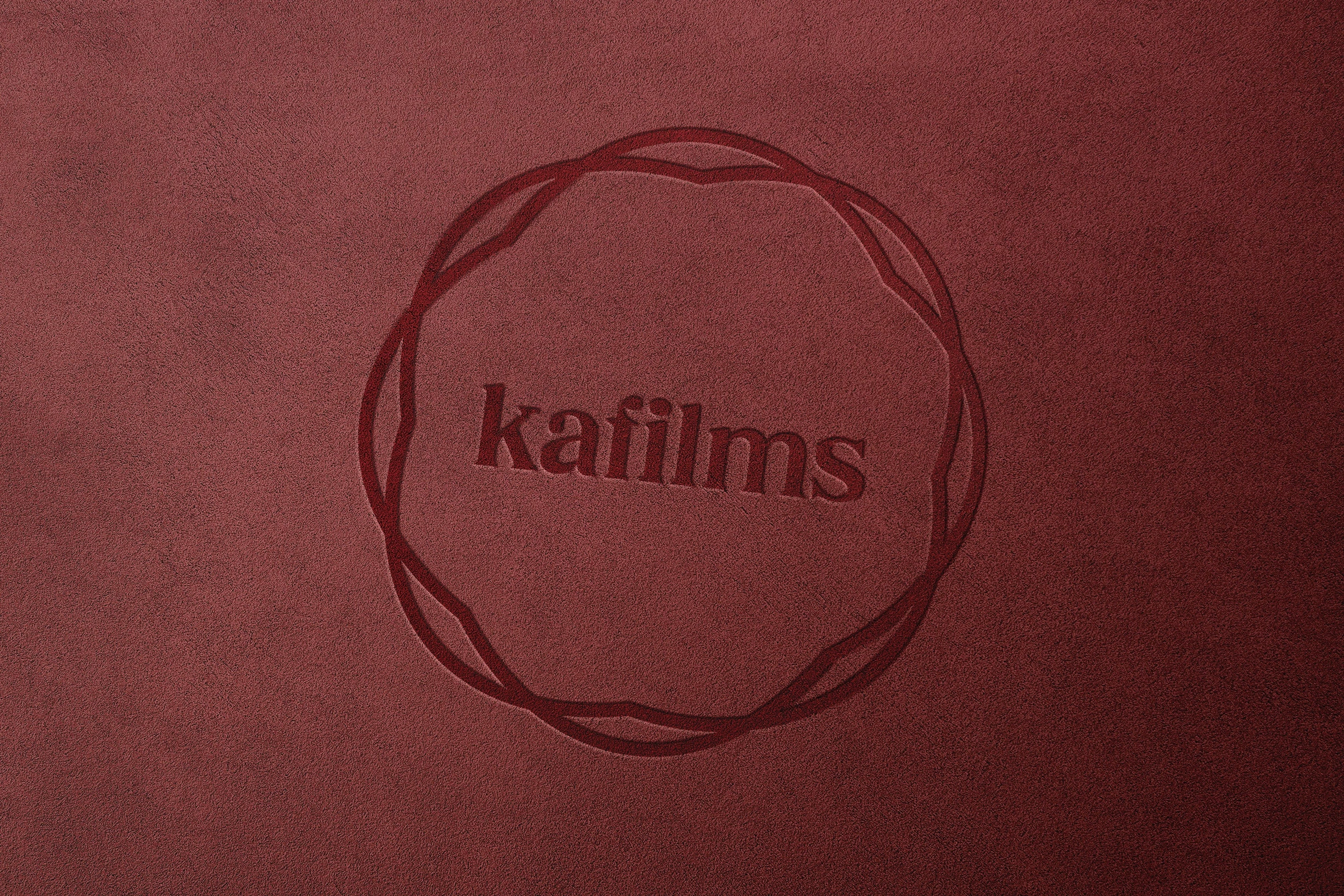
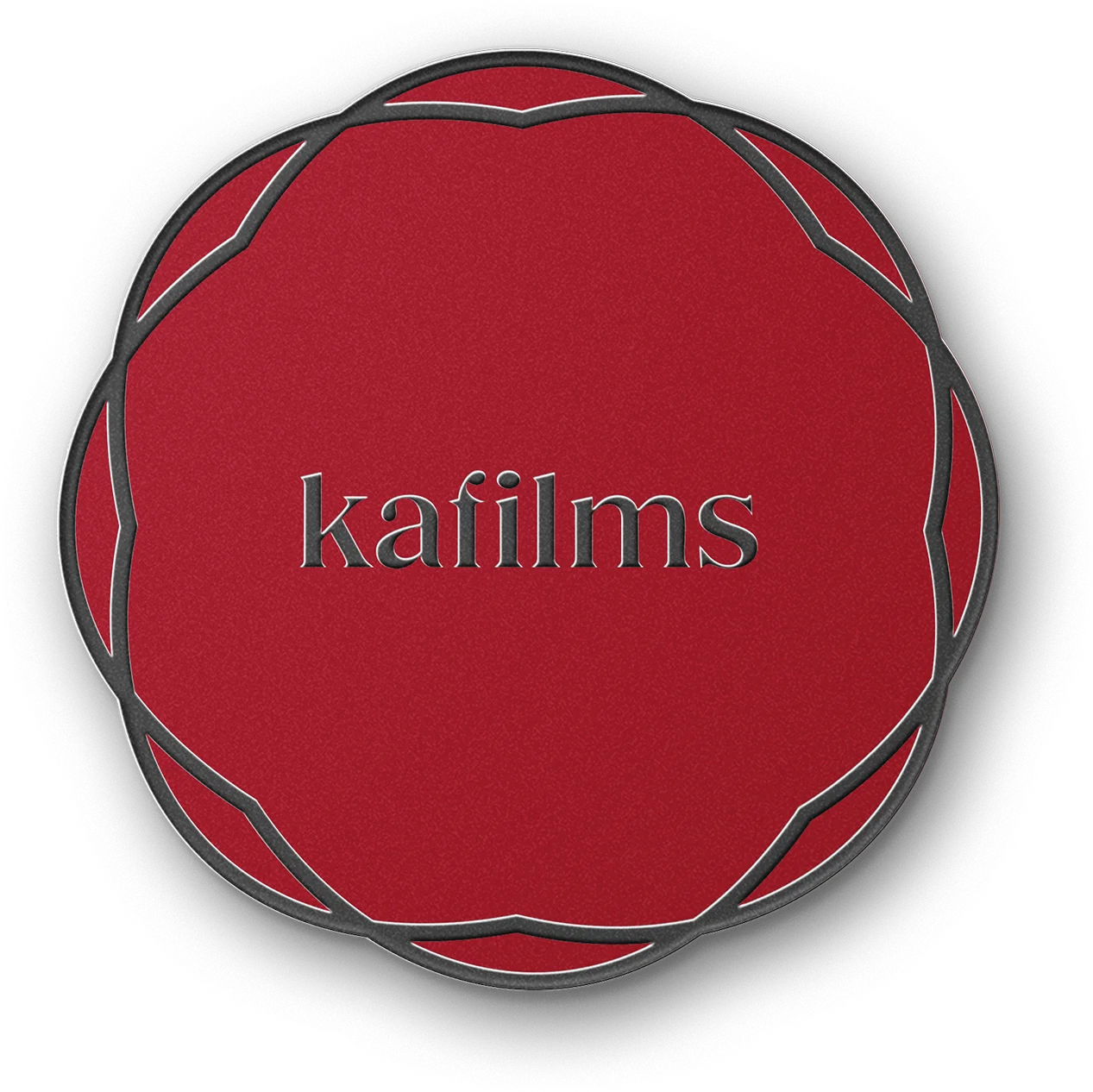
As part of the visual identity refinement, we extracted a distinct form from the lowercase “i” in the Kafilms wordmark — a subtle yet powerful detail that now serves as a standalone graphic symbol.
This shape, reminiscent of a camera lens or aperture, creates an intentional bridge between typography and visual storytelling. It doesn’t function as a logo or icon in the traditional sense, but as a signature design element that adds sophistication, consistency, and recognition across brand materials.
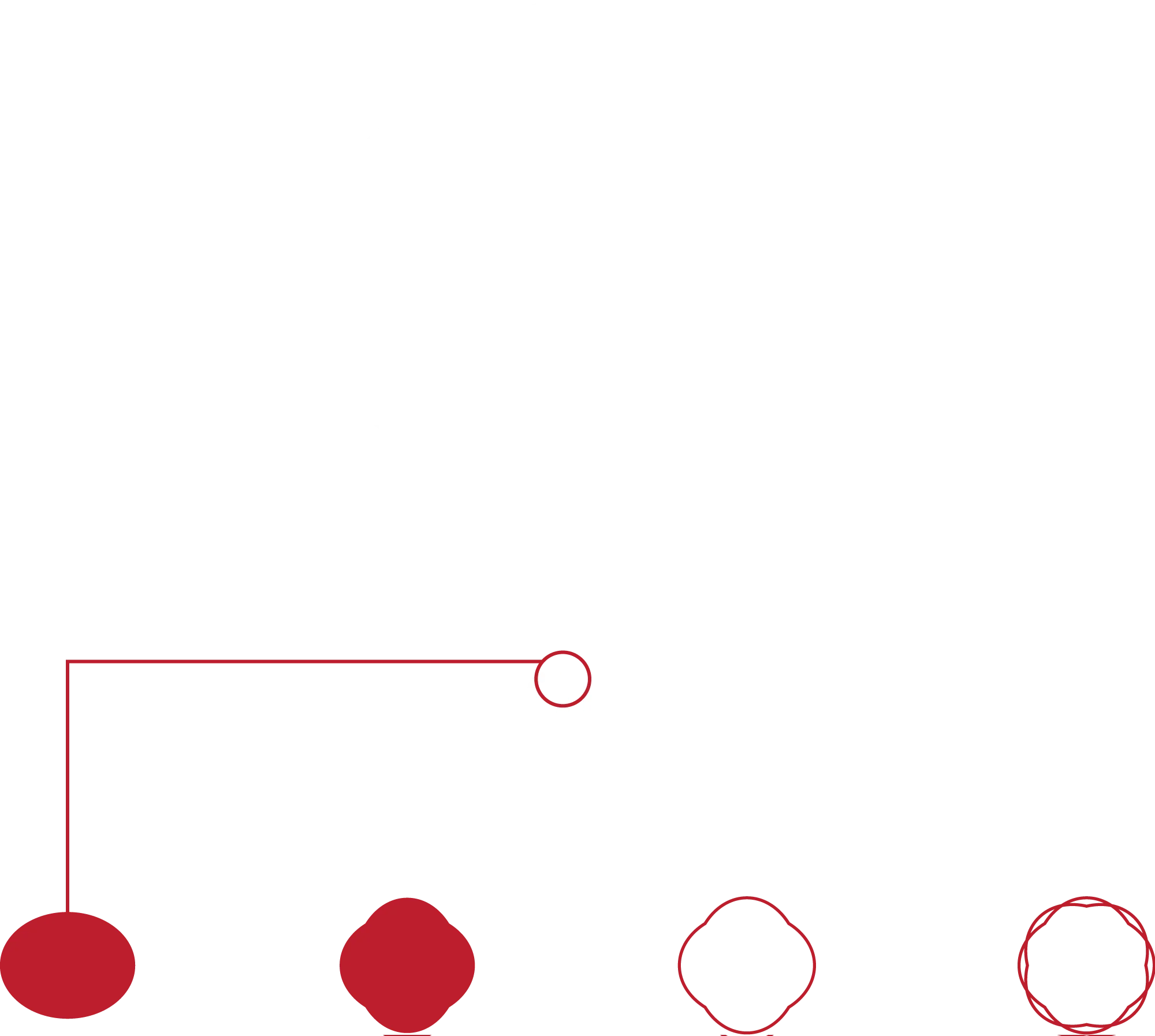
By isolating this detail and giving it its own space in the visual system, we introduce a premium mark that reflects both the brand’s aesthetic precision and its connection to cinema and photography.
The symbol allows the brand to speak without words, serving as a quiet but iconic accent in digital layouts, print applications, packaging, and motion design.
COLOR PALETTE
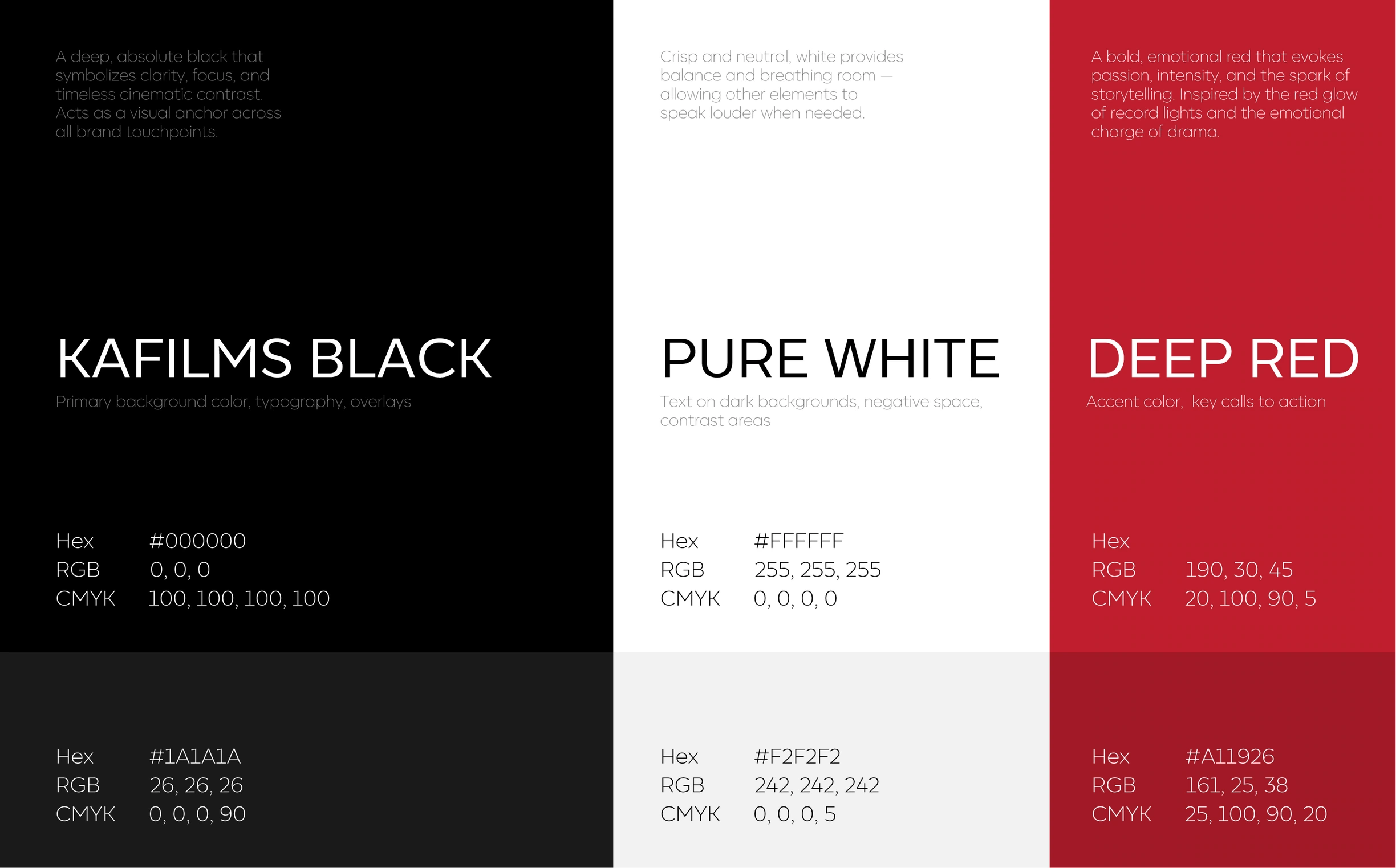
The color palette of Kafilms reflects its cinematic depth, emotional tension, and elegant restraint. The combination of powerful contrast and subtle shades creates a timeless visual language — equally suited for editorial, digital, and motion-based applications.
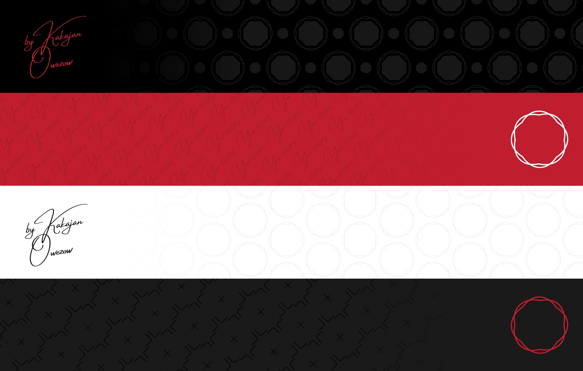
PATTERNS
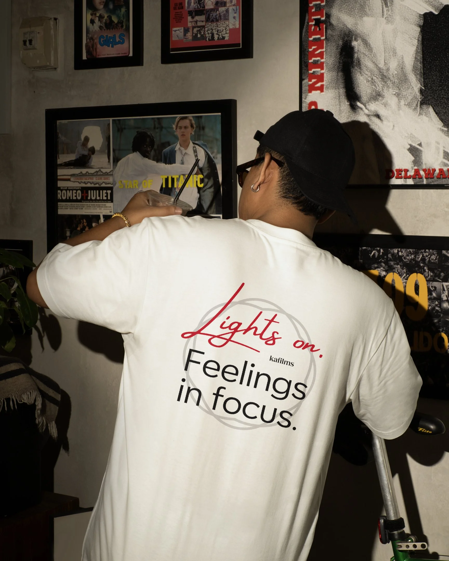
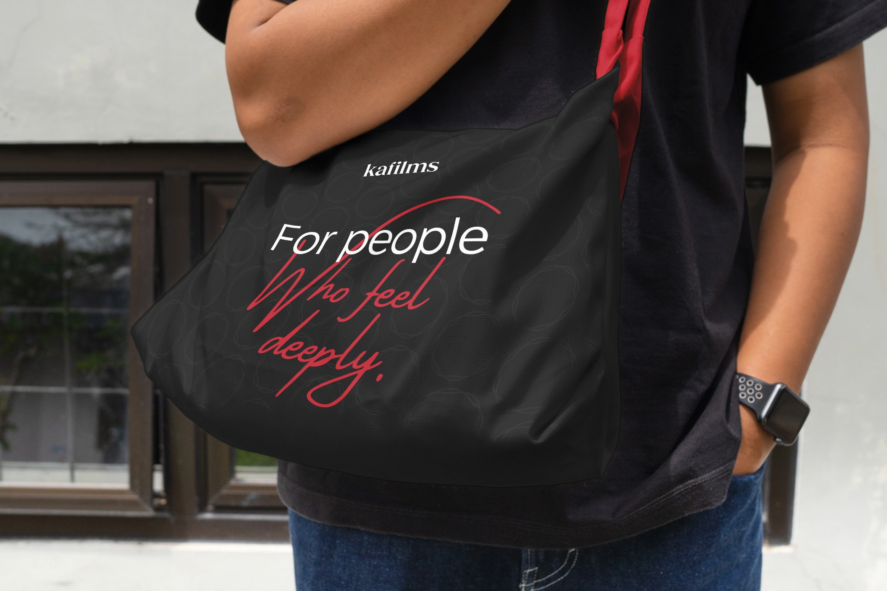
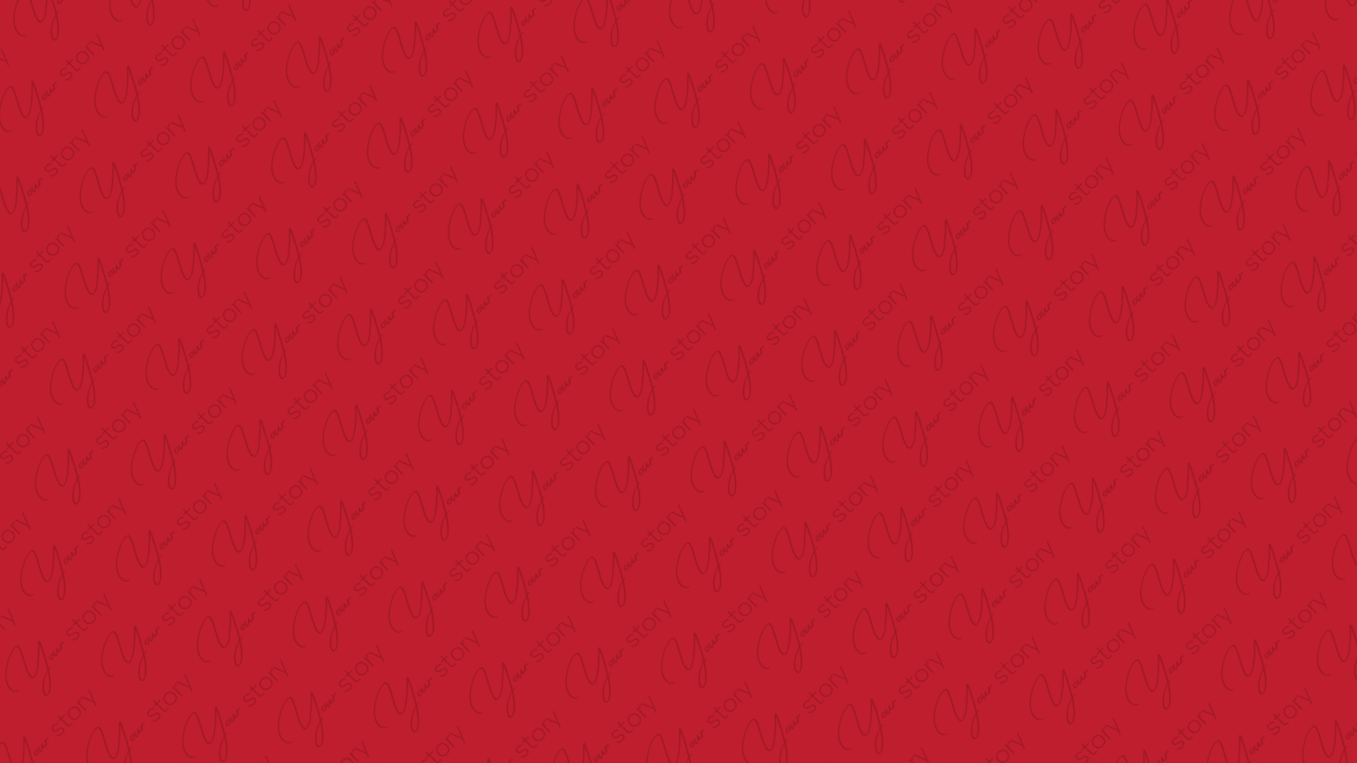
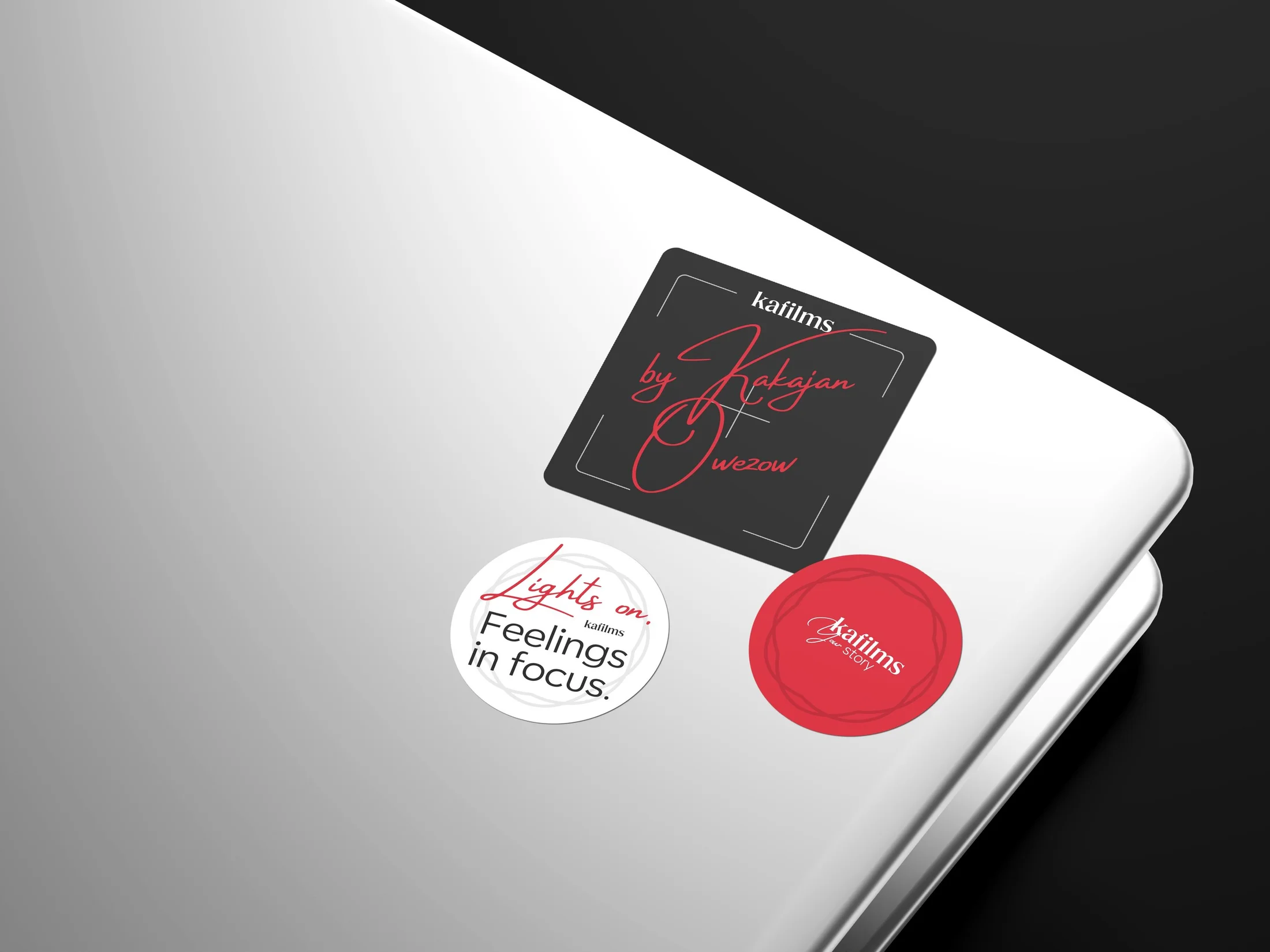
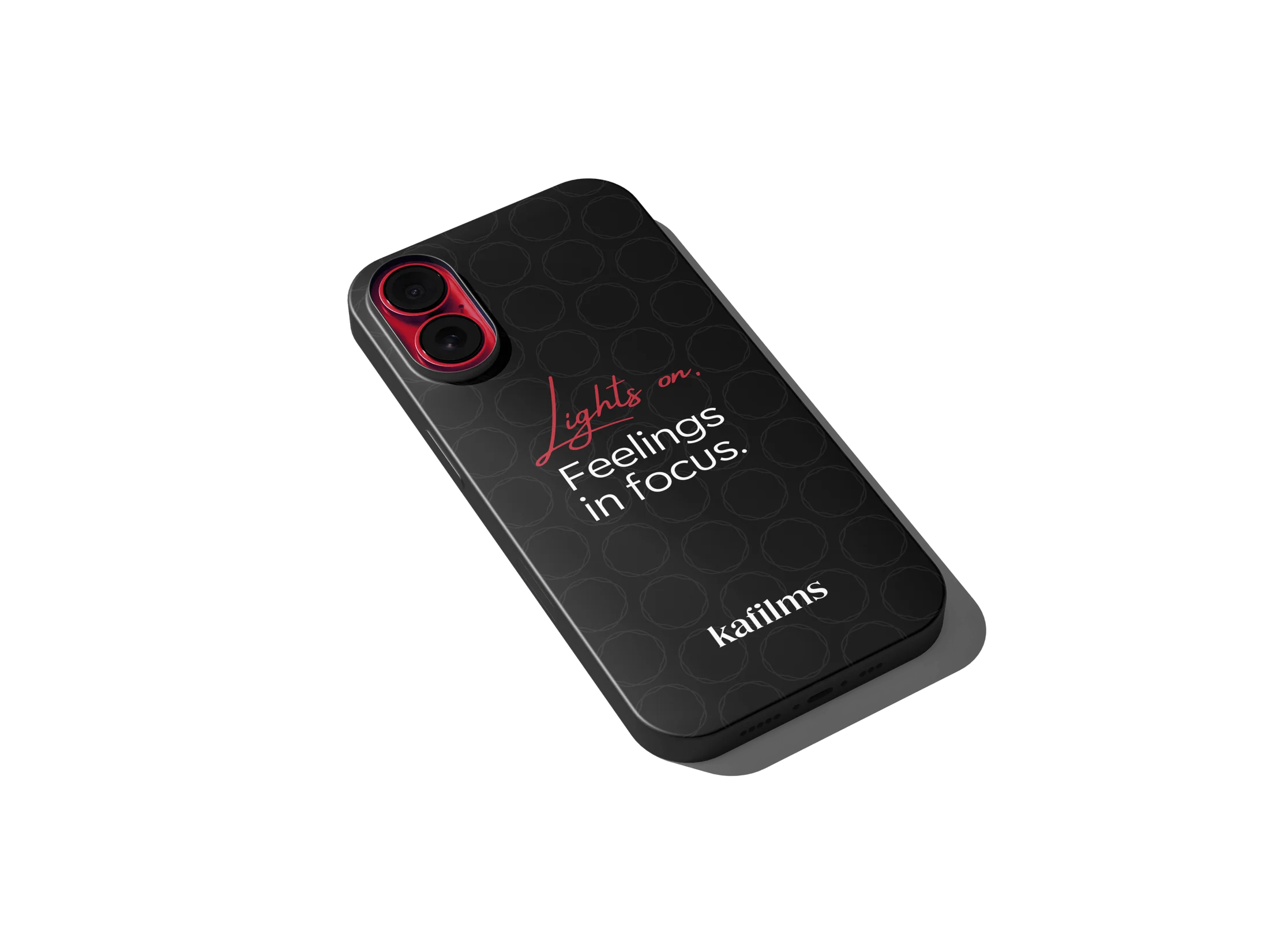
Patterns in the Kafilms identity system are designed to support the brand’s atmosphere: minimal, emotional, and cinematic. Each pattern is built from elements that already exist in the visual language of the brand — from the lens-inspired symbol to the expressive tagline typography.
These patterns are not decorative fillers, but subtle extensions of the brand voice. They can be used to add rhythm, depth, or texture to a layout, especially in packaging, posters, editorial spreads, or digital backgrounds.
TYPOGRAPHY
Headers and body font
Corsa Grotesk is a modern, neutral sans-serif typeface that offers clarity and flexibility across all mediums. Its clean geometry and well-balanced letterforms allow the brand’s visuals and storytelling to shine without distraction. It’s elegant yet unobtrusive — a perfect fit for Kafilms’ understated and atmospheric tone.

Accent typeface
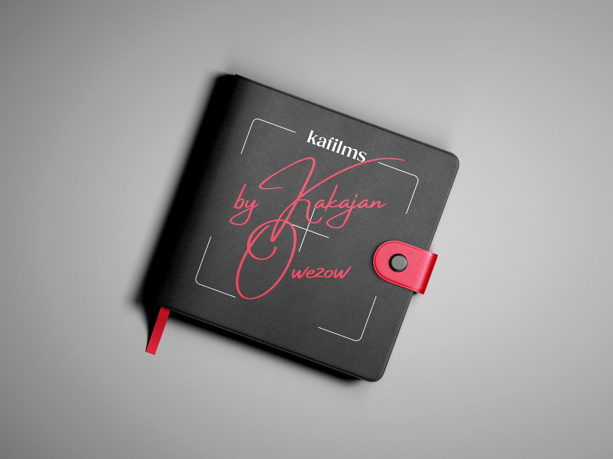
Amsterdam Four is used sparingly to introduce a touch of personal expression and warmth. This handwritten script brings contrast and emotional texture when needed — especially in artistic layouts, storytelling slides, or title frames. It should never compete with the primary typography but instead complement it in intentional, limited use cases.
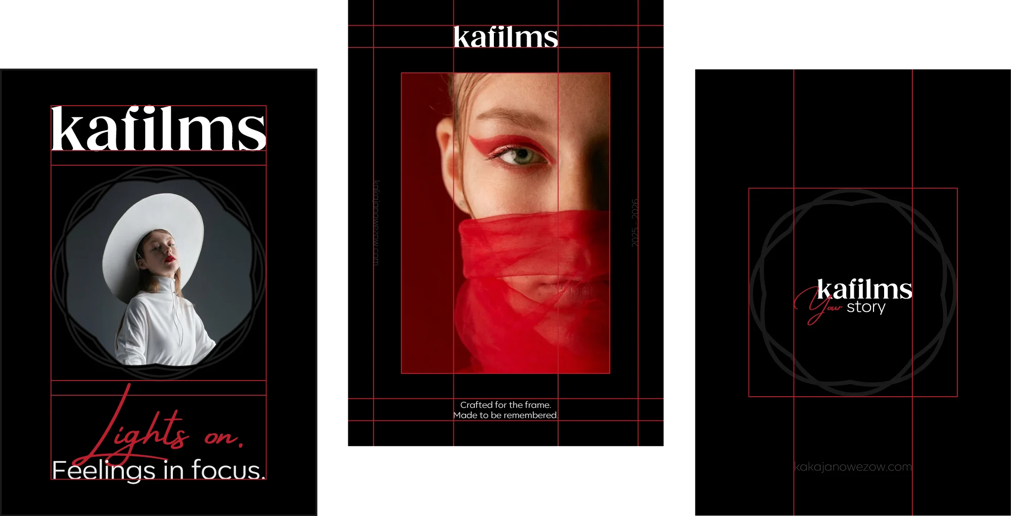
VISUAL GUIDELINES
These are not strict rules, but creative recommendations to help maintain consistency, mood, and visual impact when using the Kafilms brand. This guide is meant to support collaborators, editors, and designers in applying the identity across different formats — with flexibility and intent.
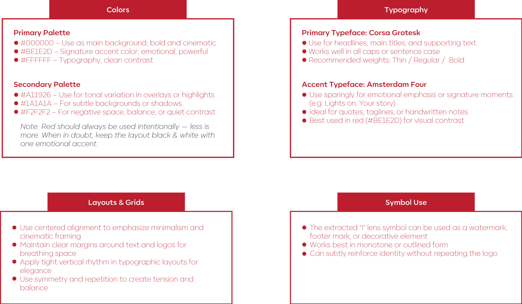
TYPOGRAPHY
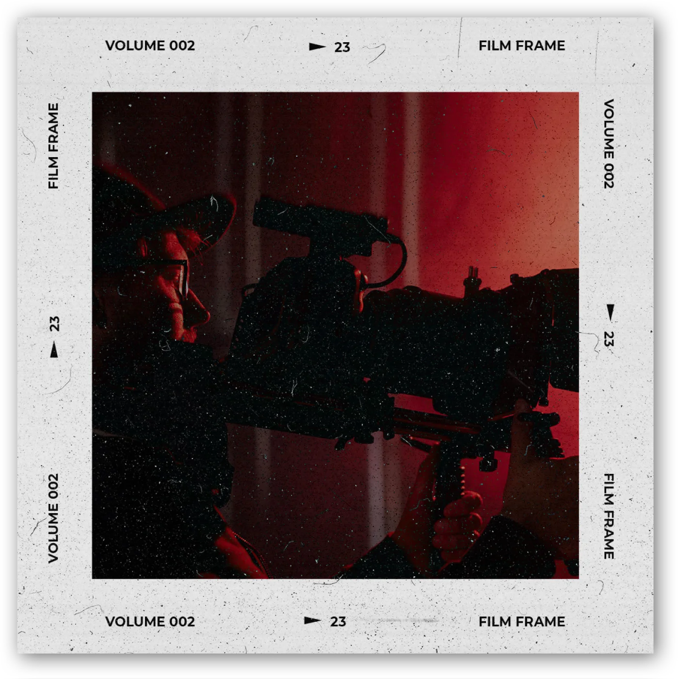
Mission

Kafilms exists to transform personal moments, brand narratives, and cultural expressions into emotionally resonant films and photography. Through a refined aesthetic and a human-centered approach, they create work that not only looks beautiful, but feels meaningful — frame by frame.
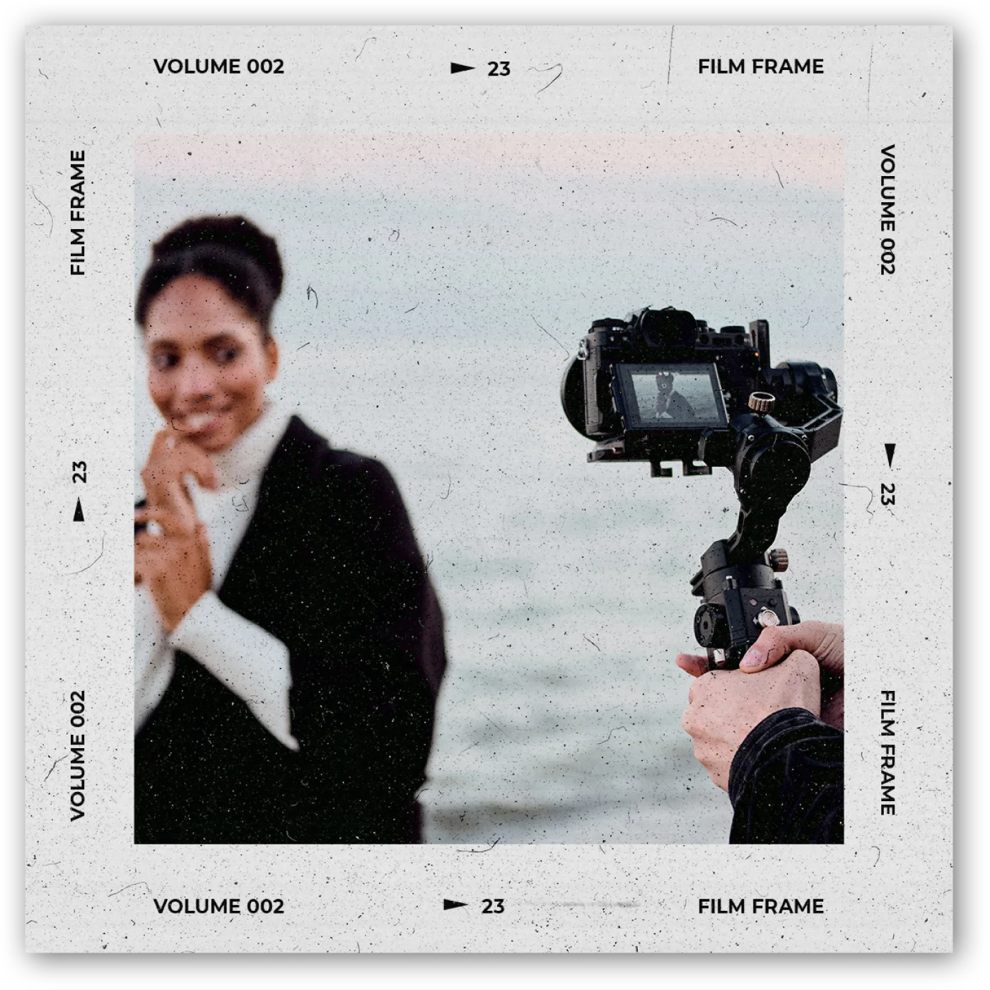
Vision
Kafilms aspires to build lasting partnerships with brands, artists, and individuals who believe in the power of stories. By blending artistic depth with cinematic clarity, their aim to create a body of work that transcends trends — and speaks directly to the heart.
MOTTO

“Your Story” is more than a phrase — it’s a promise. At Kafilms, every frame begins with the individual or brand behind it. This motto reflects our commitment to emotional authenticity and creative integrity. We don’t impose narratives; we illuminate them.
It’s about capturing the real — with cinematic care, artistic depth, and human presence. Whether it’s a love story, a brand’s evolution, or a cultural voice — it’s yours. We just help you tell it.
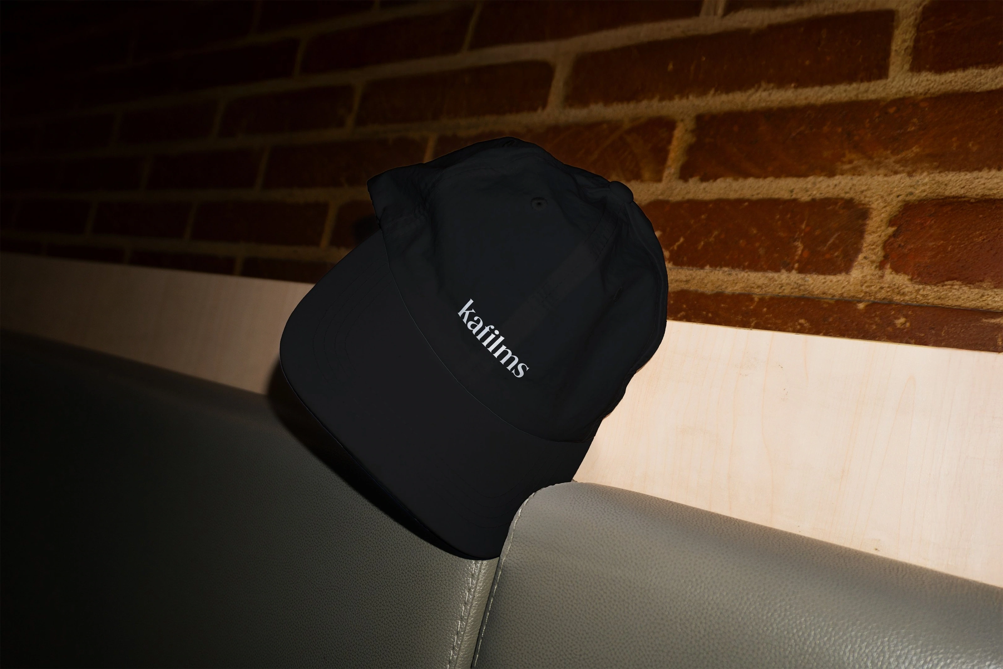
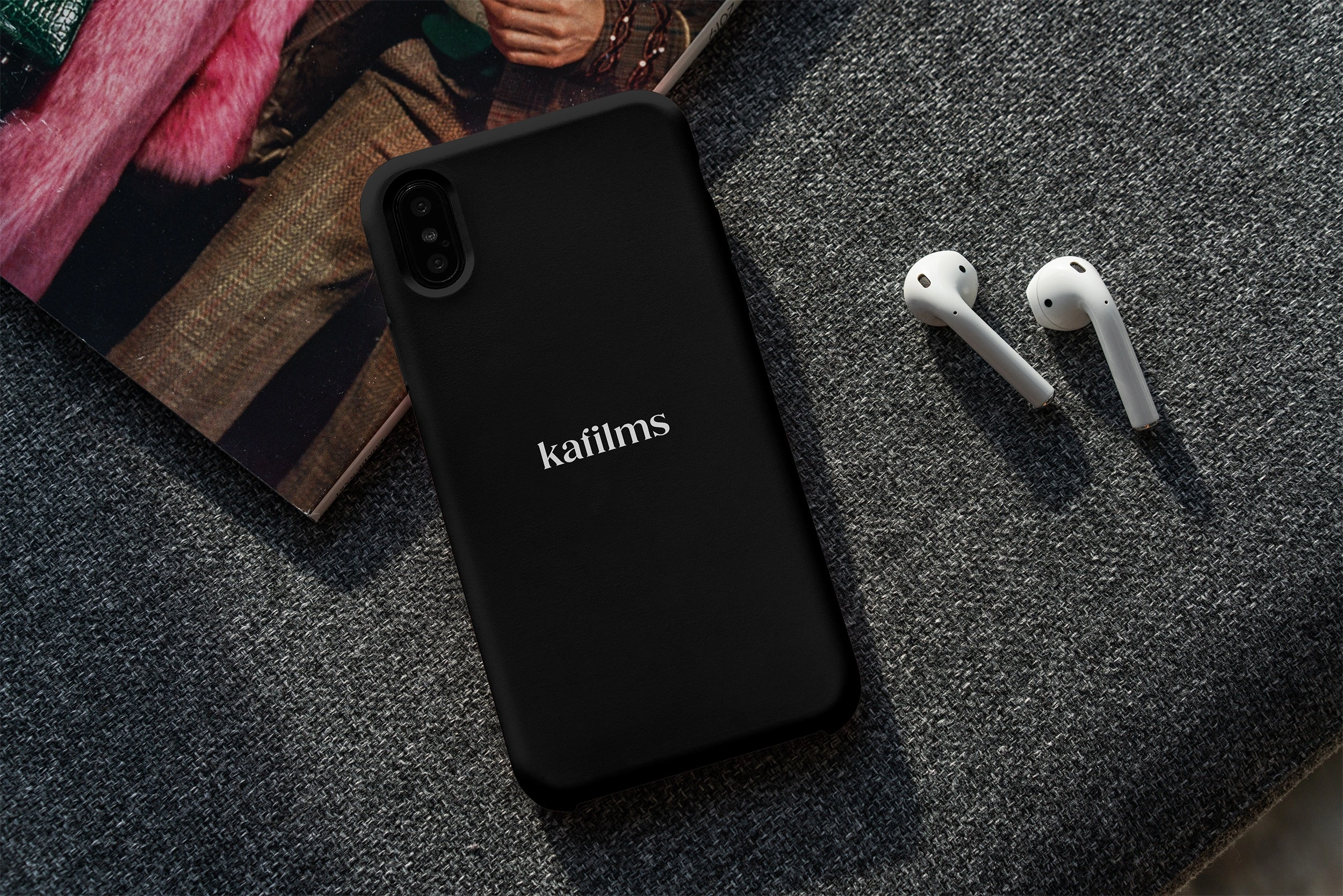
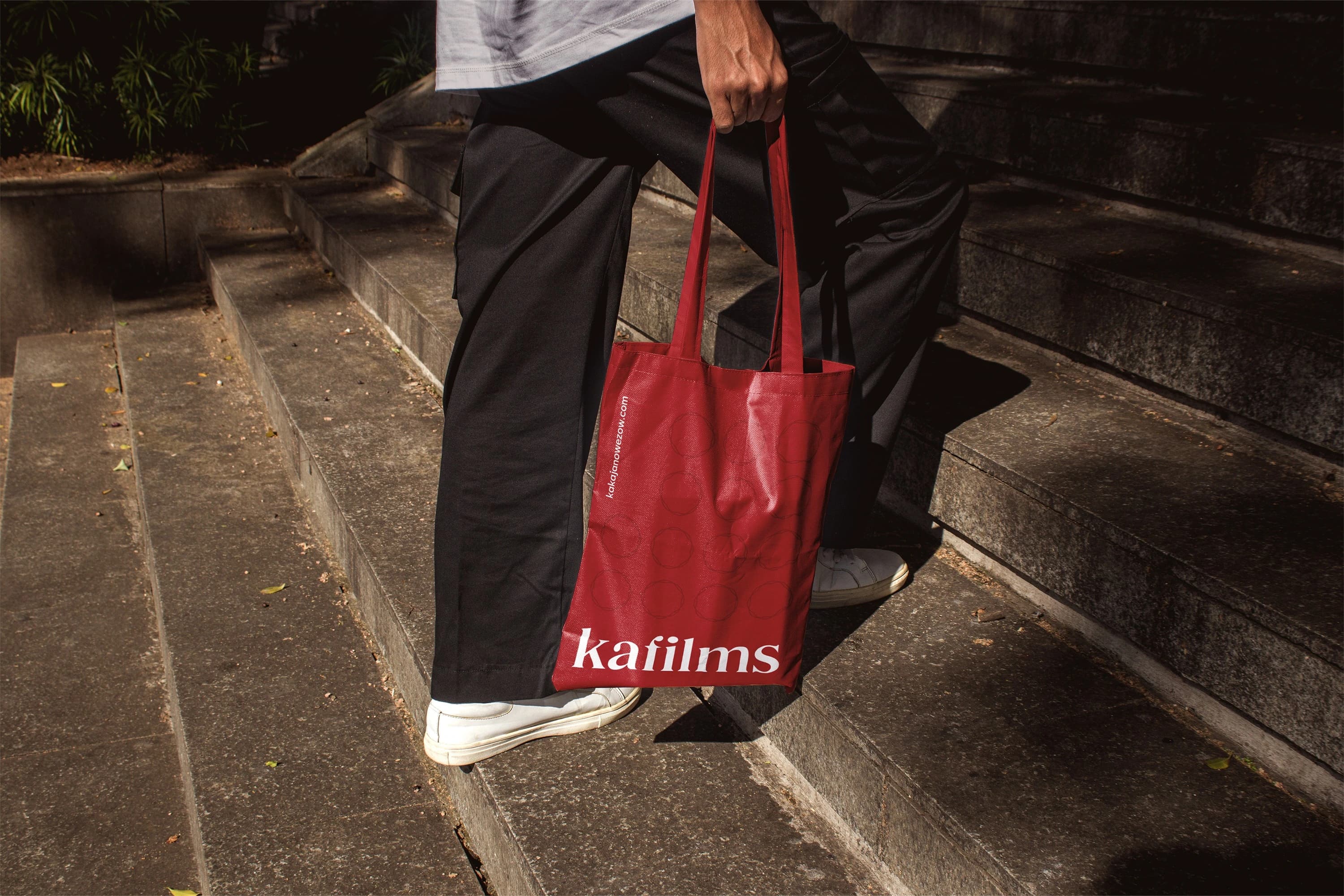
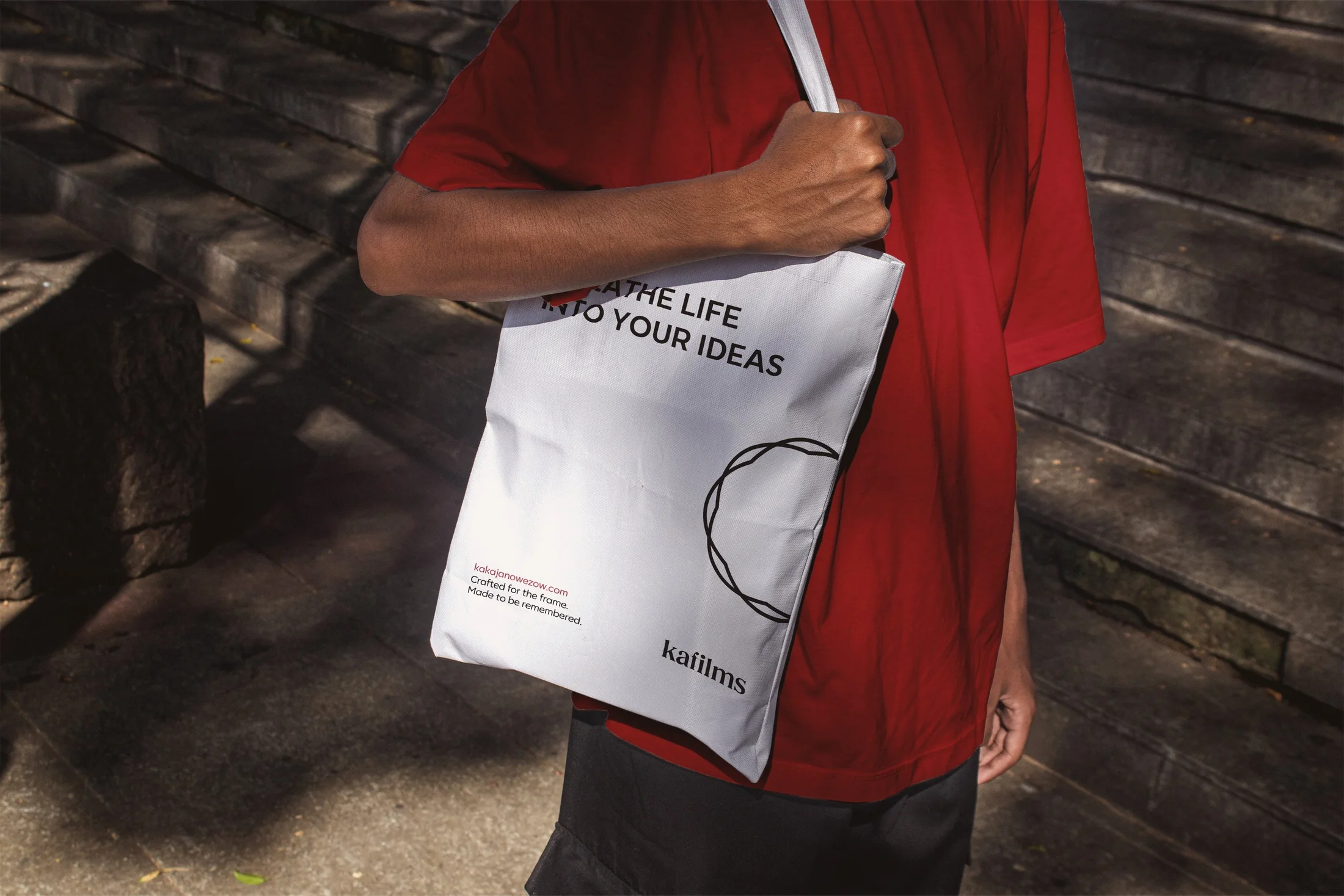
PROJECT GOAL
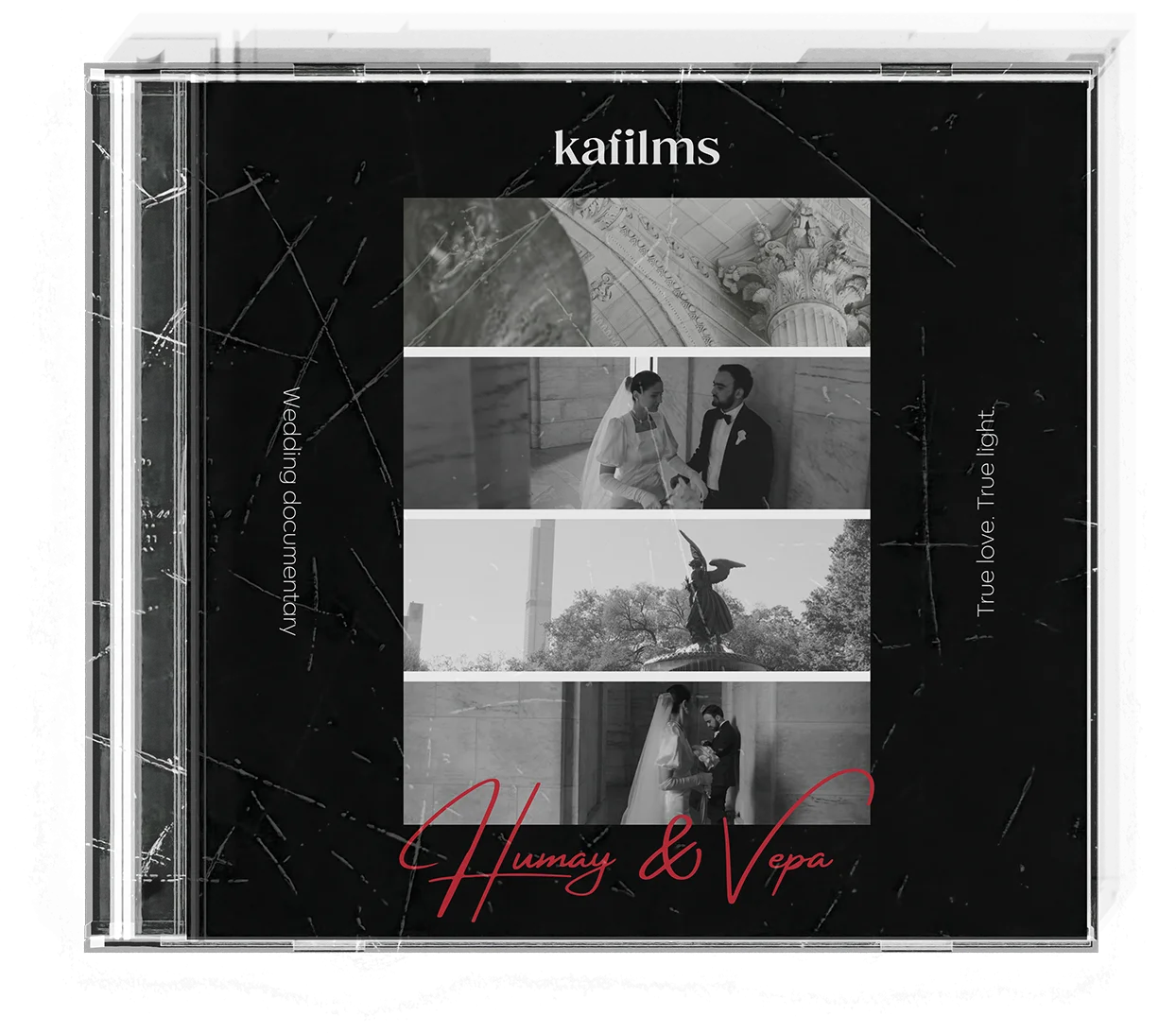
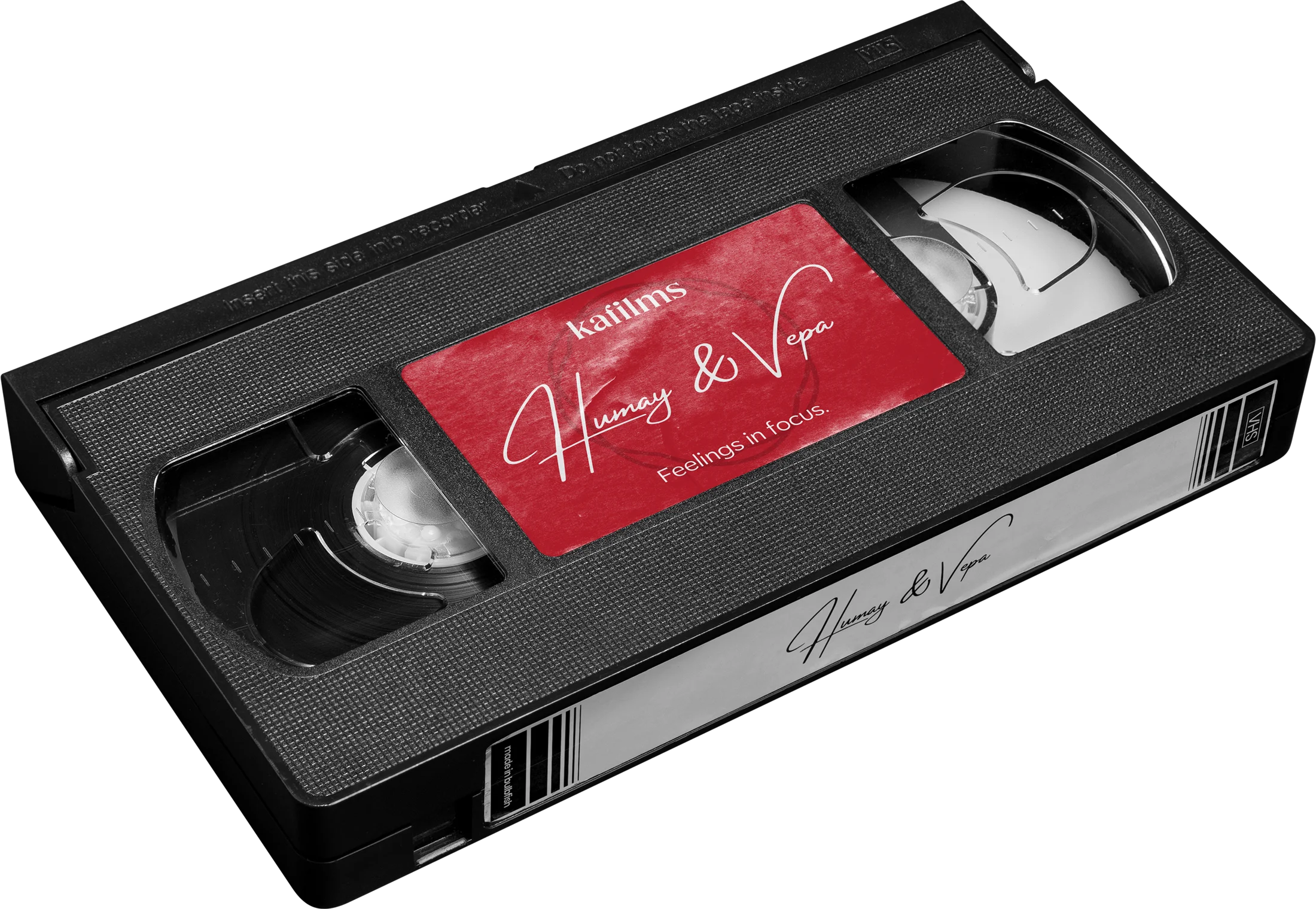
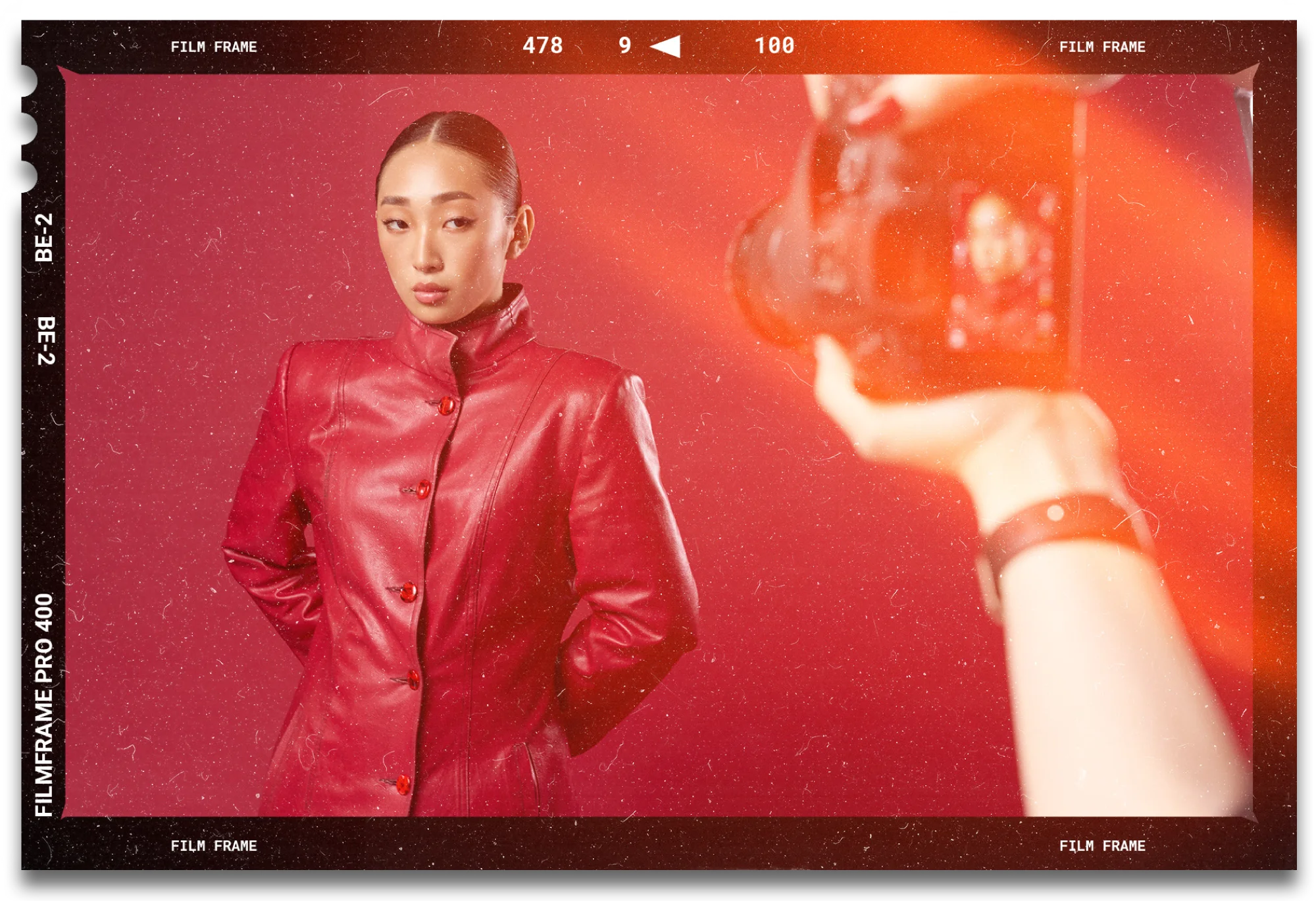
The goal of this project is to build a cinematic and emotionally distinctive visual identity for Kafilms — a creative studio specializing in fashion campaigns, commercial films, wedding documentaries, and social media storytelling. The brand system is designed to reflect Kafilms’ core values: sincerity, atmosphere, and visual integrity.
This identity blends elegant typography, a minimal yet expressive color palette, and carefully crafted graphic elements to evoke a sense of timelessness and creative depth. Whether producing high-end fashion visuals or documentaries, Kafilms aims to deliver emotionally charged, aesthetically refined content.
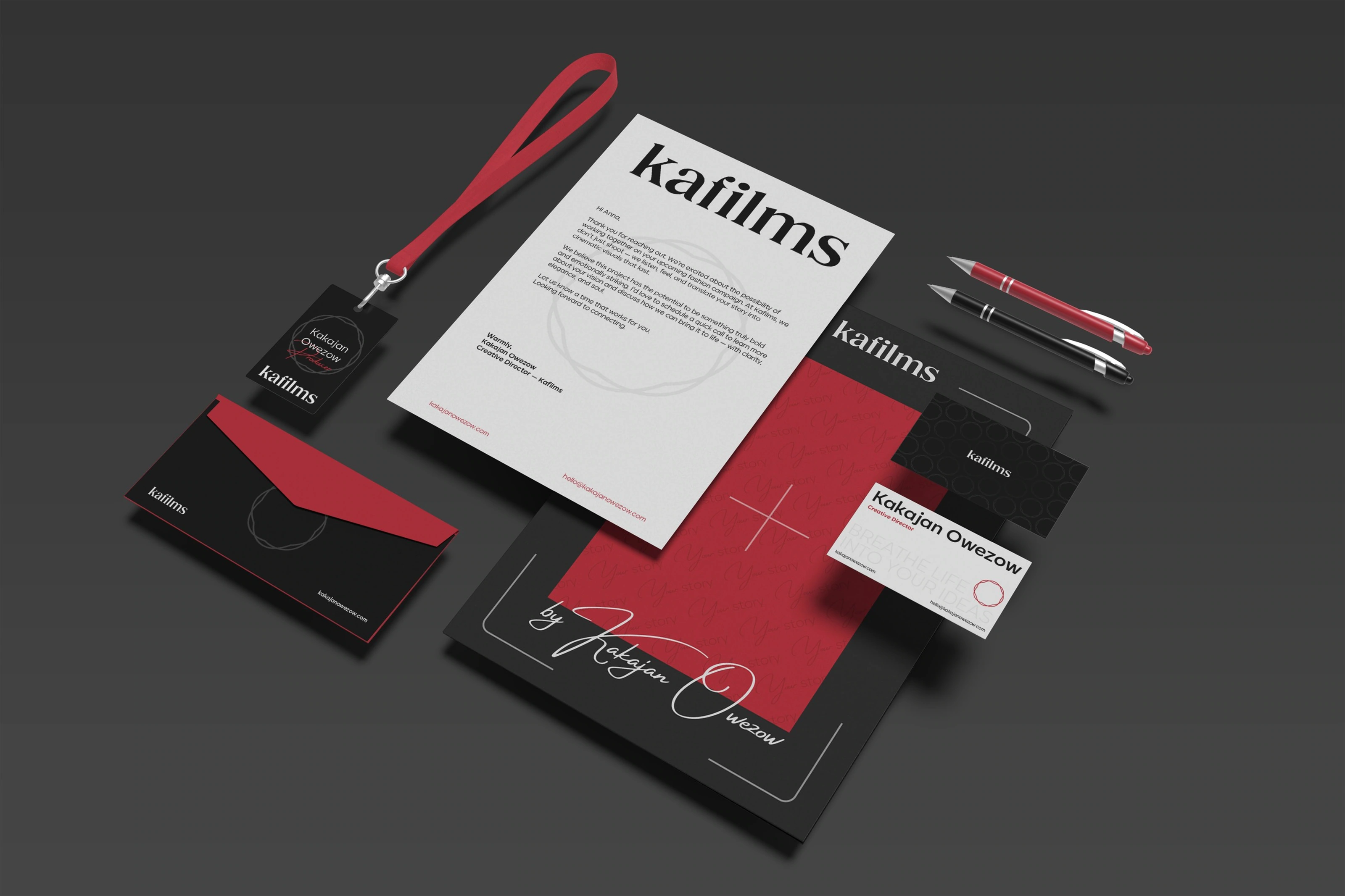
Through consistency across all touchpoints — from film titles and social content to visual guidelines — the brand strengthens recognition, builds trust, and positions Kafilms as a premium partner for bold and meaningful visual storytelling.
BRAND VOICE
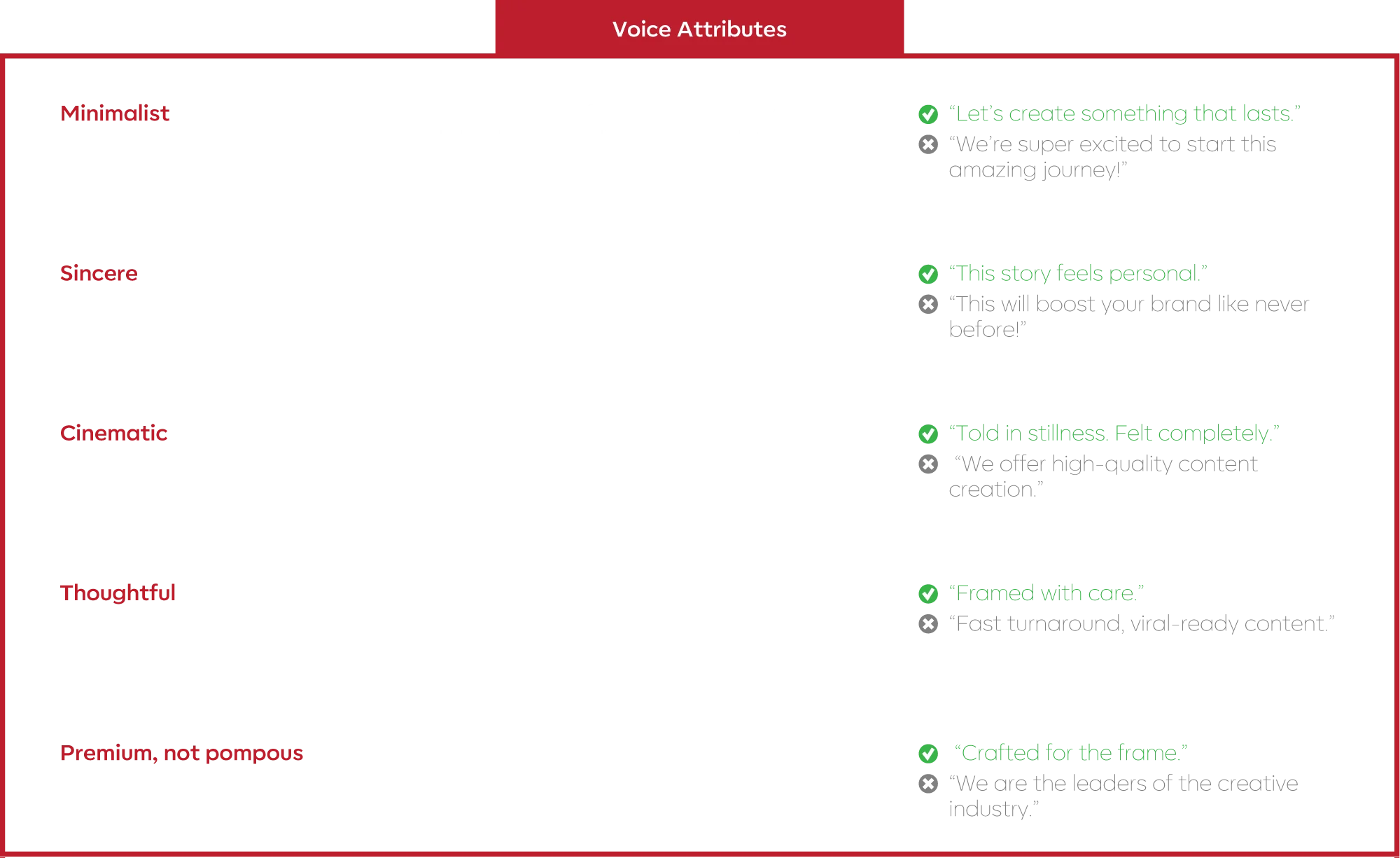
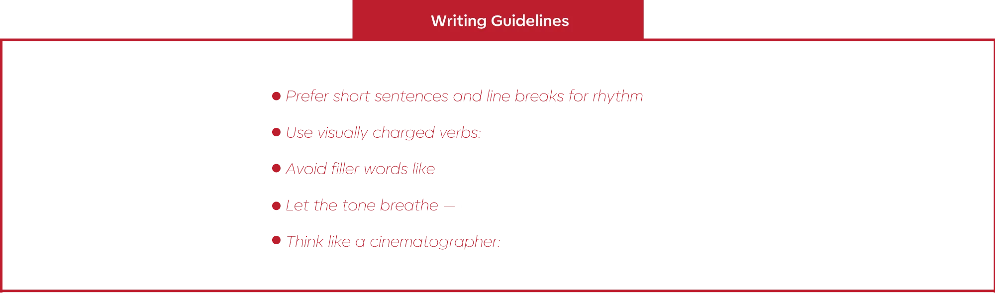
Kafilms communicates with cinematic stillness and emotional clarity. The brand’s voice is minimalist, sincere, and visually evocative — designed to feel composed, intentional, and premium without being loud. It avoids overused marketing clichés, focusing instead on the power of carefully chosen words.


VISUAL ELEMENTS & PATTERNS
Kafilms blends visual storytelling with a refined, cinematic identity. Every element — from typography to pattern — is designed to evoke emotion without distraction. The aesthetic is minimal, expressive, and elegantly composed, allowing the imagery to breathe and speak for itself.
By embracing artistic simplicity and visual precision, the brand creates a space where emotion is framed with care — inviting viewers not just to see, but to feel. The system is built for flexibility, yet always grounded in clarity, feeling, and form.
Patterns, typographic rhythm, and subtle visual cues work together to support Kafilms’ mission: to capture moments that feel deeply personal and visually unforgettable.
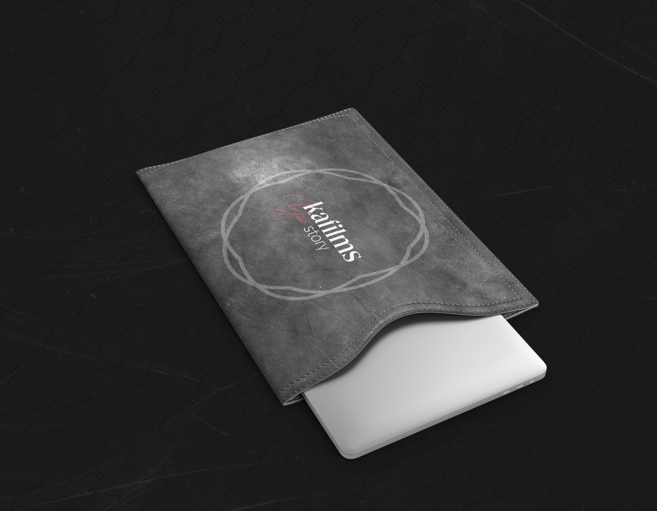
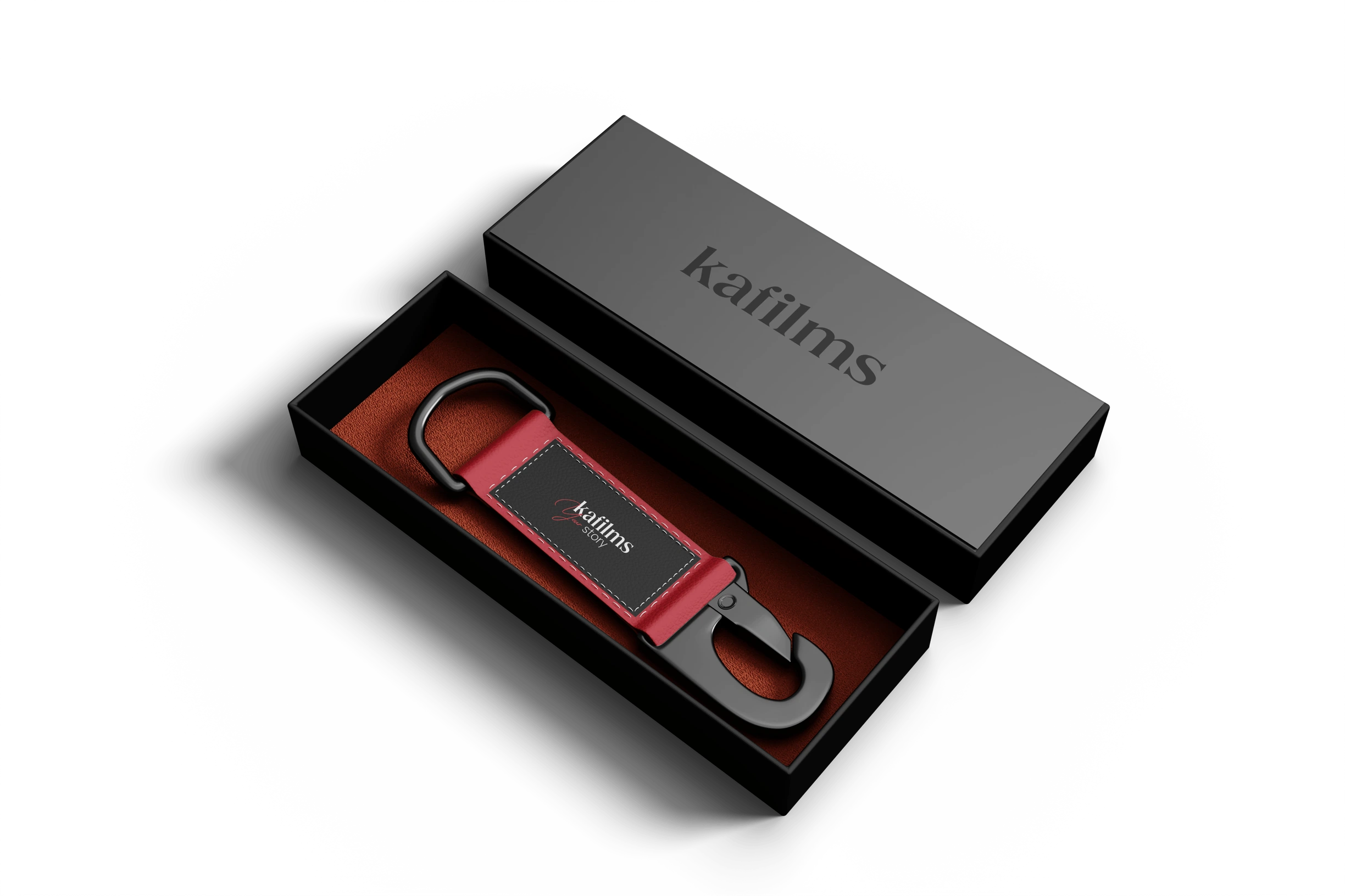
SOCIAL MEDIA
These recommendations aim to guide the visual consistency of Kafilms across social platforms — especially Instagram. The goal is to maintain the brand’s cinematic quality while adapting content for digital environments. Every post should feel composed, emotional, and intentional.
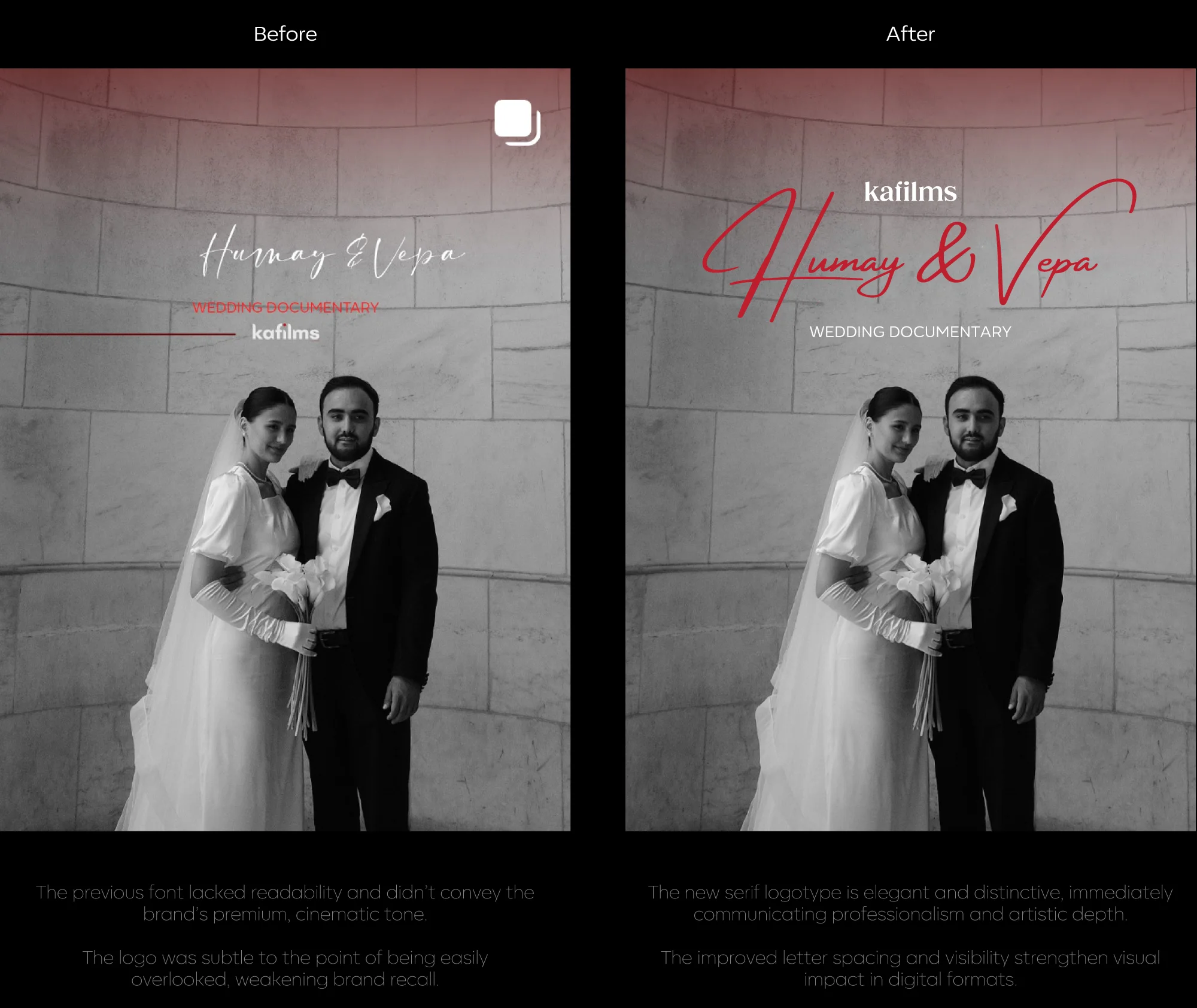
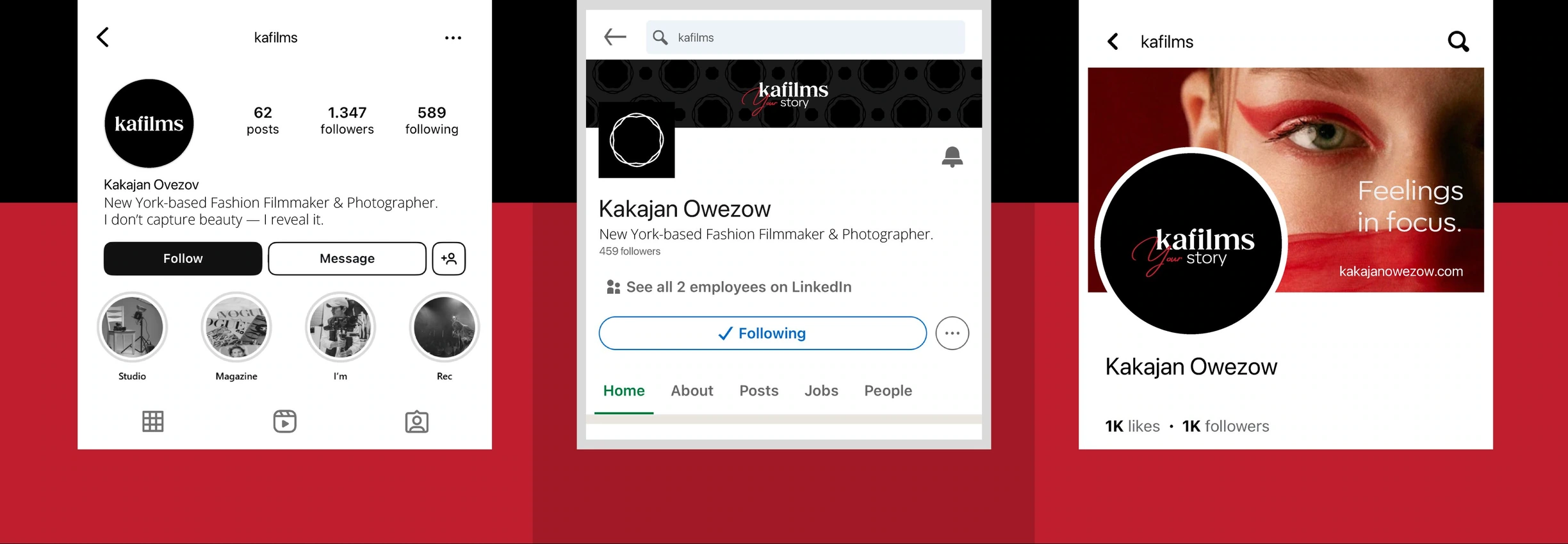
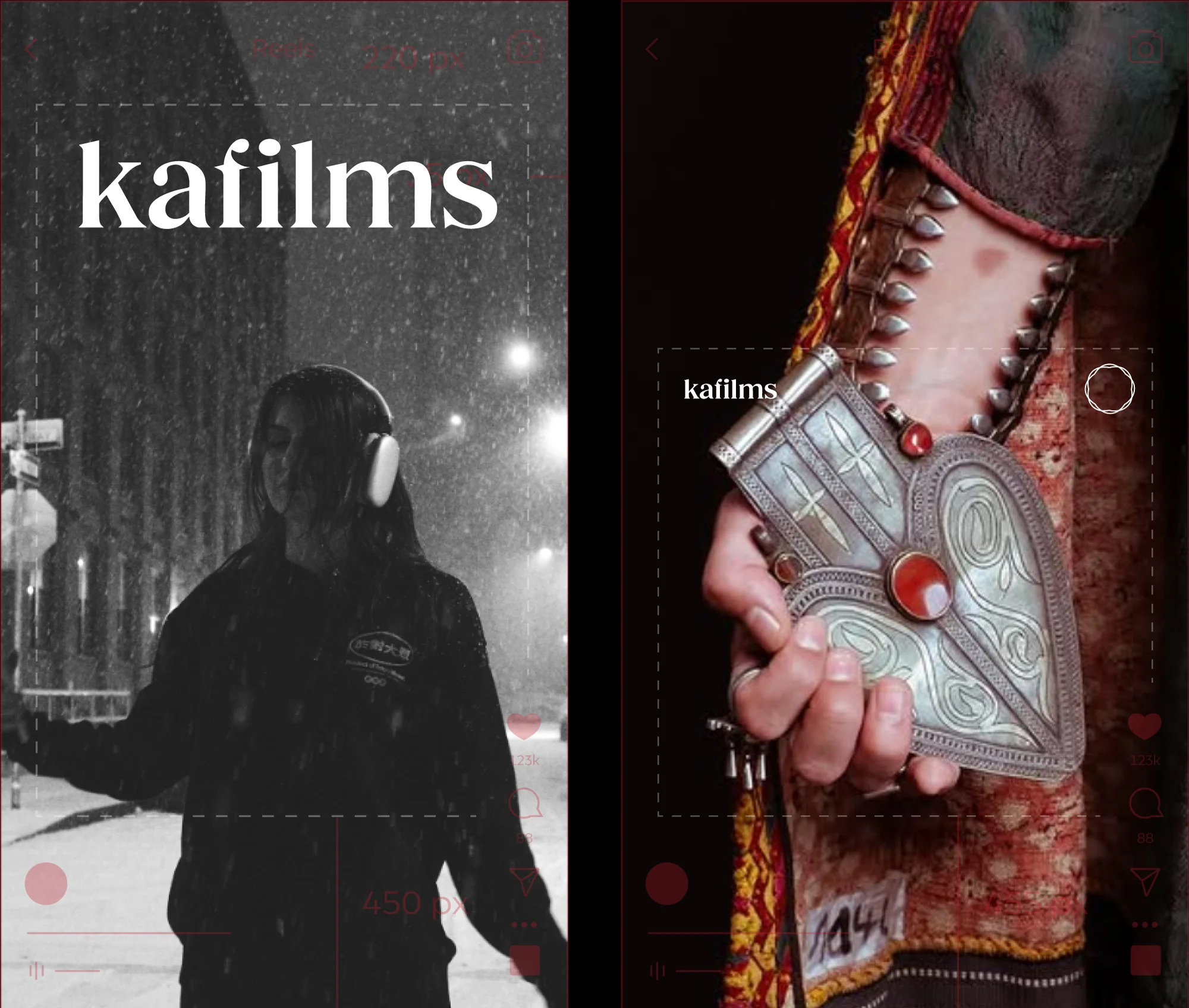
The new visual system is tailored to perform across platforms — especially on Instagram — ensuring content feels consistent, cinematic, and premium in both feeds and stories.
Logo vs Brand
Have you ever wondered what exactly separates logo design from brand design? It's a common mix-up, so let's clear things up.