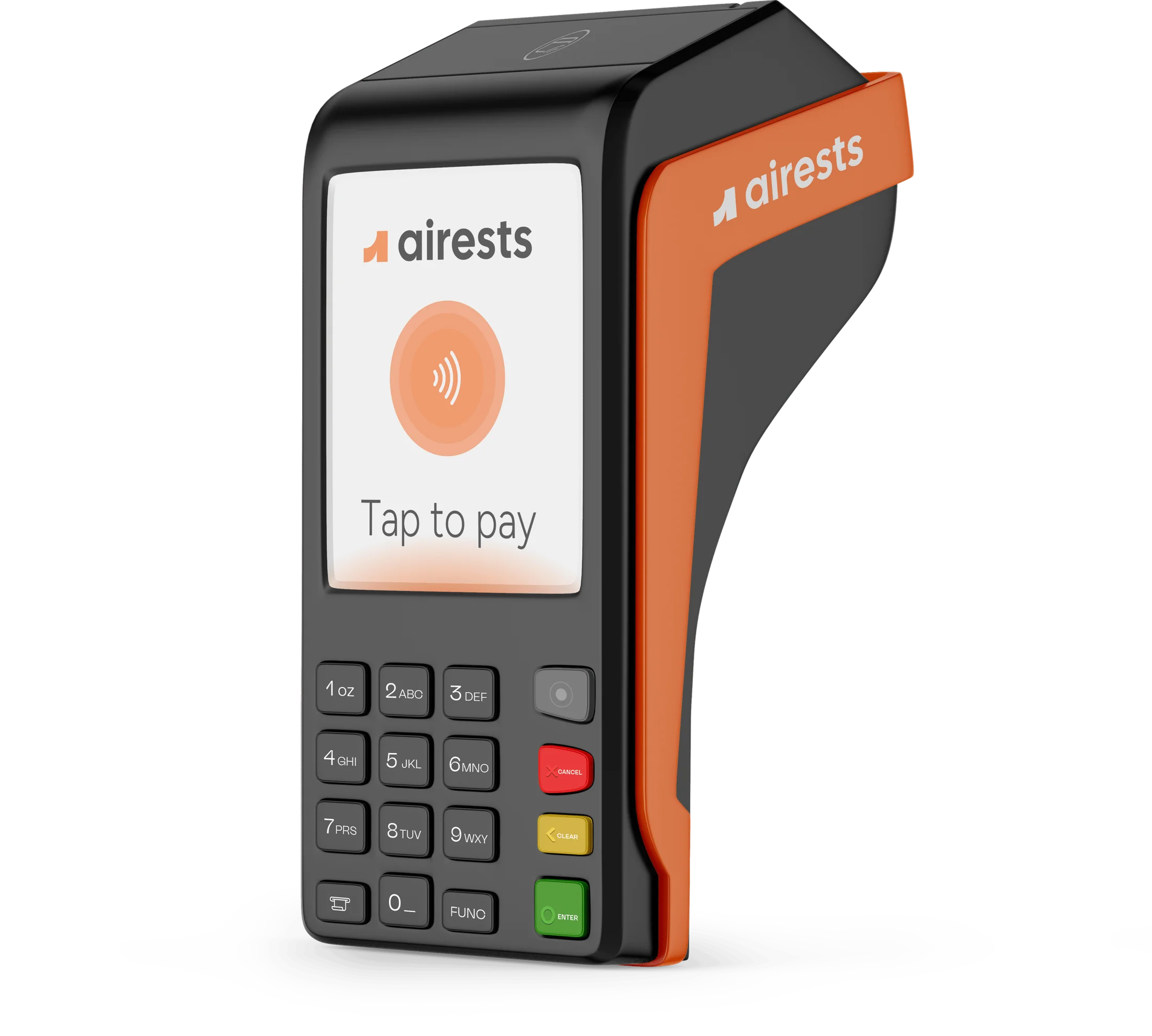
AIRESTS LLC is a technology company focused on developing intelligent Point of Sale (POS) solutions tailored to the needs of restaurants and small businesses. The platform combines hardware, software, and AI-driven tools into one seamless ecosystem that simplifies sales, payments, and inventory management.


YOU ARE IN PROFESSIONAL HANDS


AIREST BRAND STRATEGY
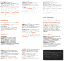
INSPIRED KEYWORDS

INSPIRED IMAGES

Before finalizing the AIRESTS logotype, various design directions were explored — from bold geometric forms to softer, people-focused styles. The goal was to balance technology and human touch, reflecting AIRESTS as both innovative and approachable. Each iteration tested clarity, distinctiveness, and adaptability, ensuring the final mark communicates reliability and forward-thinking spirit across all touchpoints.
BRANDMARK
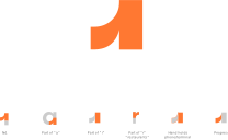
Together, these elements make the logo not just a mark, but a visual metaphor for AIRESTS’ promise: innovation, reliability, and growth through intelligent POS solutions.
The sharp angles and clean lines reflect professionalism and precision, while the smooth curve introduces friendliness and a human touch.
The open shape of the “a” symbolizes transparency and openness, reinforcing the brand’s approachable personality. The form also suggests a hand holding a phone or terminal, directly connecting to the POS industry.
Overall, the brandmark balances technology and empathy, showcasing AIRESTS as both a trusted partner and a forward-looking innovator.
LOGOTYPE


The AIRESTS logotype is built with Cal Sans Regular, chosen for its clean geometry and modern character. While the typeface itself is pre-existing, adjustments were made to spacing, kerning, and proportions to achieve a balanced and distinctive look.
These refinements ensure the logotype feels professional, approachable, and adaptable across different applications.



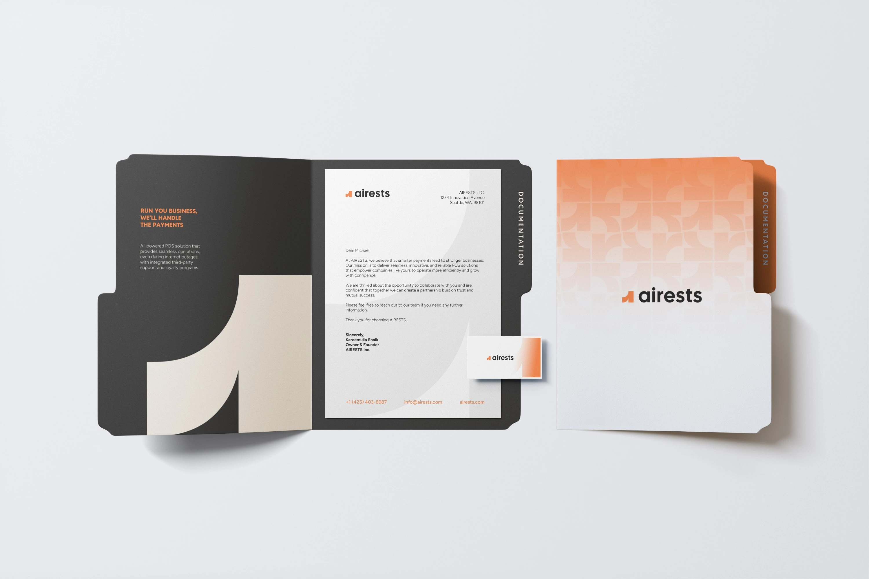
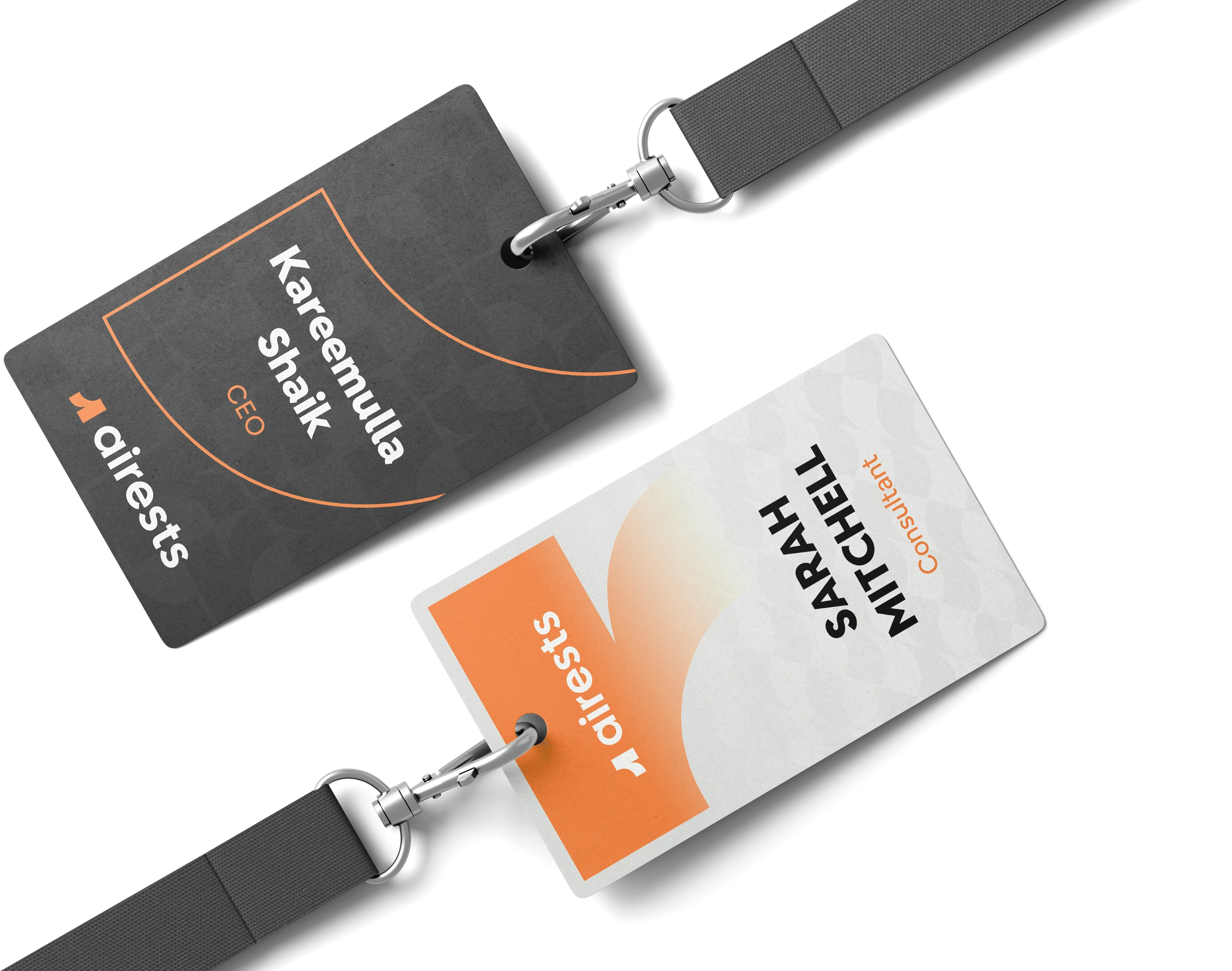
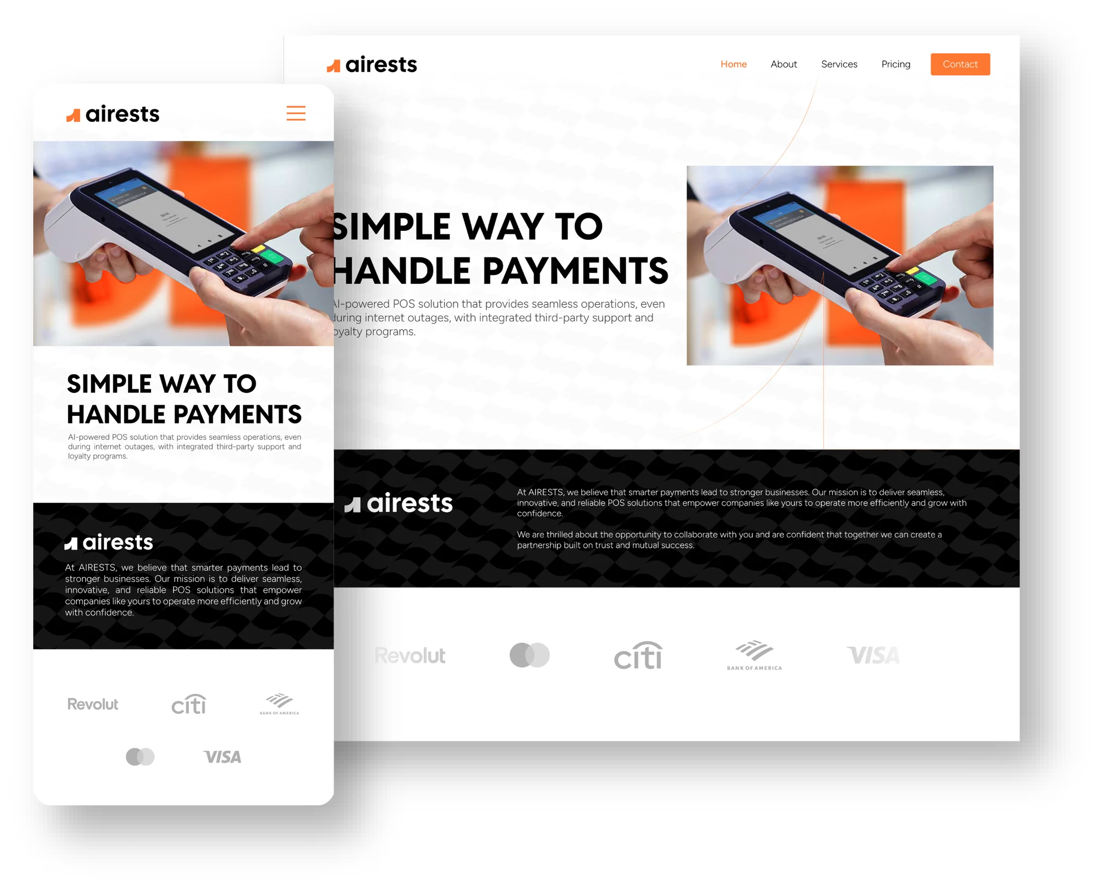
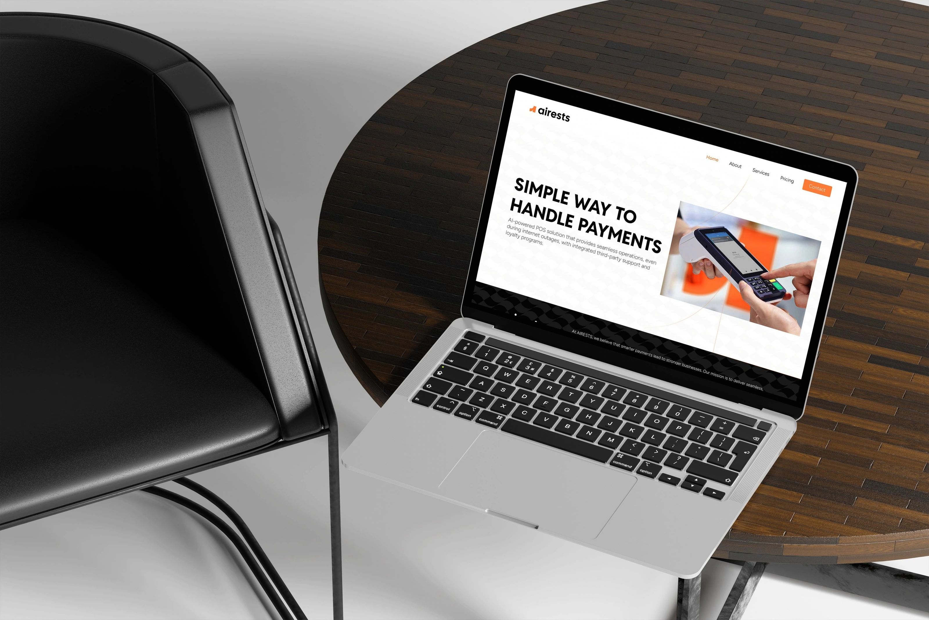
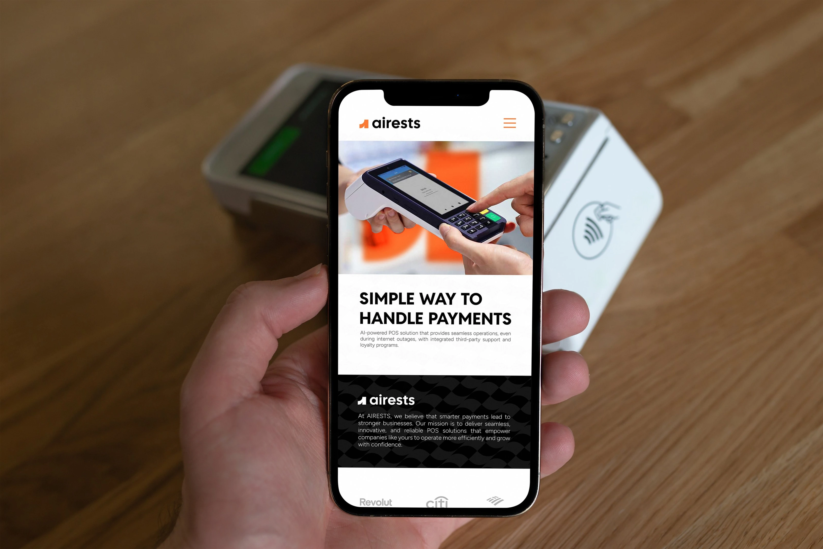
The visual identity translates strategic insights into a cohesive system. Clean geometry and balanced proportions convey precision and reliability, while subtle curves and open forms add warmth and trust, working seamlessly across digital and physical touchpoints.
LOGO GUIDE

Using the logo correctly ensures a consistent, professional brand presence, enhances recognition, and protects its value by preventing distortion or misuse.
COLOR PALETTE
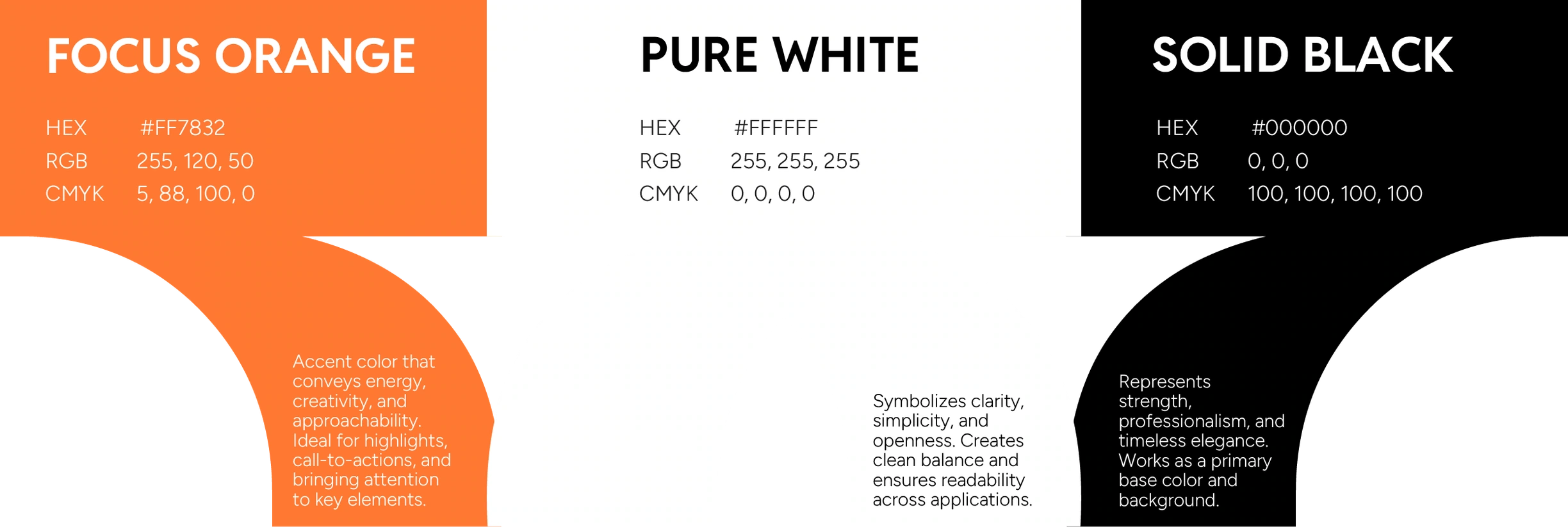
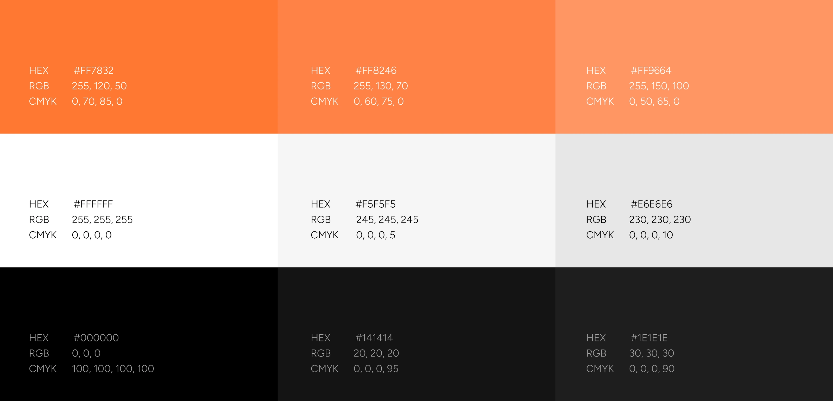
Our color palette is built on clarity, contrast, and confidence, reflecting the innovative and professional nature of AIRESTS. White and black provide a timeless foundation of balance and reliability, while orange adds energy, friendliness, and focus as an accent. Together, these colors communicate trust and modernity.
PATTERNS

Our patterns are inspired by the geometry of the AIRESTS logo. Repeated shapes and modular forms create rhythm, structure, and modernity — reflecting both the brand’s technological precision and approachable character. These patterns act as dynamic elements that bring consistency and energy across applications.


TYPOGRAPHY
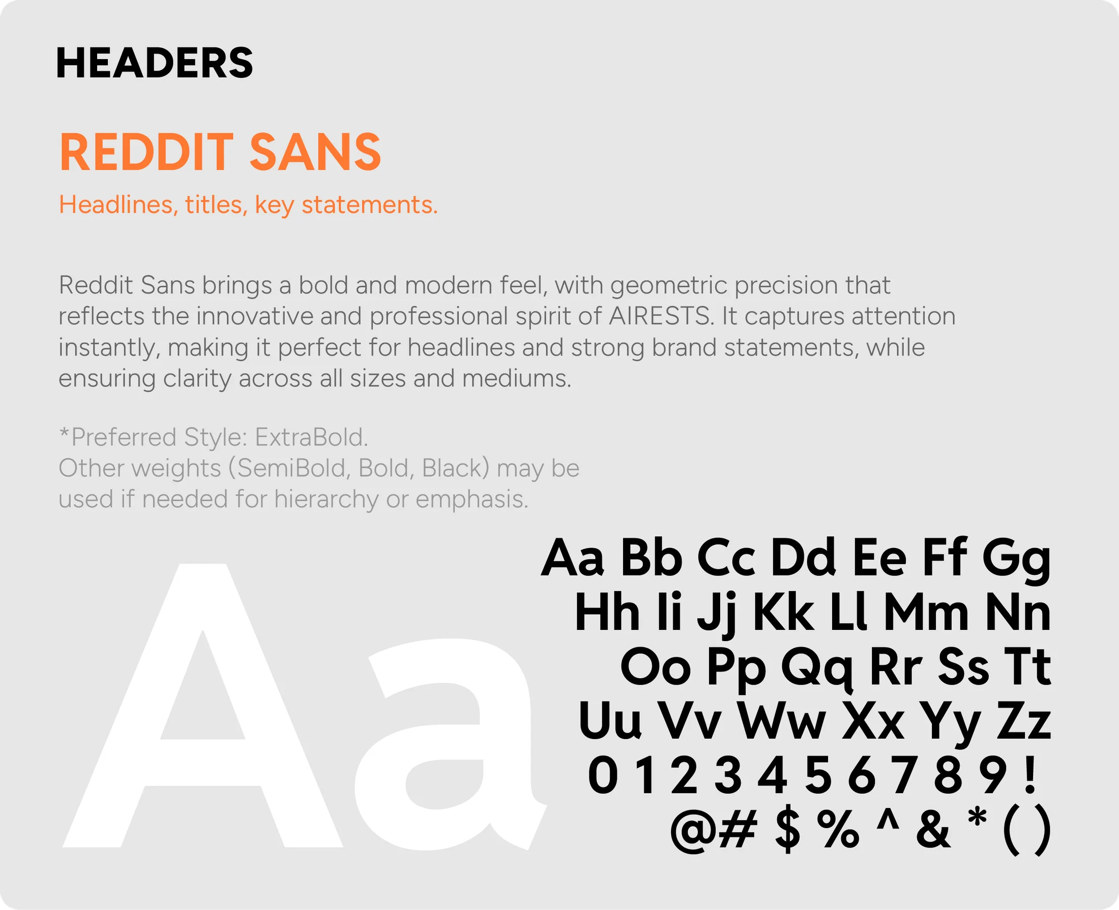
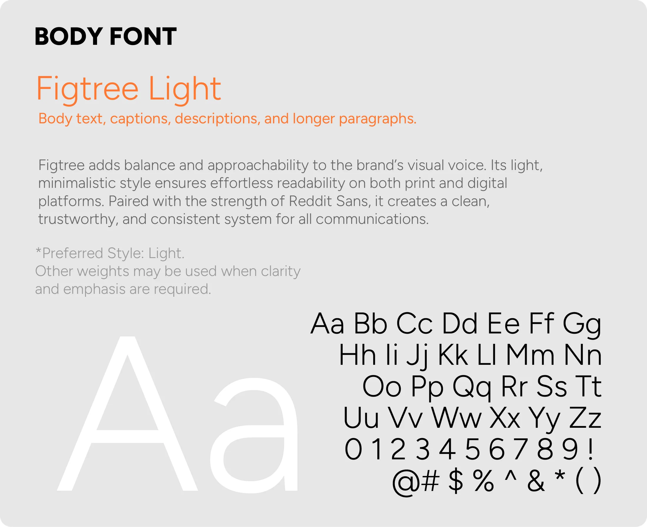
Typography plays a key role in building a consistent, recognizable brand identity. For AIRESTS, we selected modern, functional typefaces that combine clarity, readability, and professionalism, ensuring the brand feels both innovative and approachable.
MOTTO

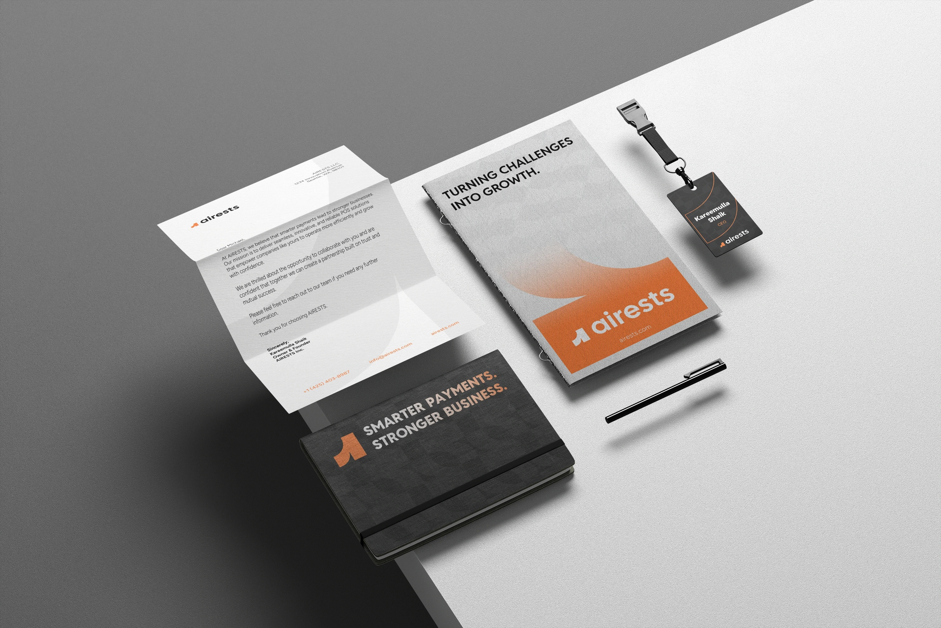
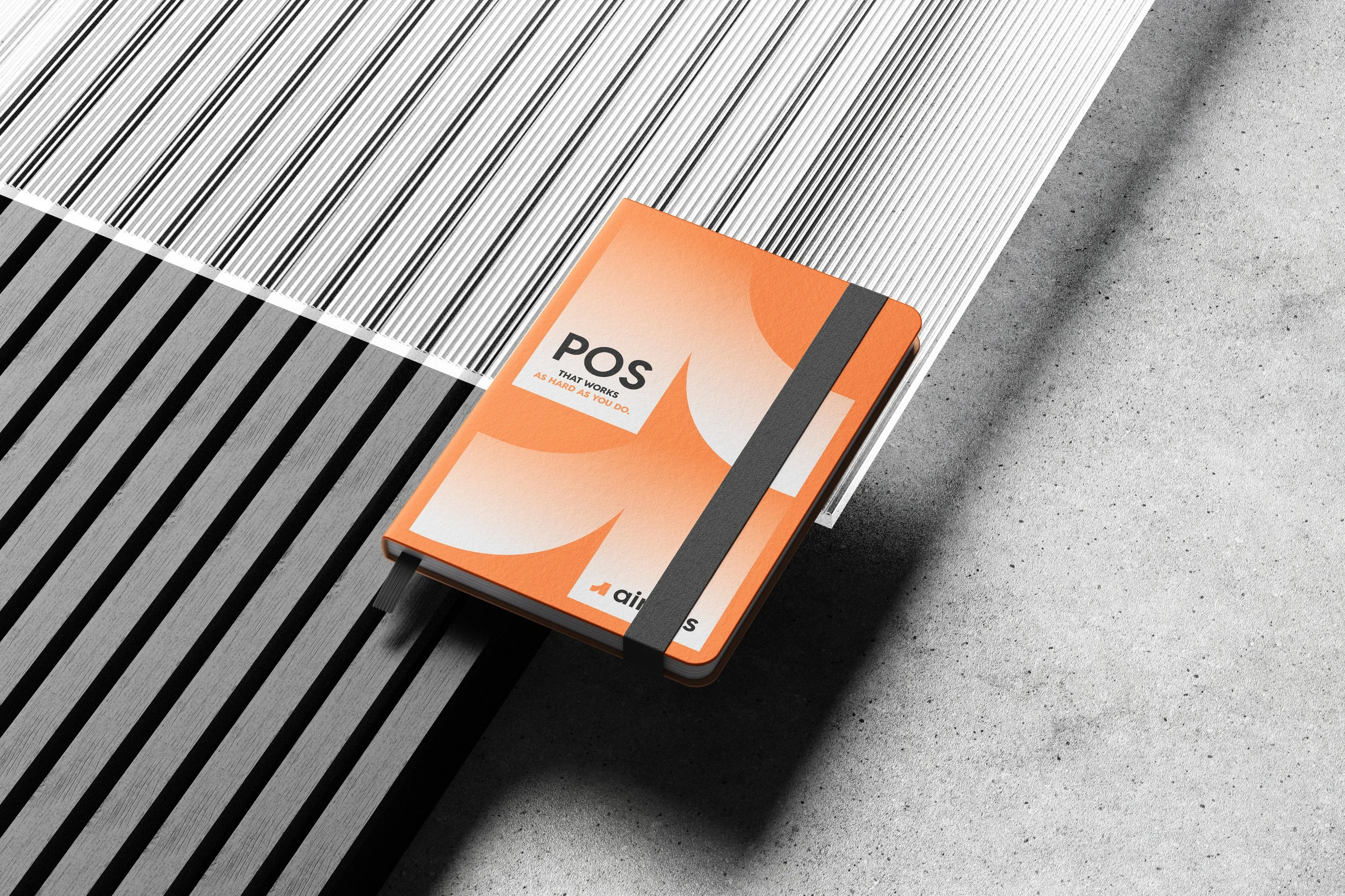
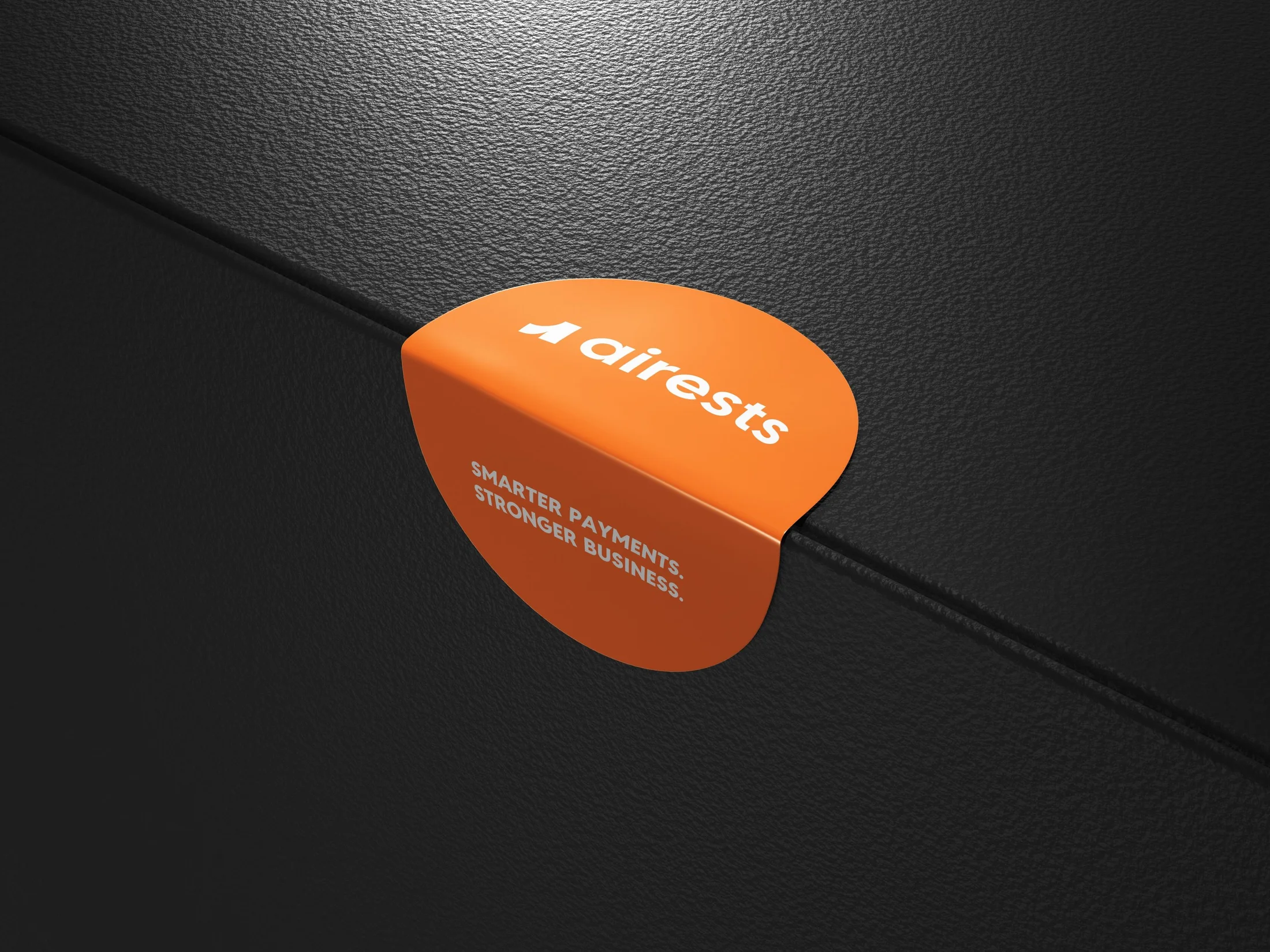
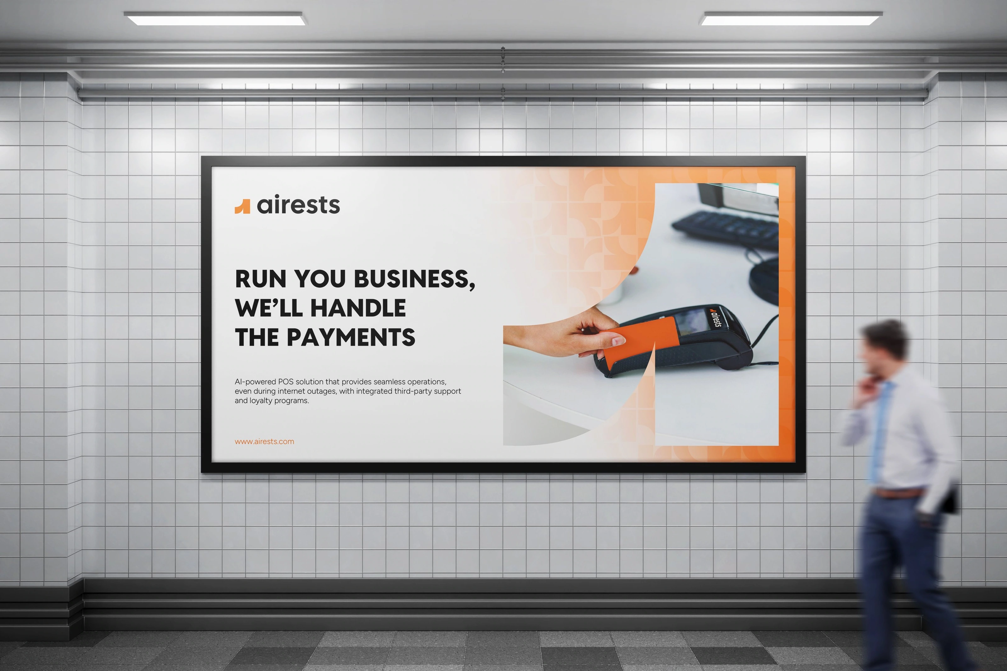
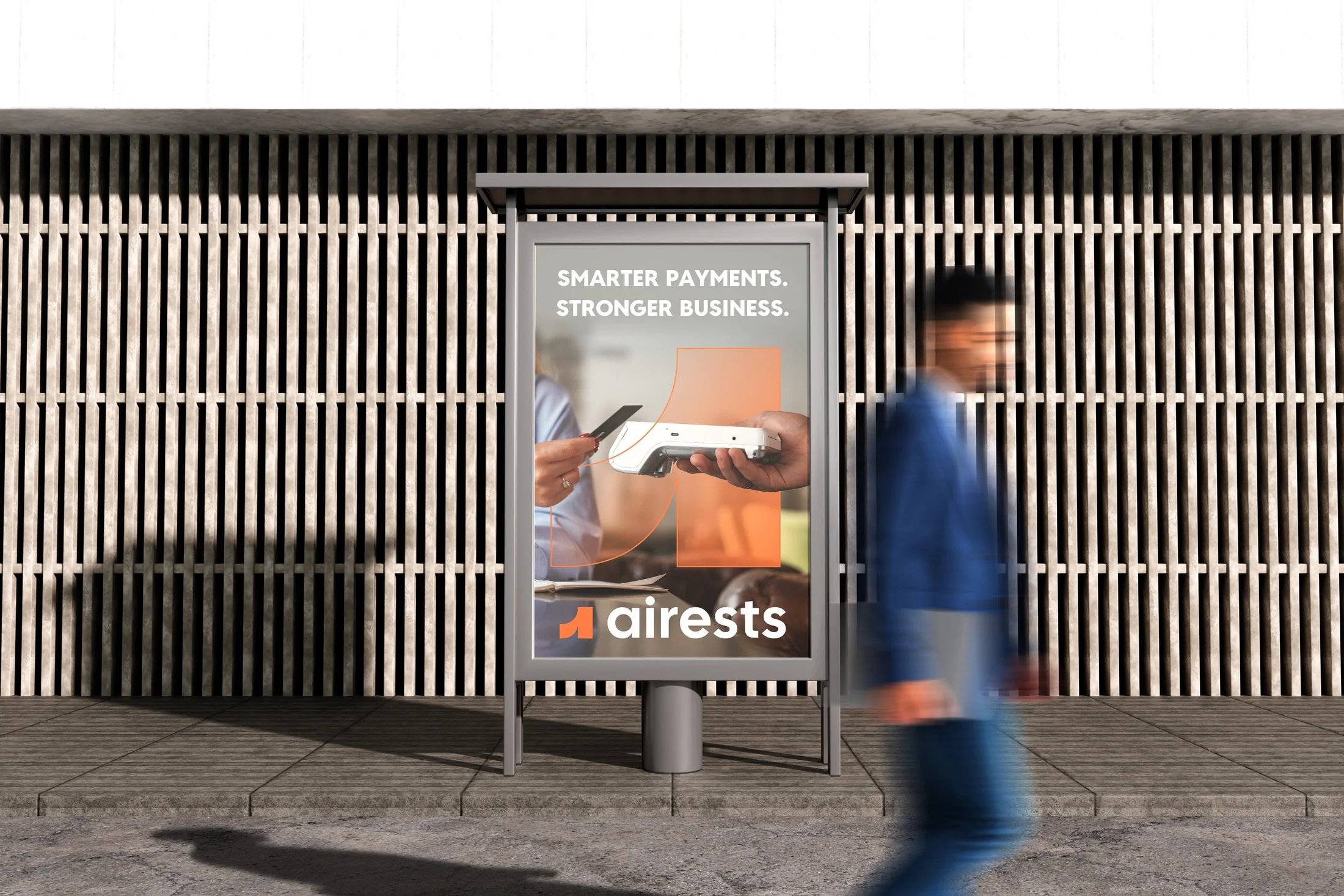
This motto reflects AIRESTS’ core value: empowering businesses through intelligent, reliable, and seamless payment solutions. It highlights the connection between smarter technology and tangible business success. Simple, bold, and memorable, it can be used consistently across platforms and communications.

PROJECT GOAL





CONCLUSION
AIRESTS is more than just a POS system — it’s a partner in growth. By combining smart technology, clean design, and customer-centered solutions, AIRESTS builds a foundation for businesses to simplify operations and scale with confidence.
This brand identity was created to reflect clarity, trust, and strength — values essential to every modern business. With consistent use of visuals, voice, and strategy, AIRESTS is ready to become a trusted leader in the payment solutions market.

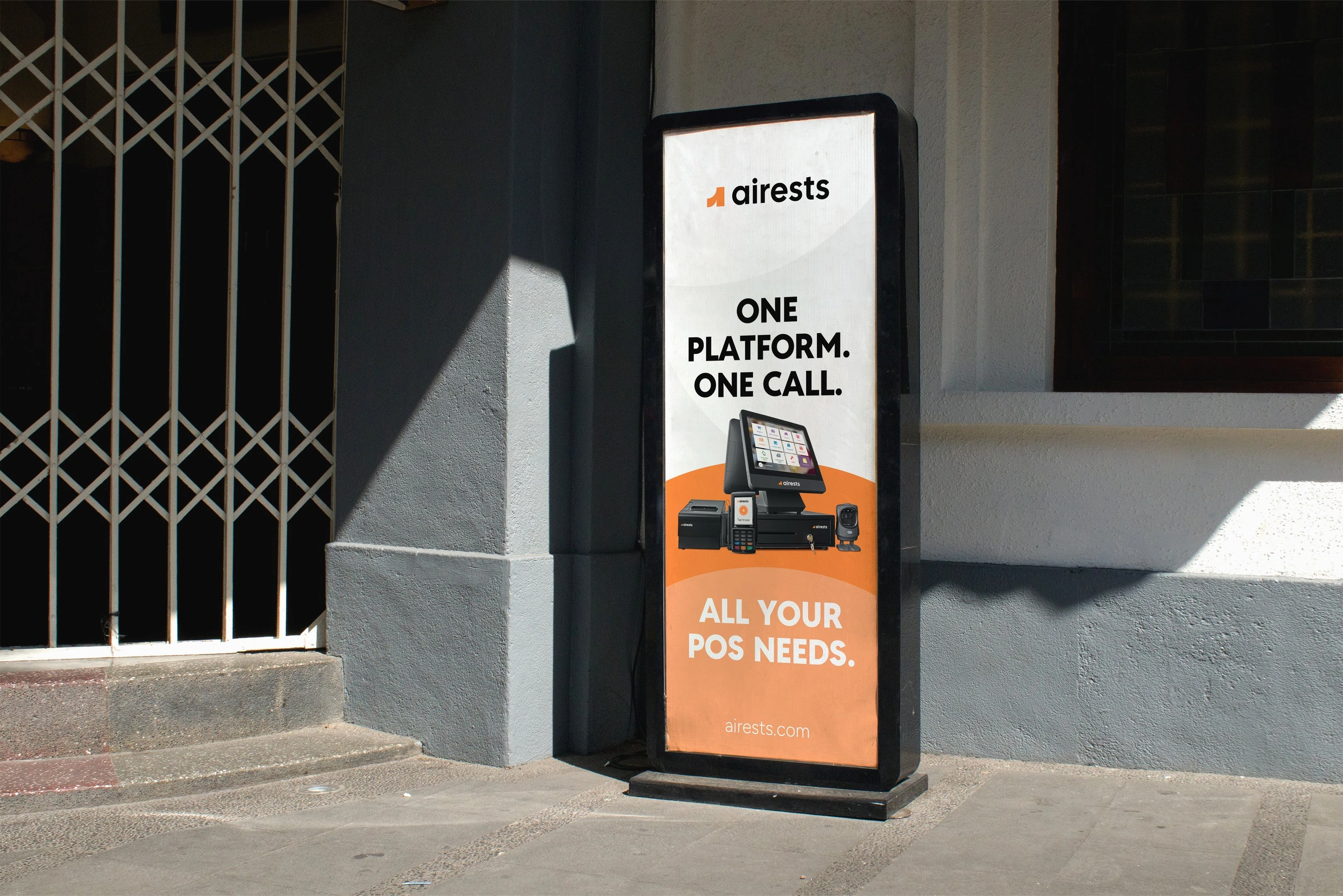
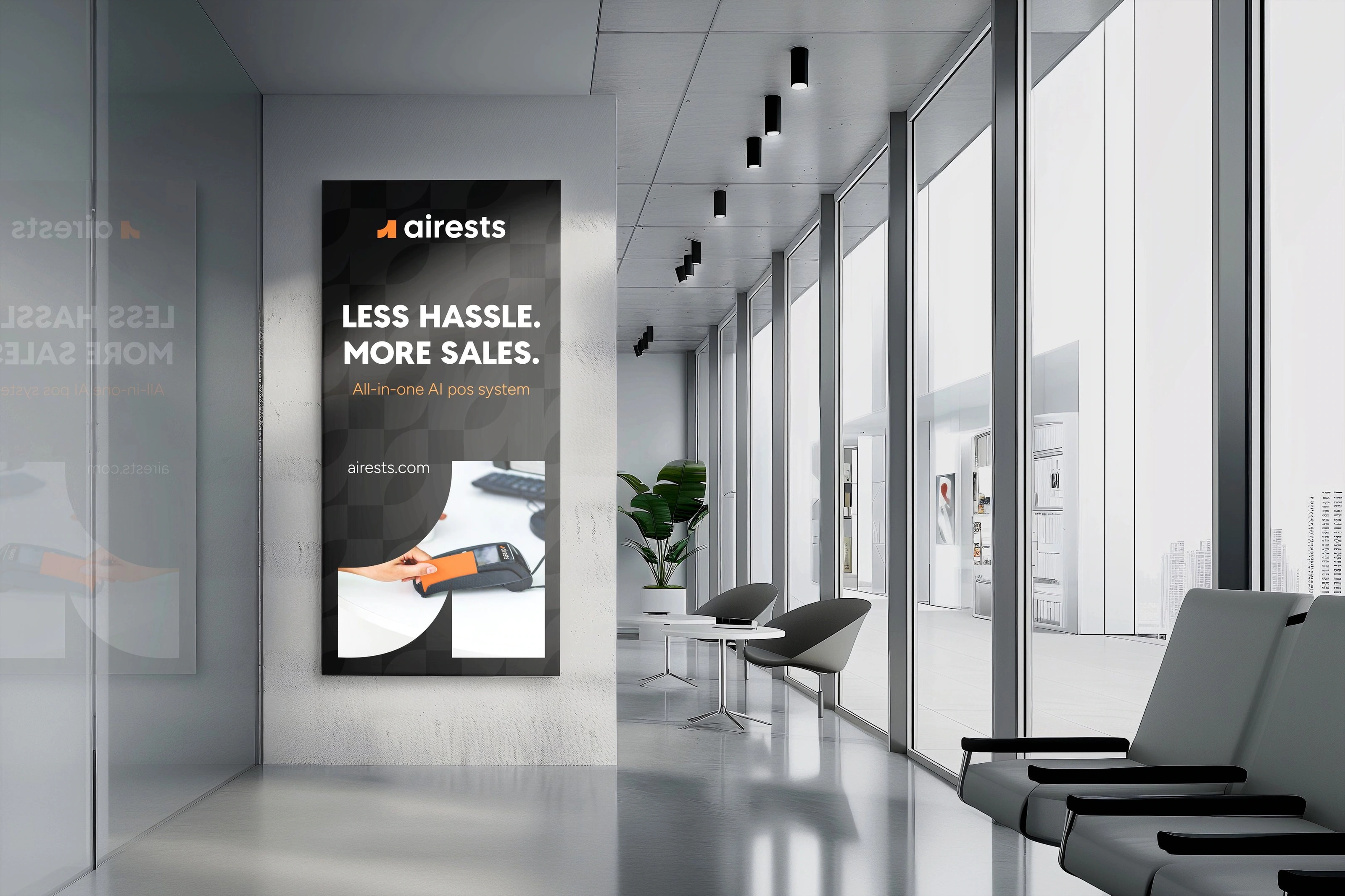
VERBAL IDENTITY GUIDELINES
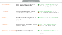
The voice of AIRESTS reflects who we are: smart, reliable, and supportive. It combines clarity with innovation, ensuring every message is both simple to grasp and inspiring to act on.
Our tone is confident yet approachable — speaking to businesses as partners on their journey to growth, not just as customers.

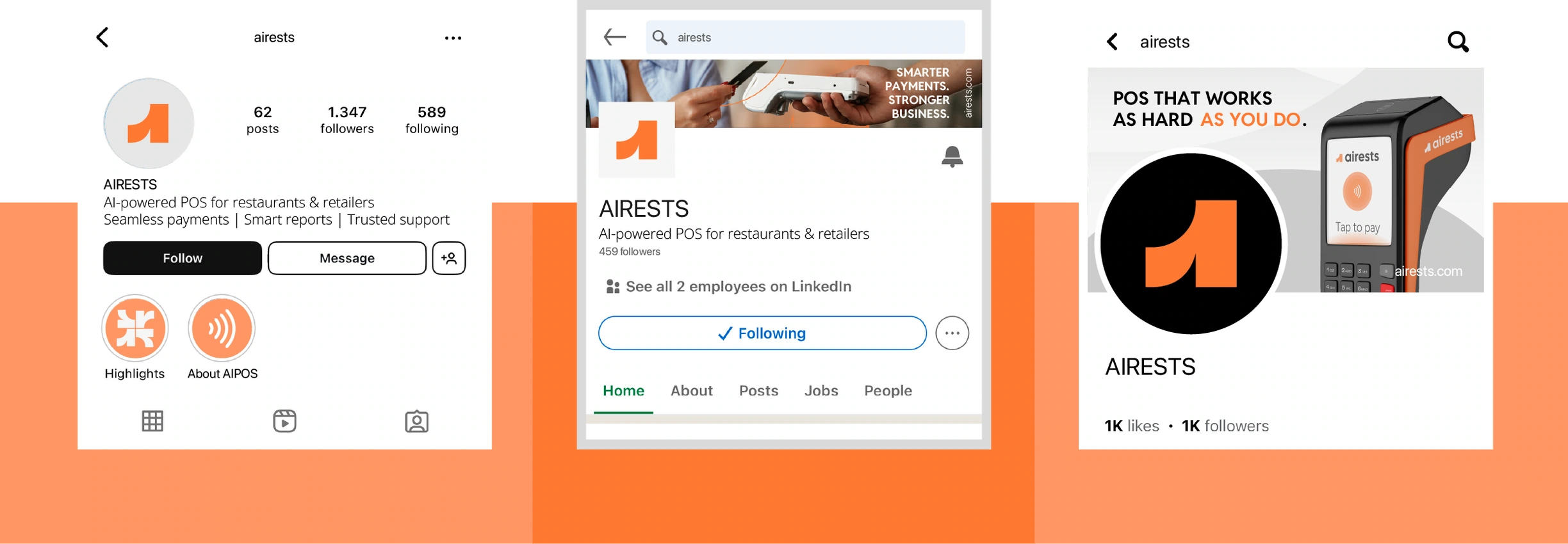
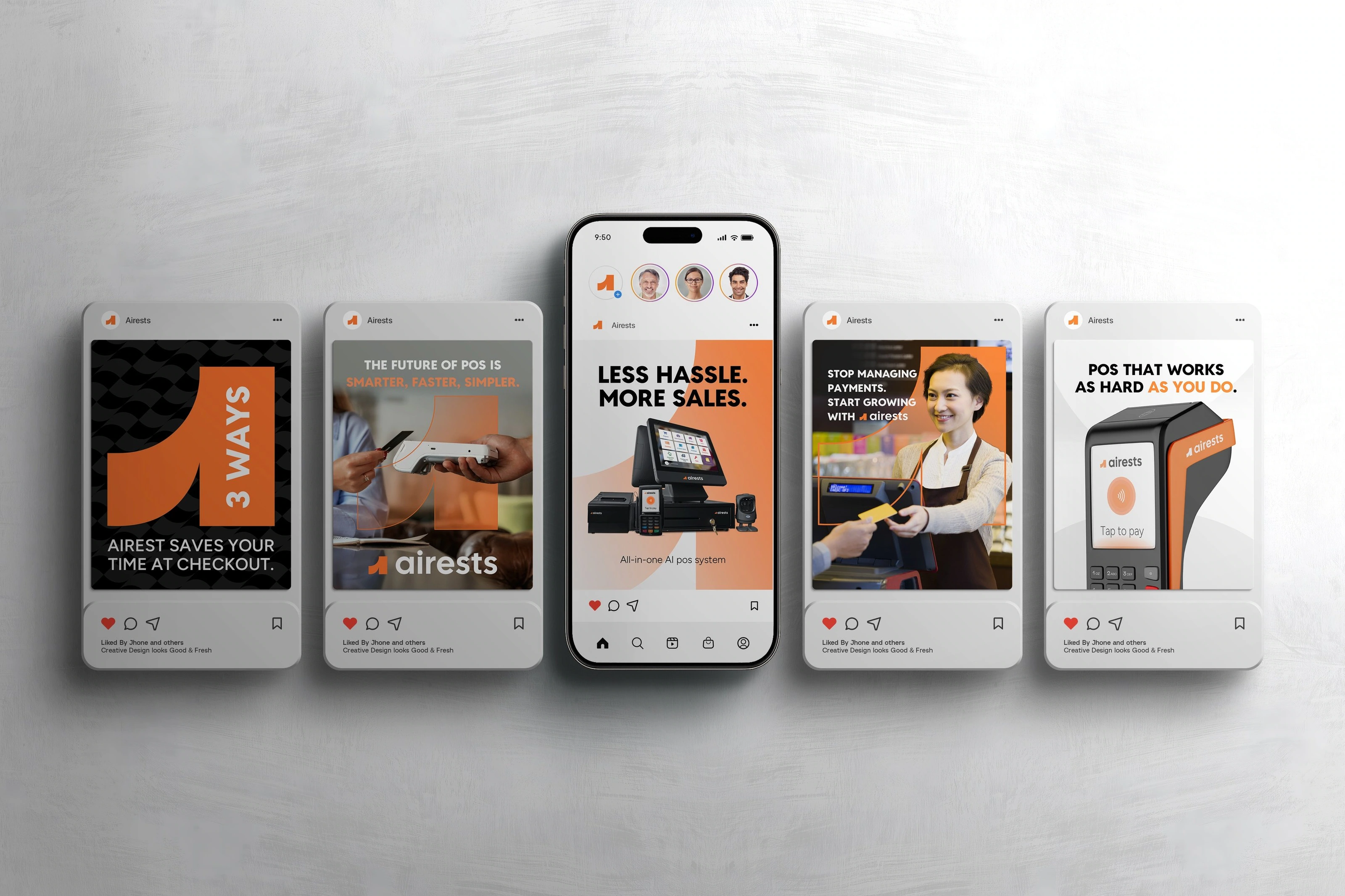
SOCIAL MEDIA
Social media is one of the strongest platforms for Araz Media to showcase its work and connect with potential clients. Our goal is to create a consistent, engaging, and visually driven presence that reflects the brand’s professionalism and creativity.

Logo vs Brand
Have you ever wondered what exactly separates logo design from brand design? It's a common mix-up, so let's clear things up.