
Neilsen Vaughan
PROJECTS
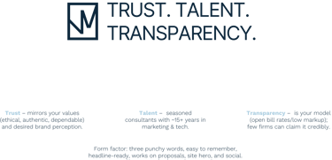
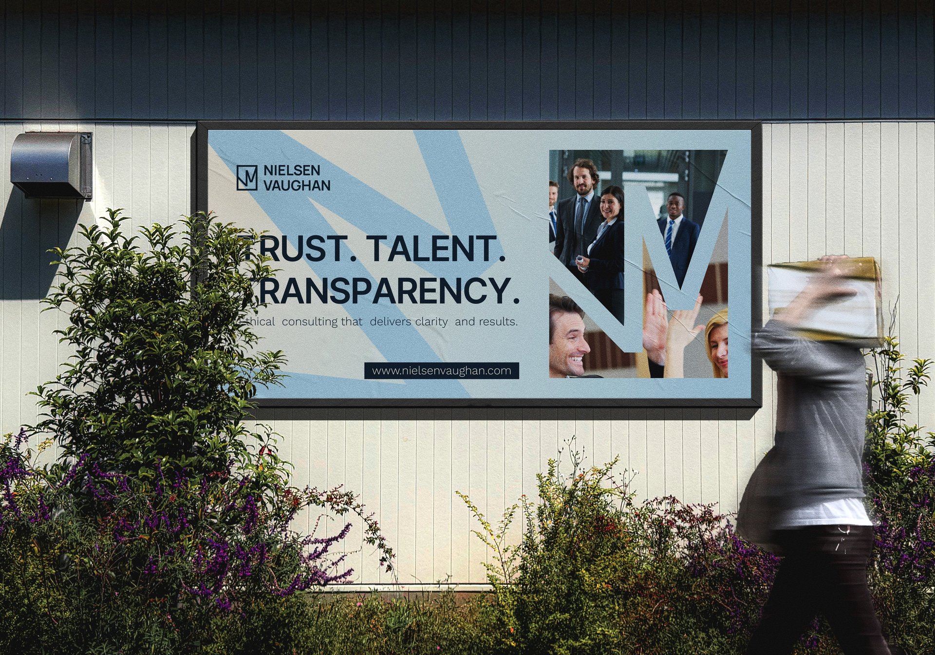
Nielsen Vaughan LLC is a consulting firm built on transparency, trust, and human connection. The brand brings together seasoned professionals and clients who value integrity and expertise.
YOU ARE IN PROFESSIONAL HANDS
Keywords - Text


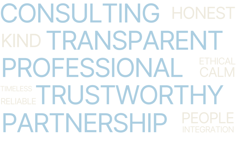
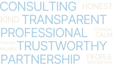
Keywords - Visual
We have defined some important elements that shows the personality of “Nielsen Vaughan” brand so we can use them in our new concept of branding.
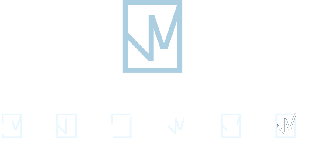
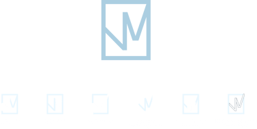
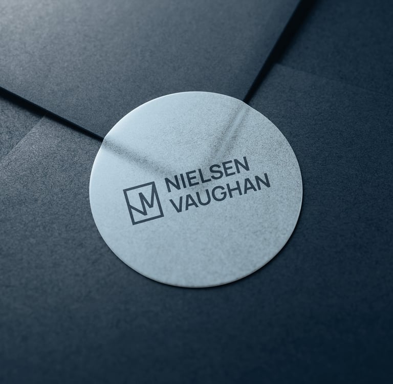
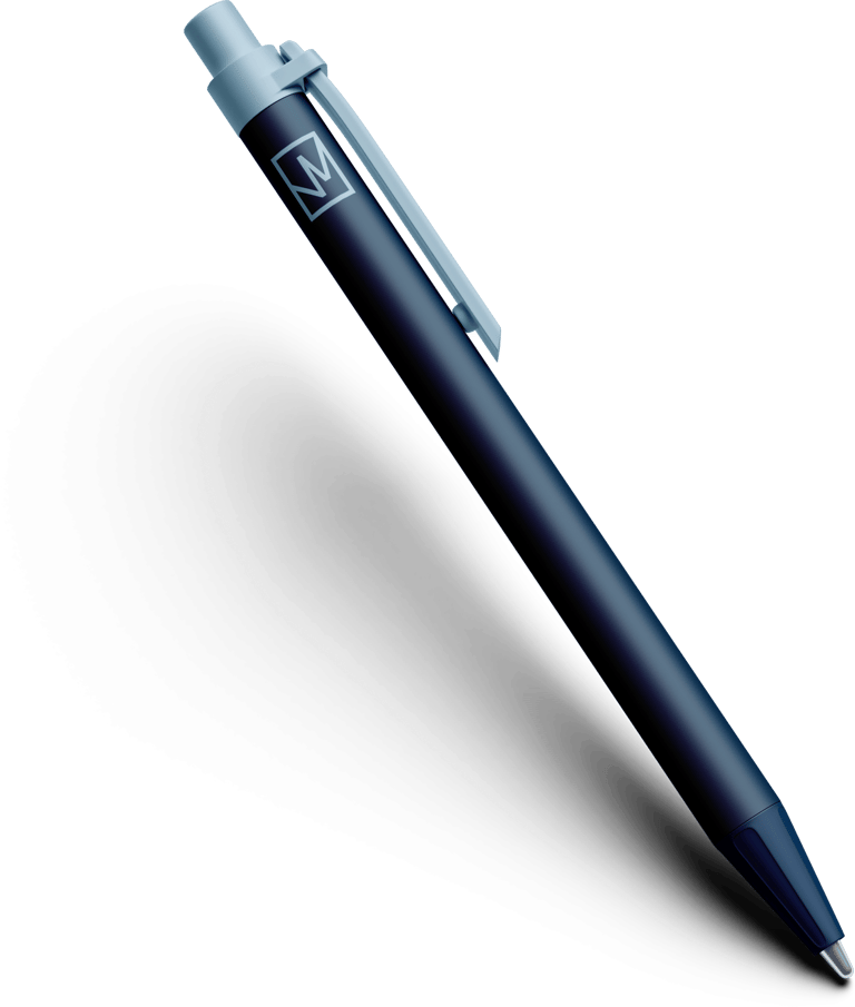
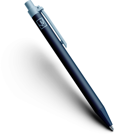
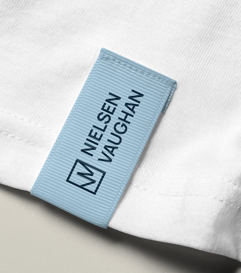
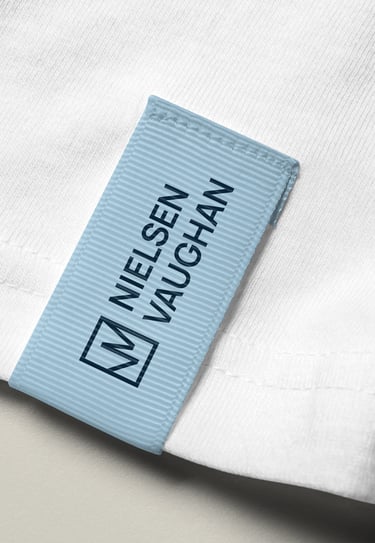
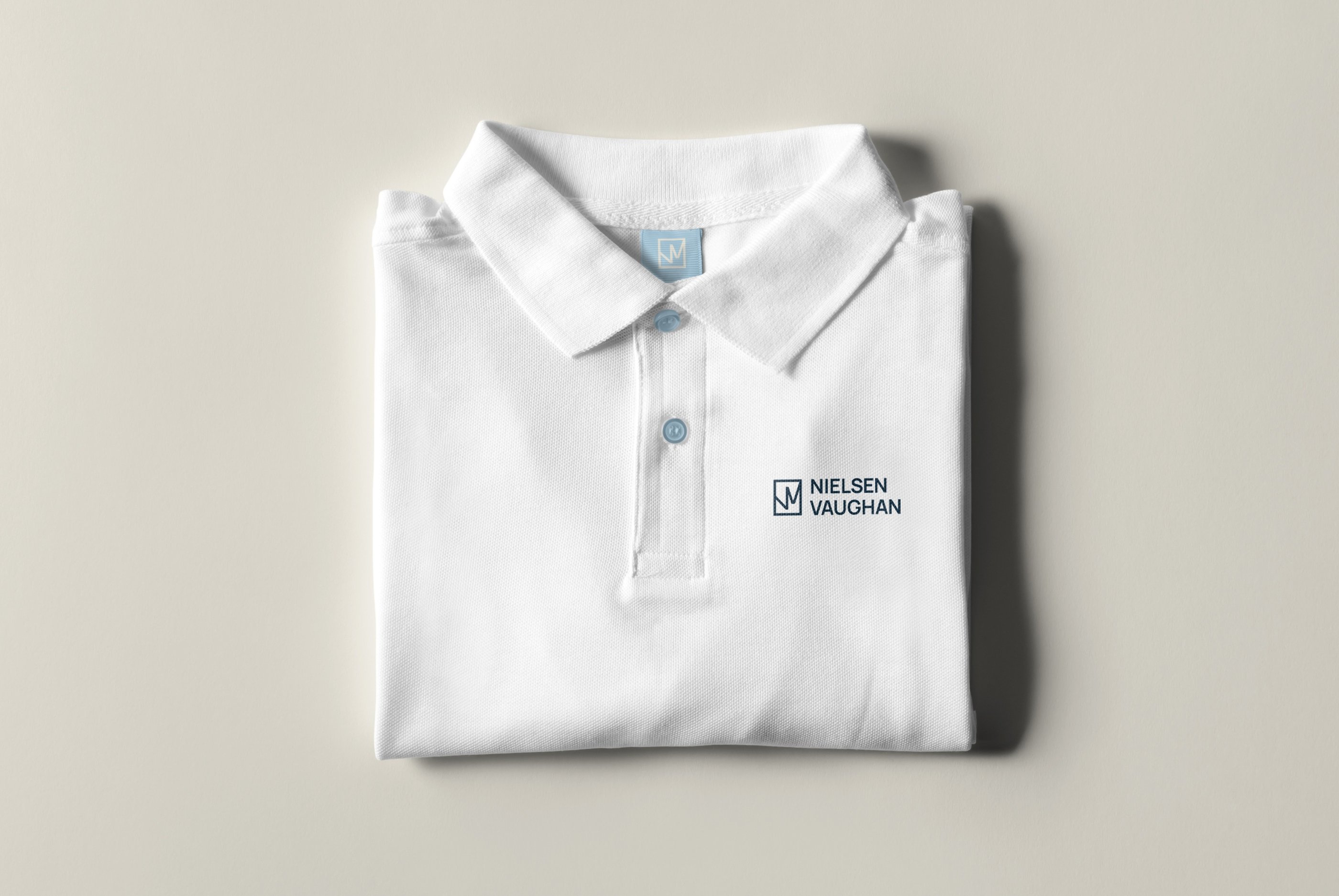
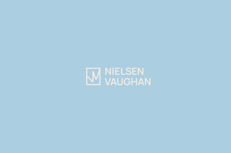
Brandmark


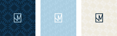
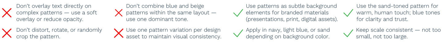
PATTERNS
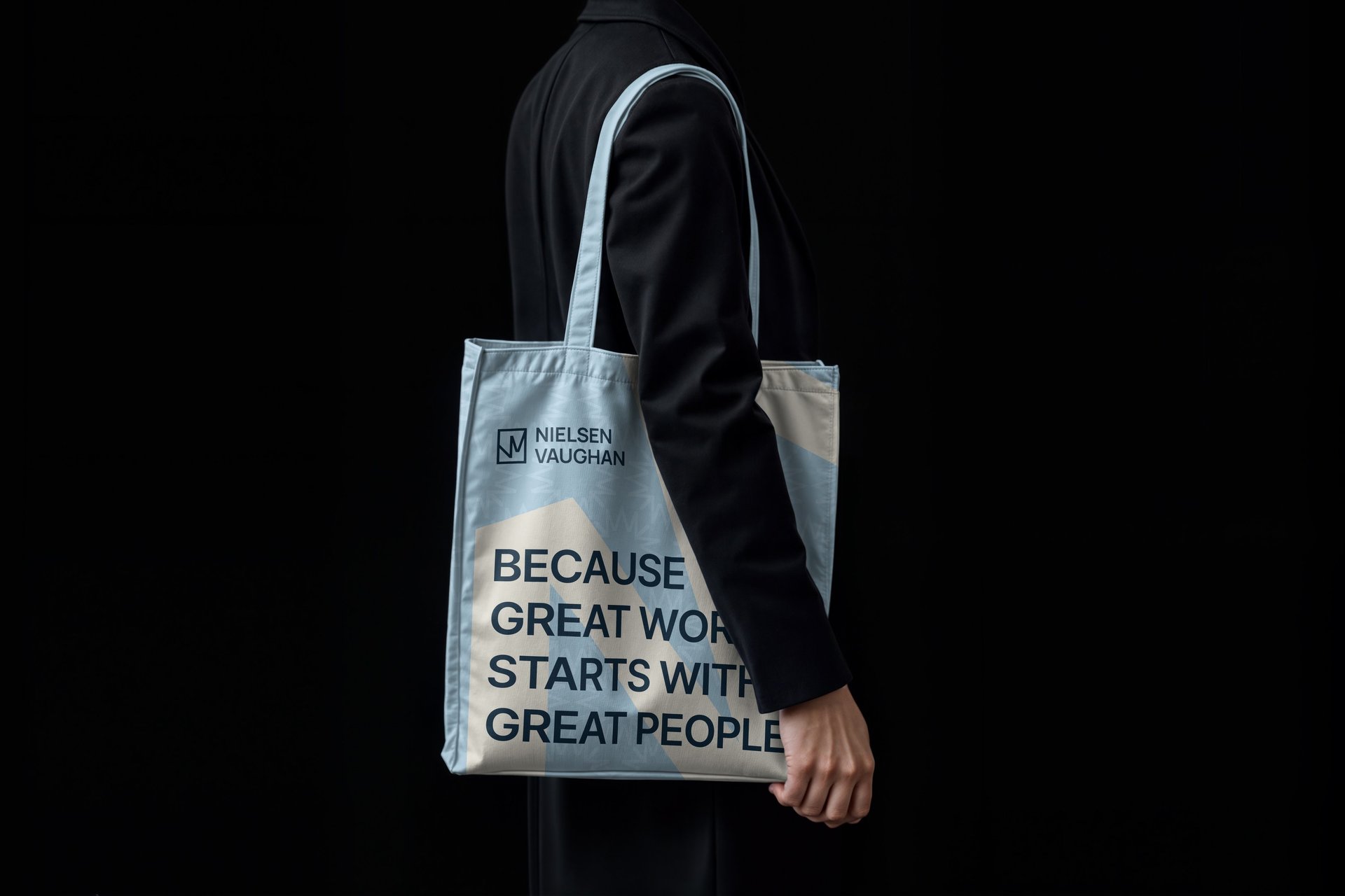
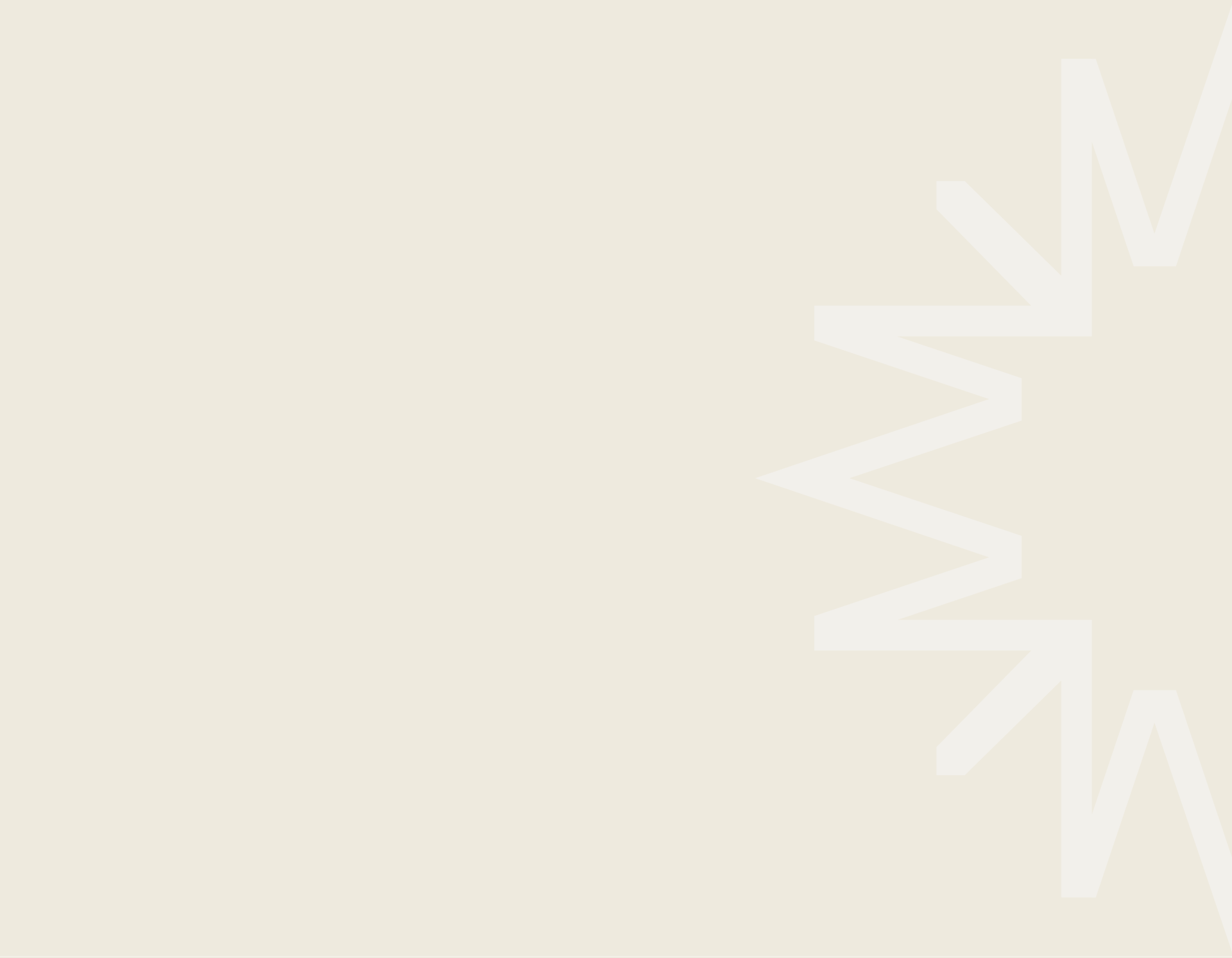
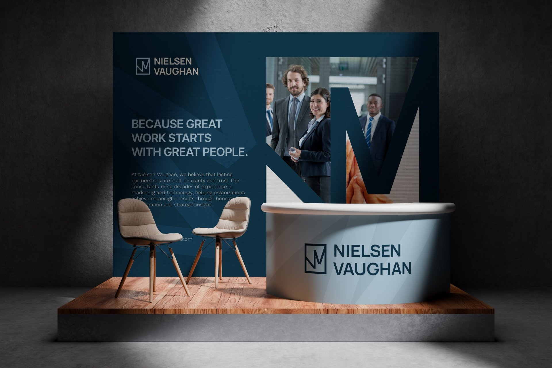
Our patterns are built from the geometry of the Nielsen Vaughan logo. The repeated symbol creates a rhythm that reflects clarity, structure, and connection — the core values of the brand. Each variation balances professionalism and warmth, demonstrating how consistency and transparency come through in every interaction.

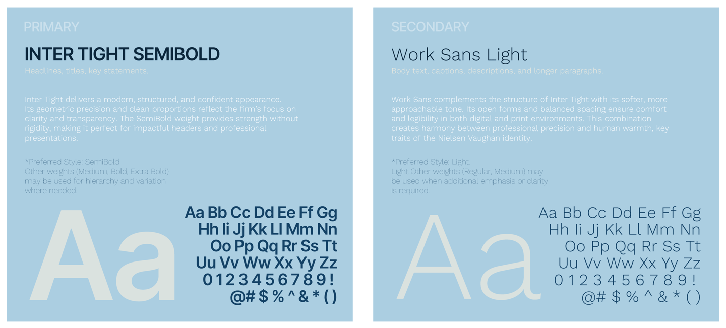
TYPOGRAPHY
Typography plays an essential role in creating a clear, consistent, and professional visual identity for Nielsen Vaughan. We selected modern, human-centered typefaces that balance clarity, confidence, and warmth, ensuring strong readability across all brand applications.

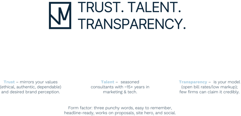
MOTTO
Our approach to visual brand system design is strategic, modern, and intentional. We begin by understanding the brand’s essence—its purpose, values, and audience—before translating these insights into a clean, cohesive visual language.
Every element is designed to work as part of a system, not in isolation. From typography and color to layout and visual rhythm, we focus on clarity, consistency, and usability. The result is a modern, flexible brand system that feels confident, refined, and easy to apply across all touchpoints.
Approach
Visual Identity
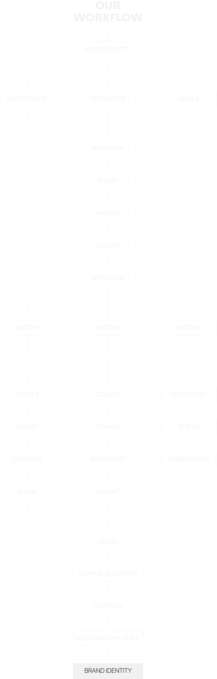
There are several elements to a brand concept, including your mission, brand name, voice and visual style.
We care about a logo being appropriate, distinctive and simple. That proves the quality of the logo. It helps to show brand positioning.

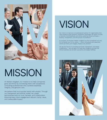
Our goal was to create a professional, timeless, and human-centered brand identity for Nielsen Vaughan — one that reflects transparency, trust, and the firm’s people-first approach to consulting. We aimed to build a brand that communicates confidence without formality, clarity without coldness, and professionalism rooted in empathy.
The process focused on aligning the visual and verbal identity with the company’s mission and values, ensuring the brand supports both immediate credibility and long-term growth in an ethical, transparent, and human way.
PROJECT GOAL

Nielsen Vaughan unites professionalism with human warmth and structural clarity. The identity embodies transparency, trust, and connection — every element designed to communicate both precision and approachability. The aesthetic is minimalist yet meaningful, balancing corporate stability with emotional authenticity.
Inspired by forms of architecture and partnership, the system’s geometry represents unity, structure, and collaboration — a visual metaphor for ethical consulting and shared growth. Its versatility allows seamless application across digital, print, and environmental media while maintaining a sense of calm confidence and visual harmony.
Typography, composition, and pattern repetition work together to reinforce Nielsen Vaughan’s mission: to help companies grow through clarity, trust, and people-first collaboration that delivers real impact.
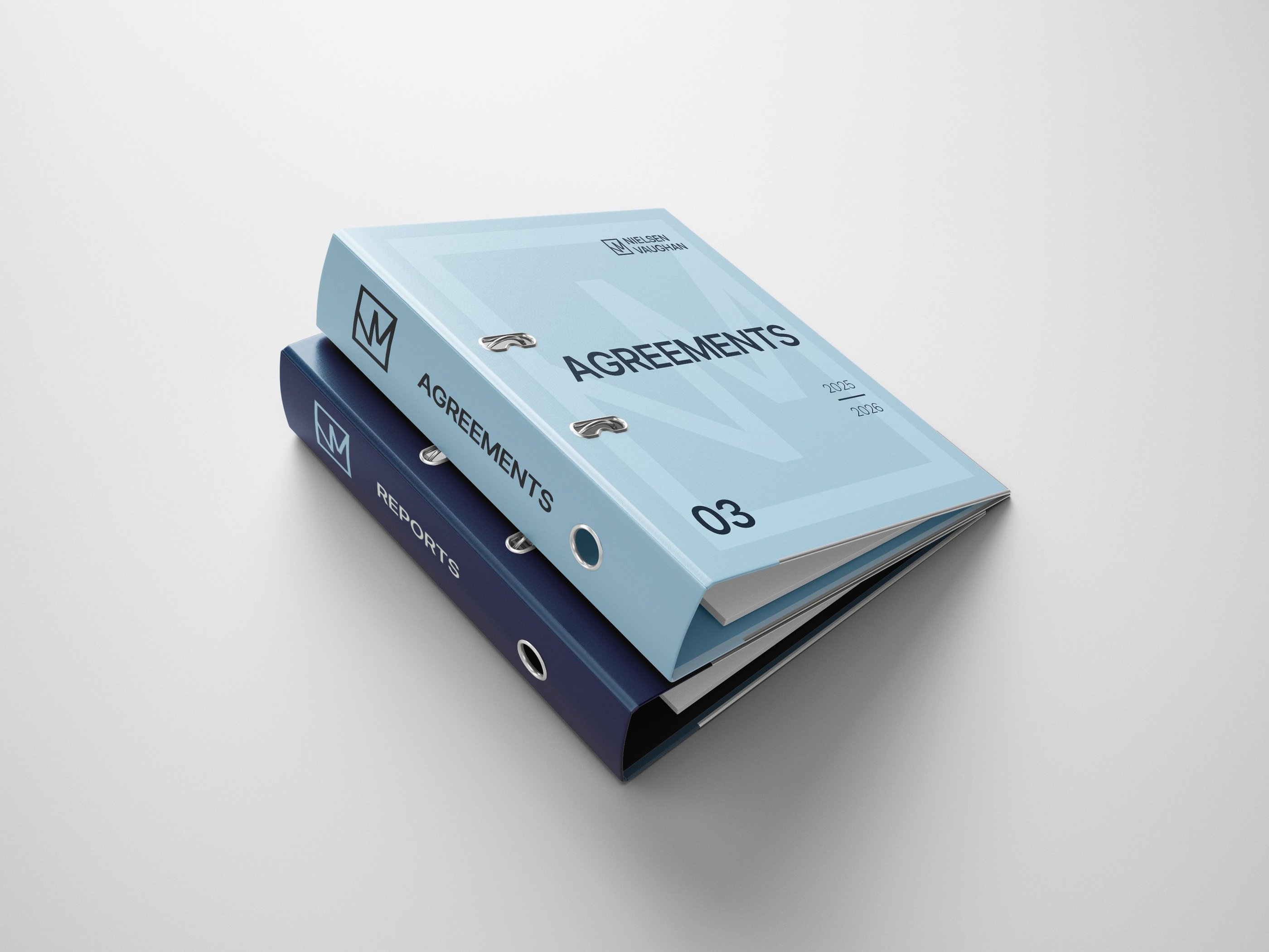
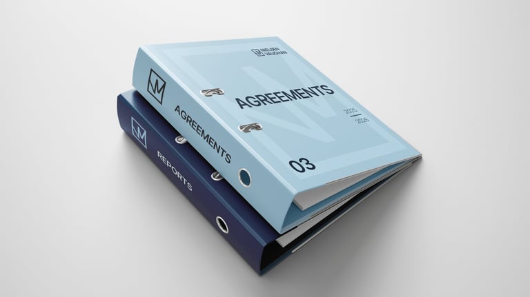
VISUAL ELEMENTS & PATTERNS
Concept
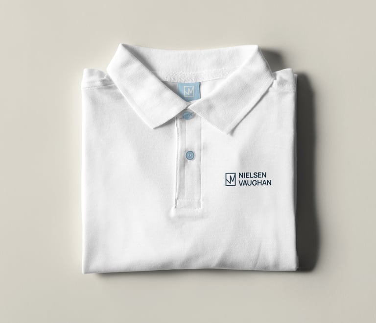
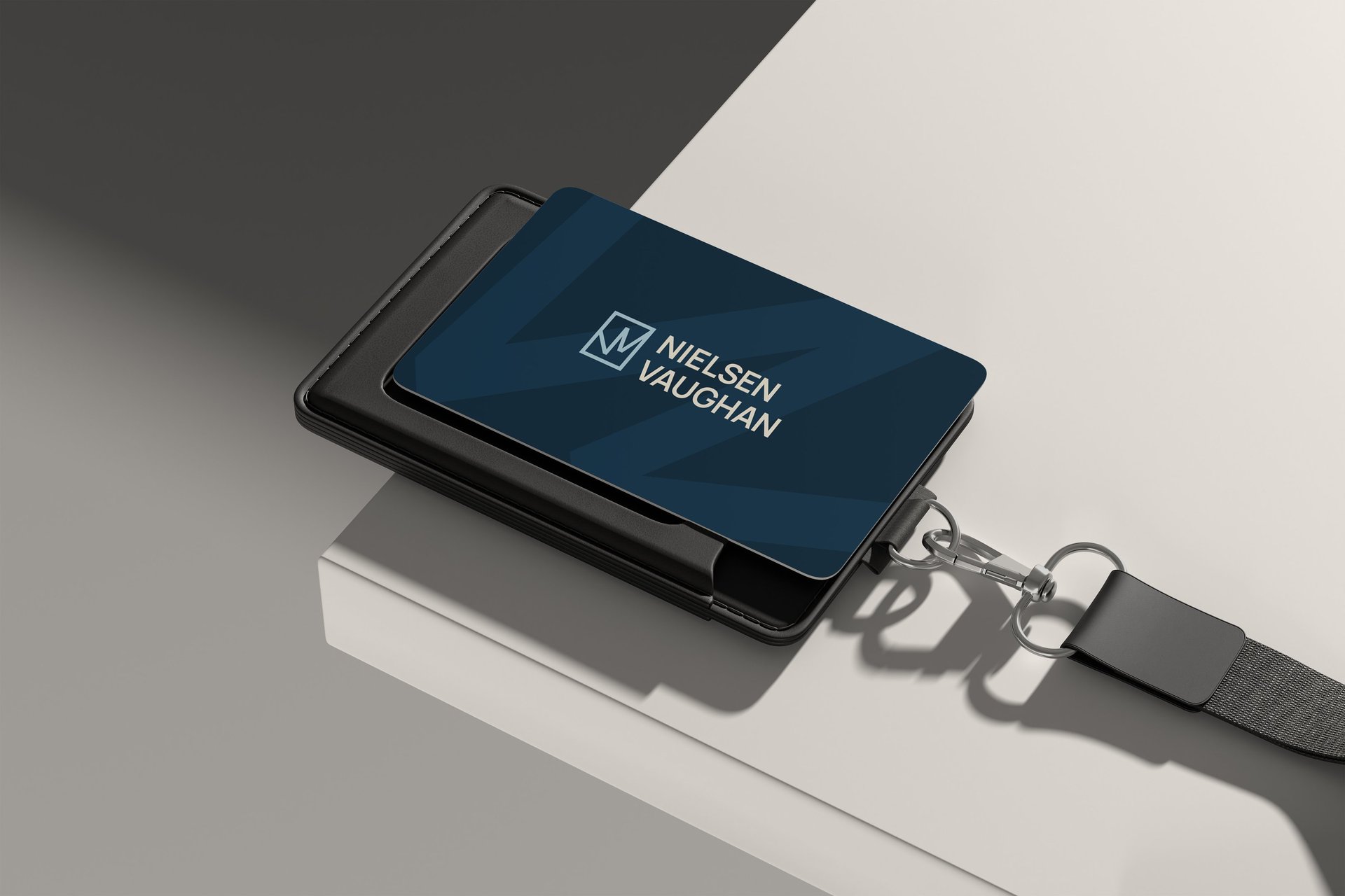
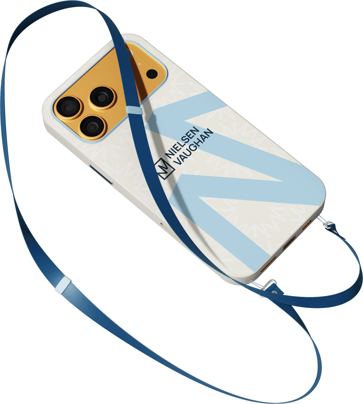
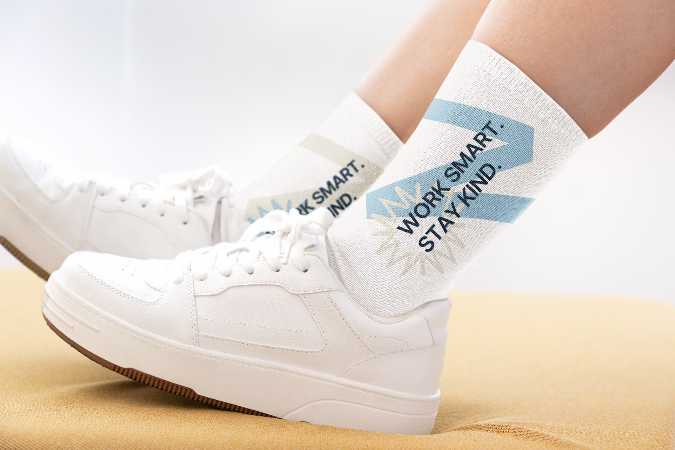
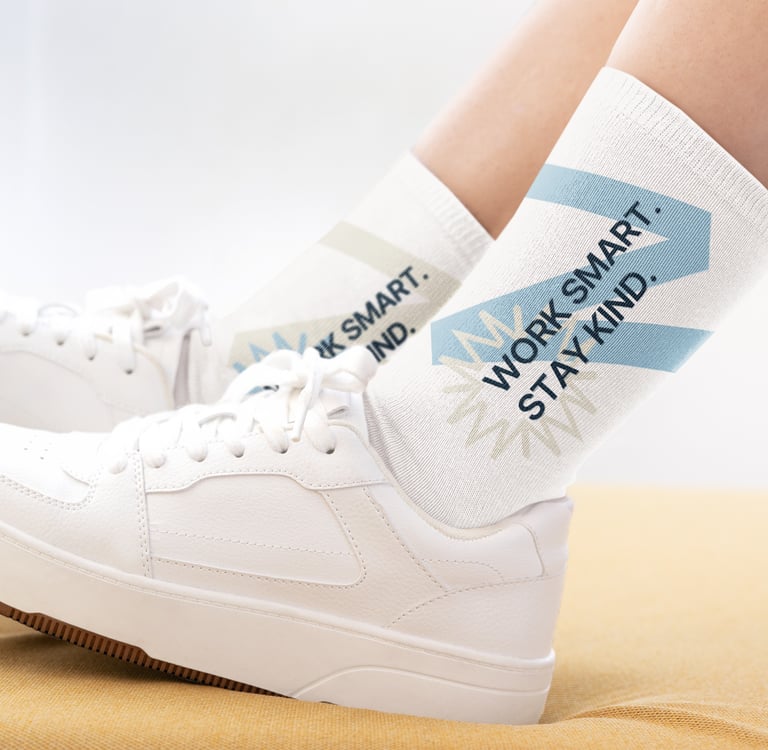
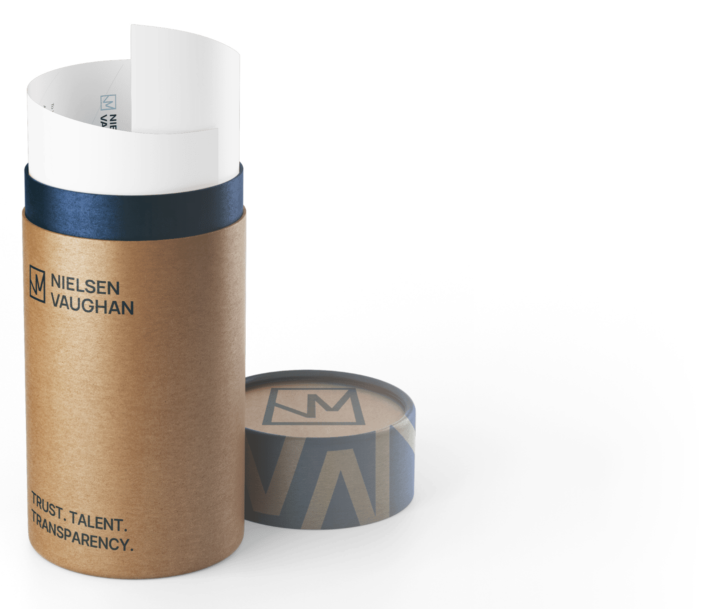
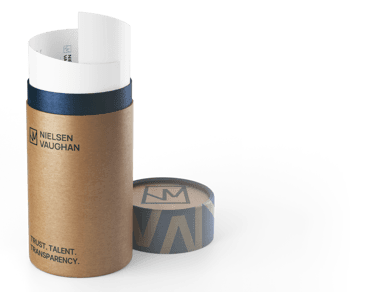
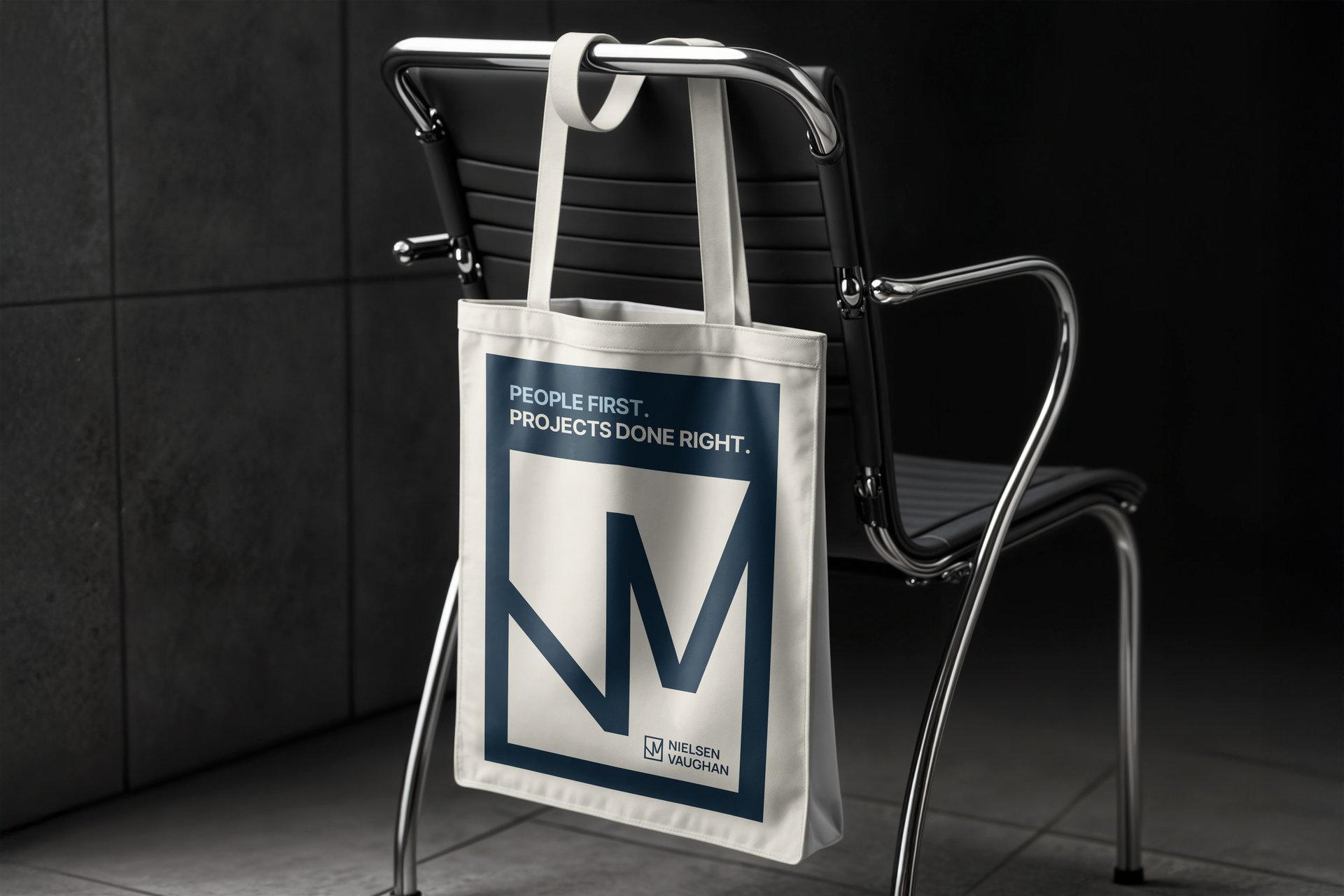
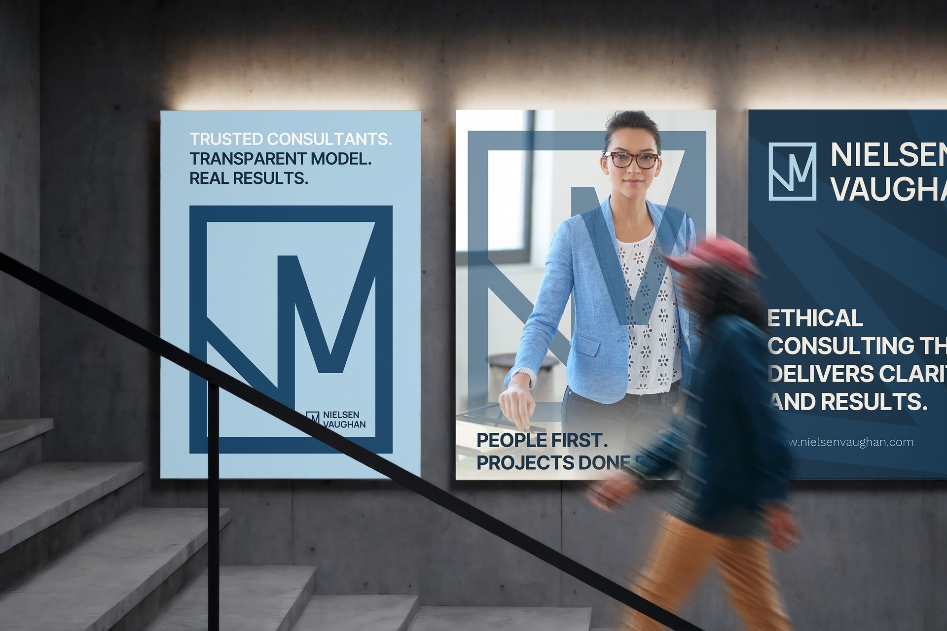
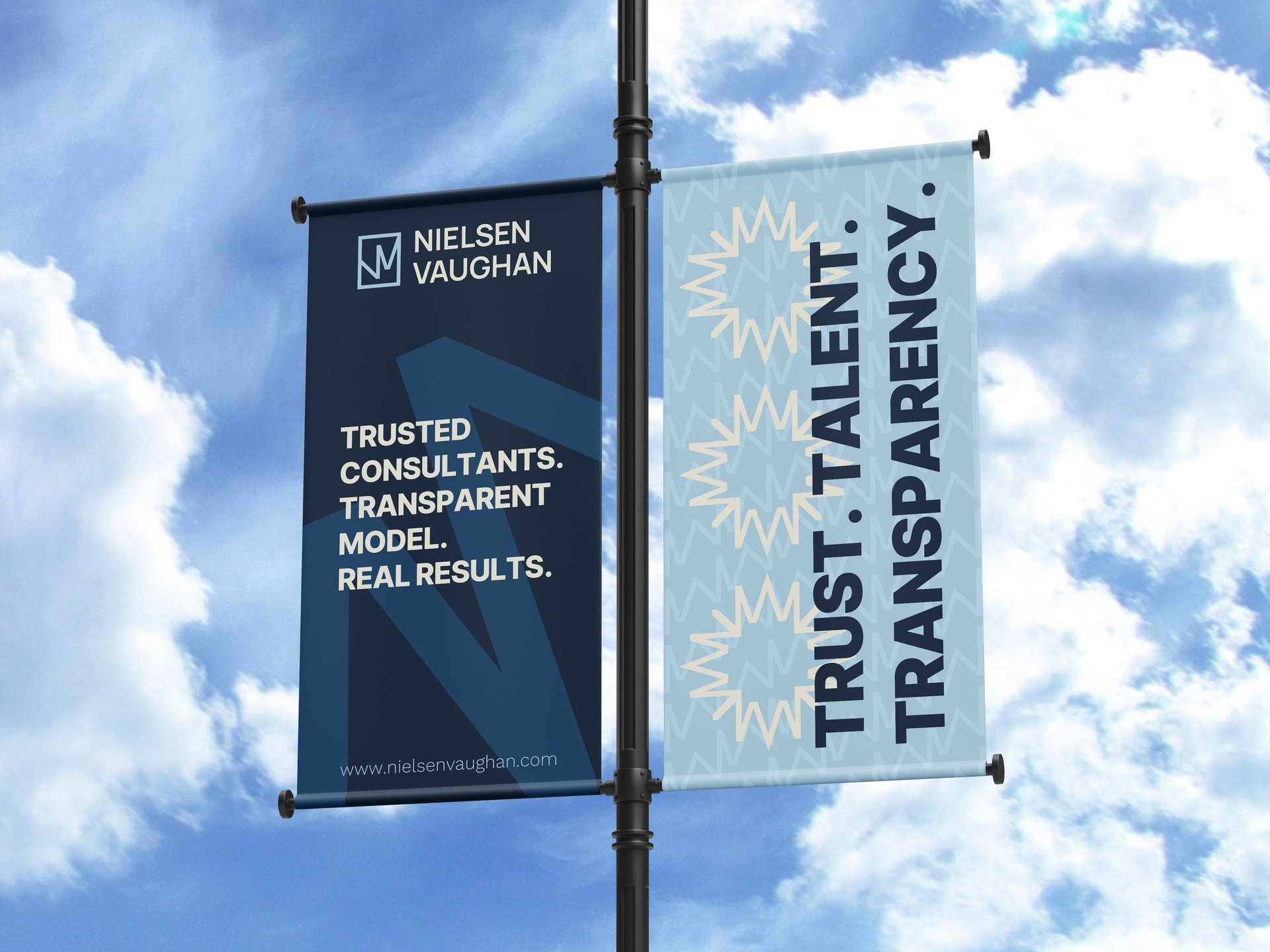
In the realm of business with a modern flair, once we've crafted a strong concept, we use this foundation to propel branding across websites, packaging, advertisements, and more!
Subjectively, the visual identity is pivotal for instilling a strong sense of connection, trust, belonging, and engagement with the brand. Exploring contemporary strategies for growth and heightened sales is integral in our approach.

Logo vs Brand
Have you ever wondered what exactly separates logo design from brand design? It's a common mix-up, so let's clear things up.
Pages
Socials
© 2021 Kesewi Branding Consulting