
LOVPA
PROJECTS
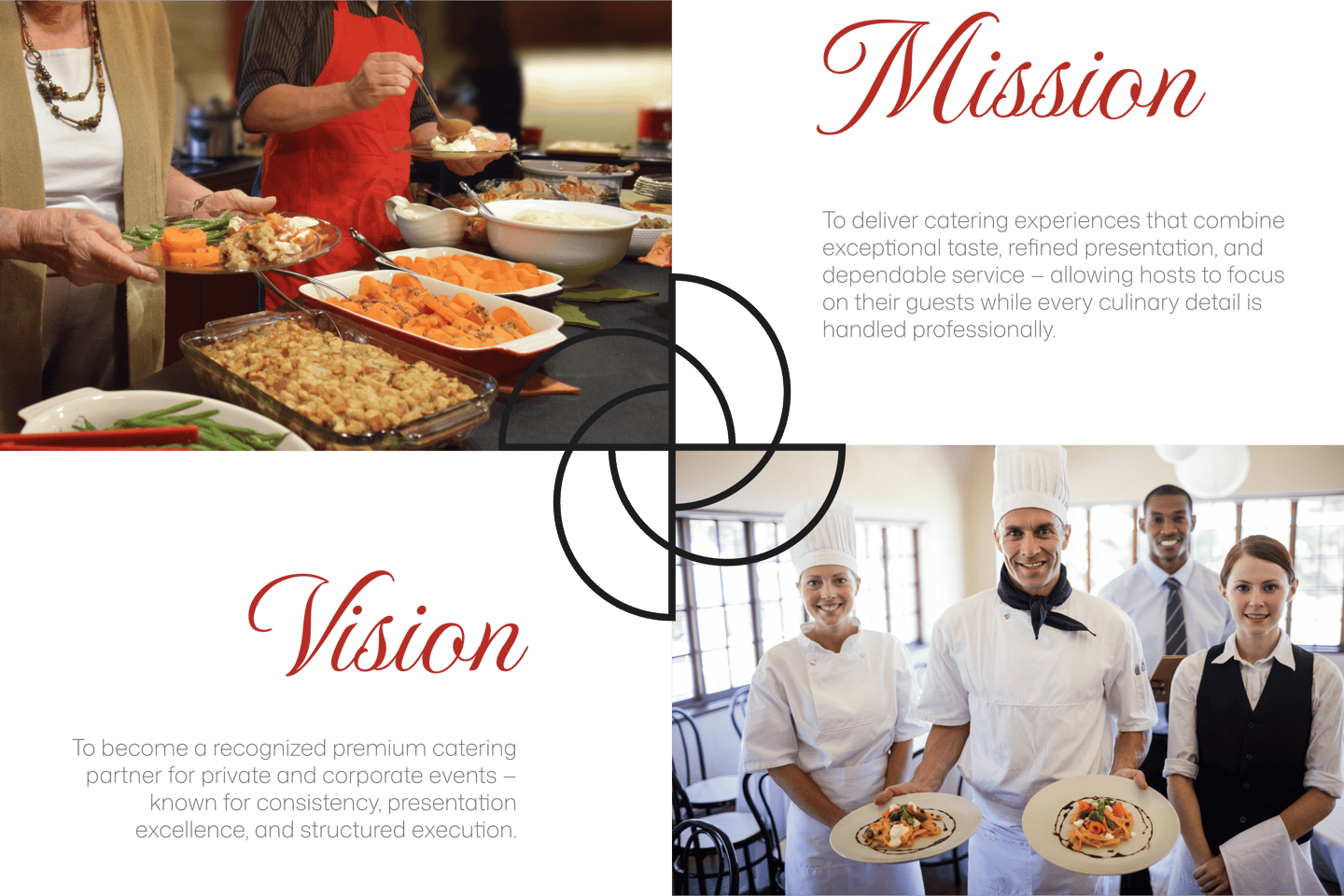
LOVPA is a premium catering brand focused on delivering high-quality food, elegant presentation, and reliable execution for private and corporate events. LOVPA combines restaurant-level taste with event-level professionalism — ensuring every celebration feels seamless and refined.
YOU ARE IN PROFESSIONAL HANDS
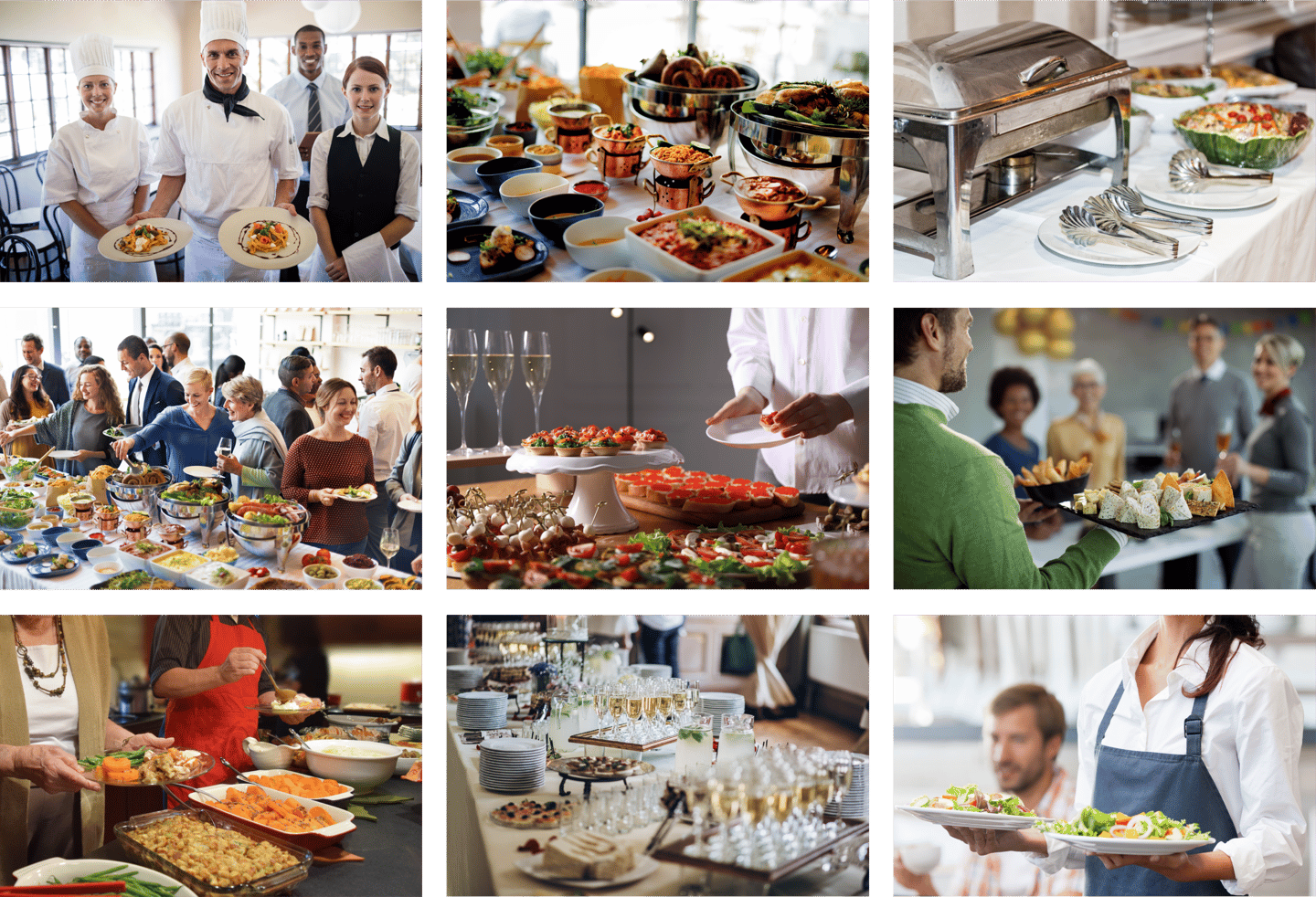
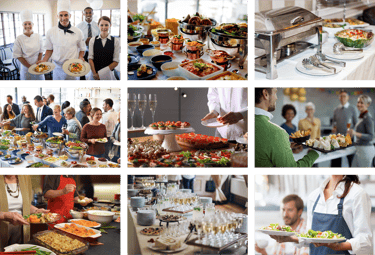
IMAGE STYLE
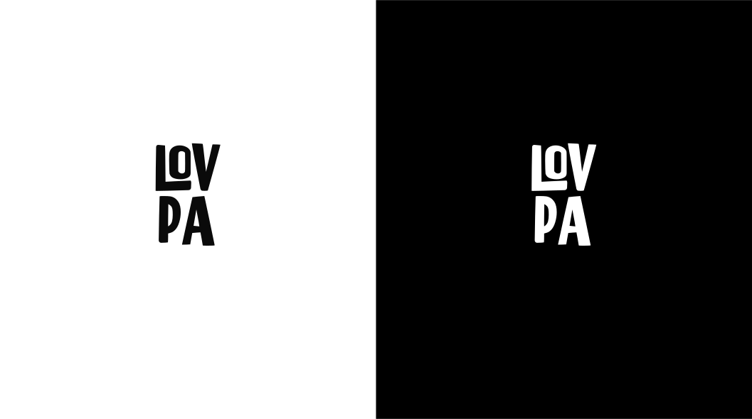
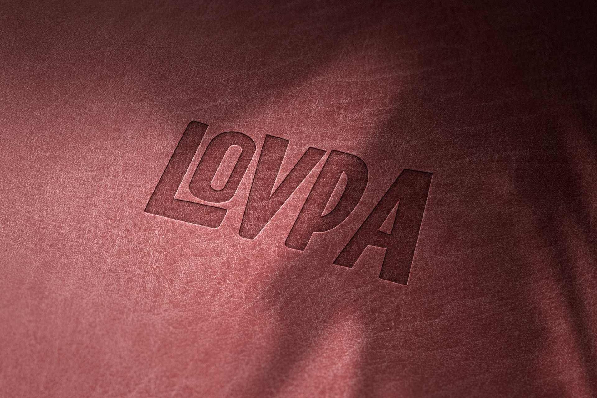
The logo retains its clarity and meaning in single-color use. Ideal for stamps, engravings, and minimal layouts.
COLOR SYSTEM
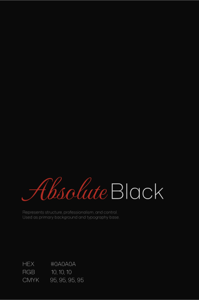
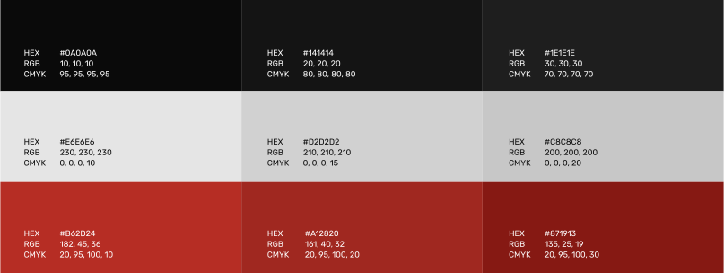
The LOVPA color palette is bold, refined, and intentional. It combines depth and contrast to create a confident, premium visual presence.
The overall balance between dark tones and light neutrals ensures clarity, structure, and strong brand recognition across print and digital applications.
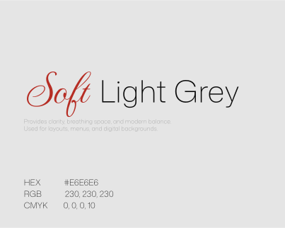
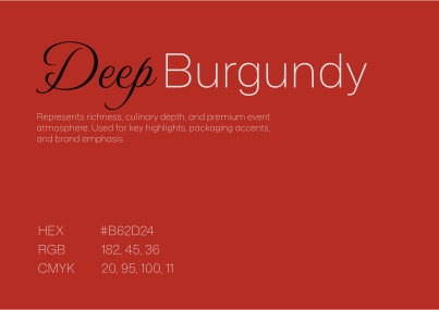
Supporting shades provide flexibility and visual hierarchy across different applications. Darker tones add depth and layering, grey variations improve readability and balance, and burgundy tones allow controlled emphasis while maintaining brand consistency. These colors are also used in patterns, overlays, and graphic elements to create visual consistency while maintaining a refined, premium look.
PATTERNS
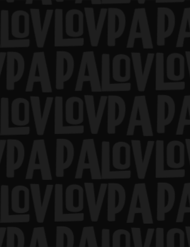
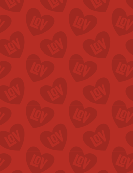
LOVPA patterns are built from the logo’s geometry to maintain visual consistency. The repeating elements reinforce brand recognition, while the central circular pattern is inspired by catering plates and food presentation — subtly referencing hospitality and structured serving.
The system adds texture and identity without overpowering the layout.

FONTS
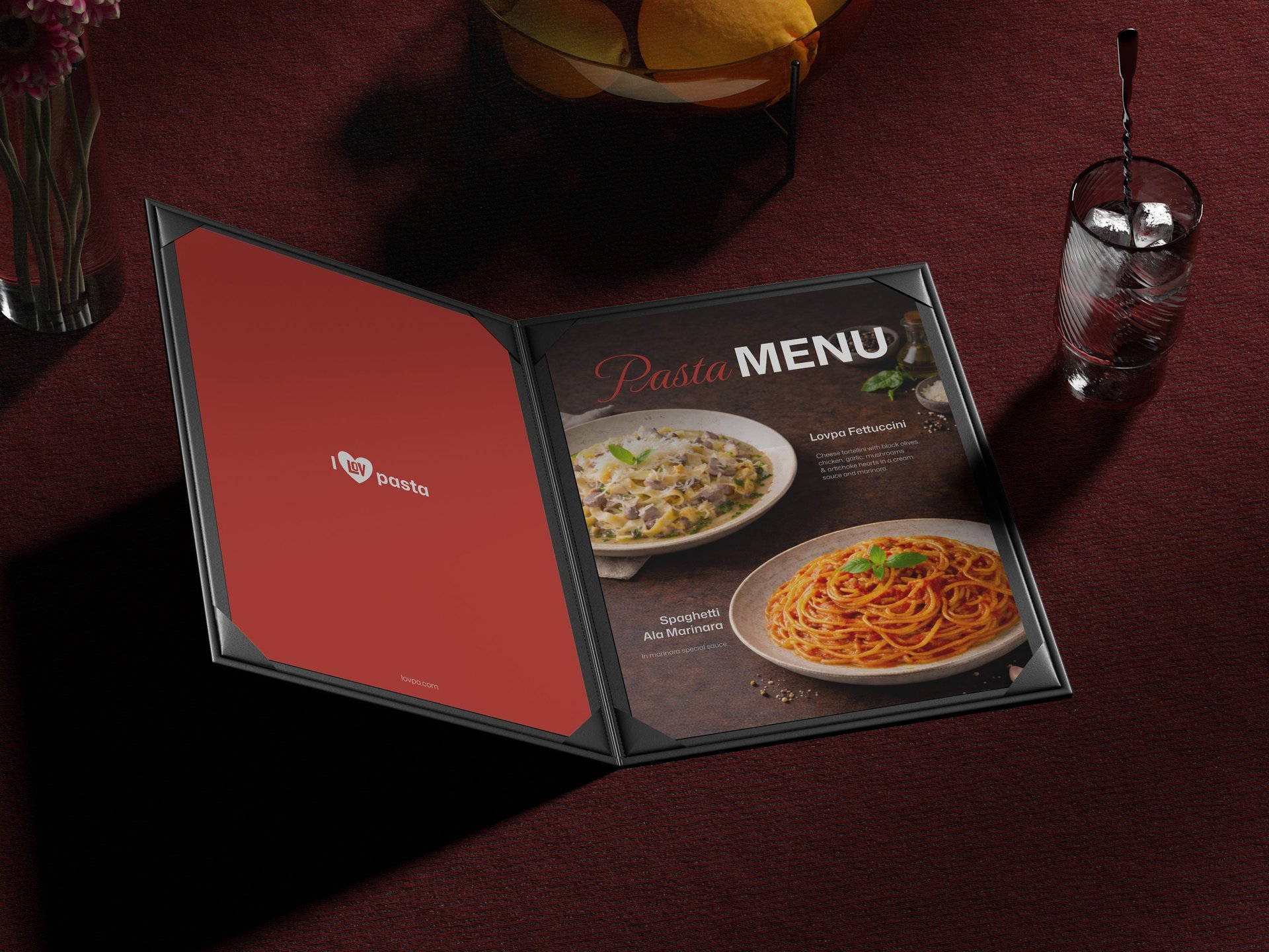
Typography plays a key role in expressing LOVPA’s refined and structured identity. The type system balances elegance, clarity, and modern simplicity — ensuring readability across menus, packaging, and digital materials.
The overall typographic tone must feel confident, premium, and clean — never decorative or excessive.
Noto Serif brings sophistication and quiet authority to the brand. Its refined serif structure conveys tradition, quality, and attention to detail — aligning with LOVPA’s premium catering positioning.
Used for headlines, section titles, and key brand statements.
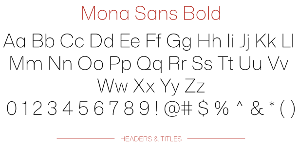
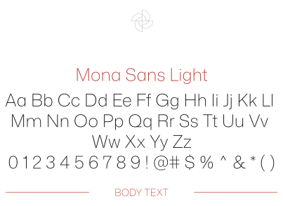
Mona Sans is a modern, highly legible sans-serif that supports clarity and structure. Its clean geometry ensures smooth readability across menus, pricing lists, and digital content.
Used for paragraphs, descriptions, and functional information.
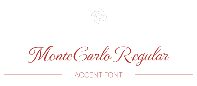
The Monte Carlo adds a subtle expressive touch to the brand. Used sparingly for highlights, invitations, or signature phrases, it introduces elegance and personality without overpowering the structured system.
LOGO GUIDE
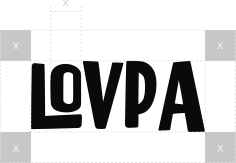
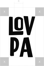
Using the logo correctly ensures a consistent and professional brand presence, making it easily recognizable and protecting its value by preventing distortions or misuse that could weaken its impact.
LOGO MISUSE
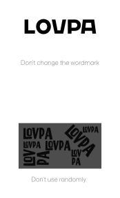
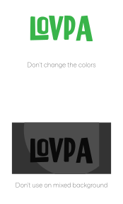
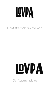
Maintaining logo integrity is essential; misuse can undermine brand recognition. This section emphasizes correct usage to protect the brand's consistent image.



MOTTO
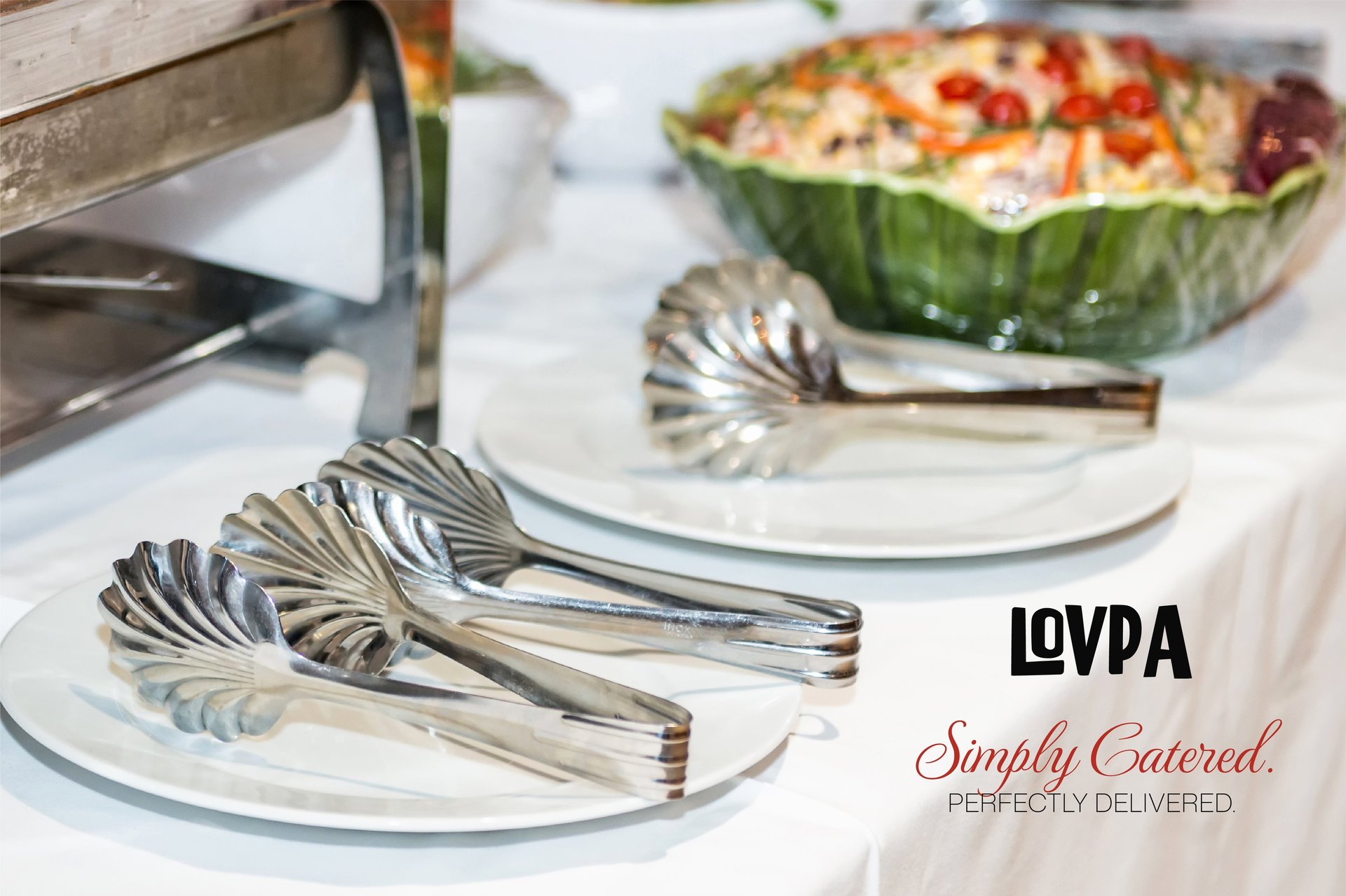
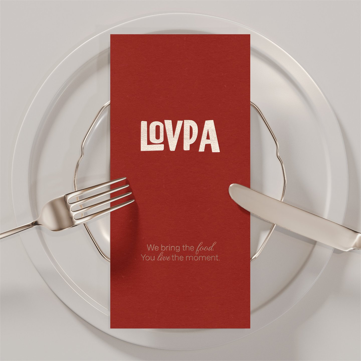
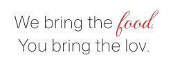
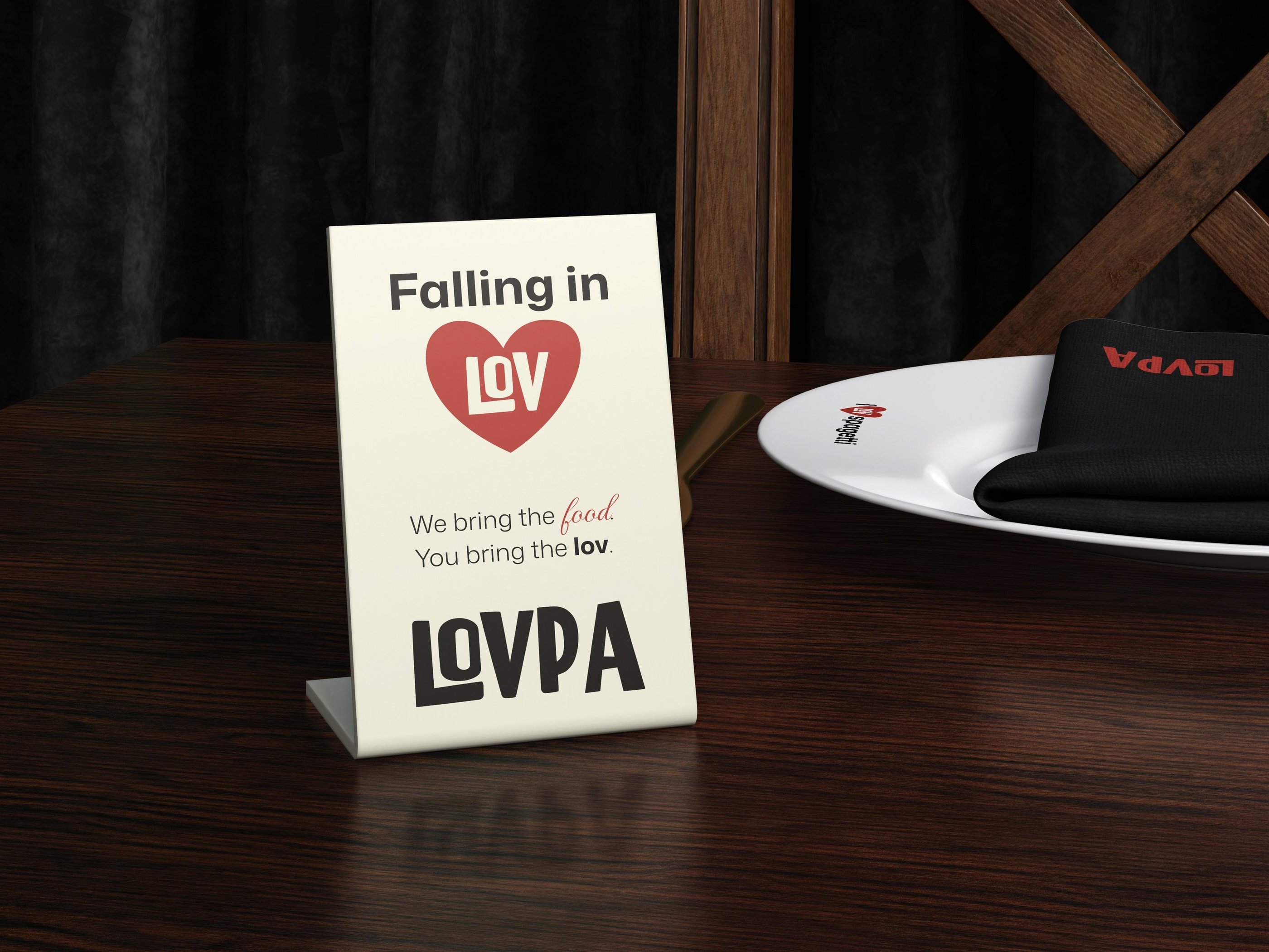
The motto can be used in two distinct variations depending on the context and layout.
The first version integrates the heart symbol directly into the phrase, creating a playful yet refined visual accent that strengthens brand recognition and emotional connection.
The second version presents the brand name more prominently, paired with the tagline beneath it. This format offers a stronger logo-led composition, ideal for packaging, event materials, and large-format applications.
Both variations maintain consistency while allowing flexibility across different design contexts.
BRAND MESSAGES
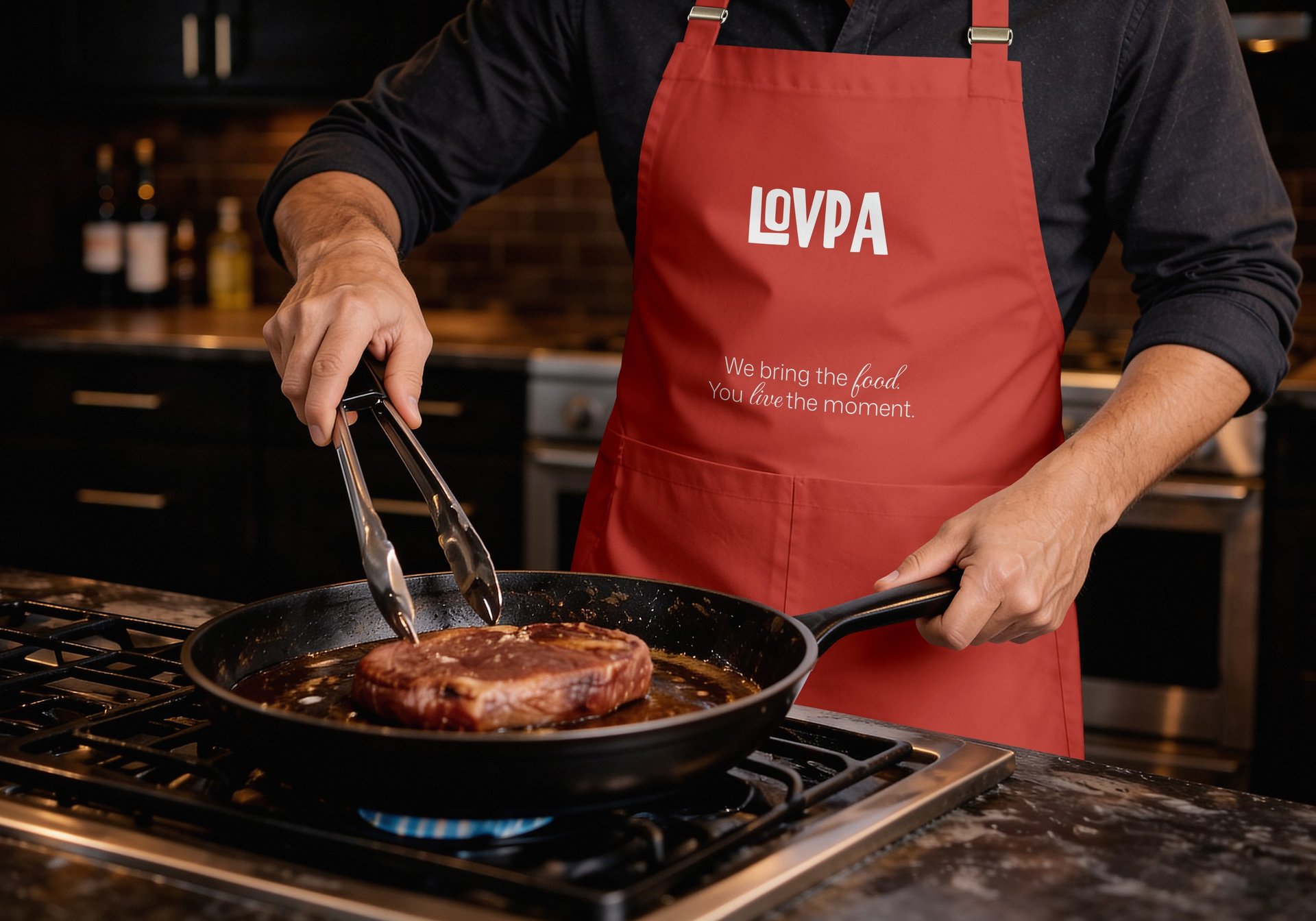
These messages is more than a tagline — it represents the core of LOVPA’s promise. It communicates ease without compromising quality, and excellence without unnecessary complexity.
It reflects the brand’s commitment to delivering refined catering experiences that feel effortless for the host and exceptional for the guest.
LOVPA stands for structured hospitality — where every detail is handled with precision, and every event is elevated through taste, presentation, and reliability.

PROJECT GOAL
The goal of this project is to develop a refined and visually unified brand identity system for LOVPA — a premium catering brand focused on quality, presentation, and reliability.
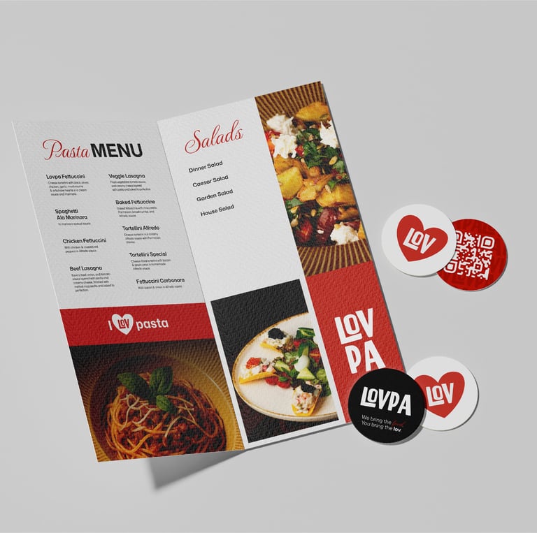
The system reflects the brand’s values of structure, precision, and elevated hospitality. This design system integrates typography, color palettes, and subtle but distinctive patterns, all working together to create a bold, confident, and premium visual presence.
Through consistency across all materials — from menus and packaging to digital platforms — LOVPA aims to strengthen brand recognition, communicate professionalism, and deliver a cohesive event-level experience.
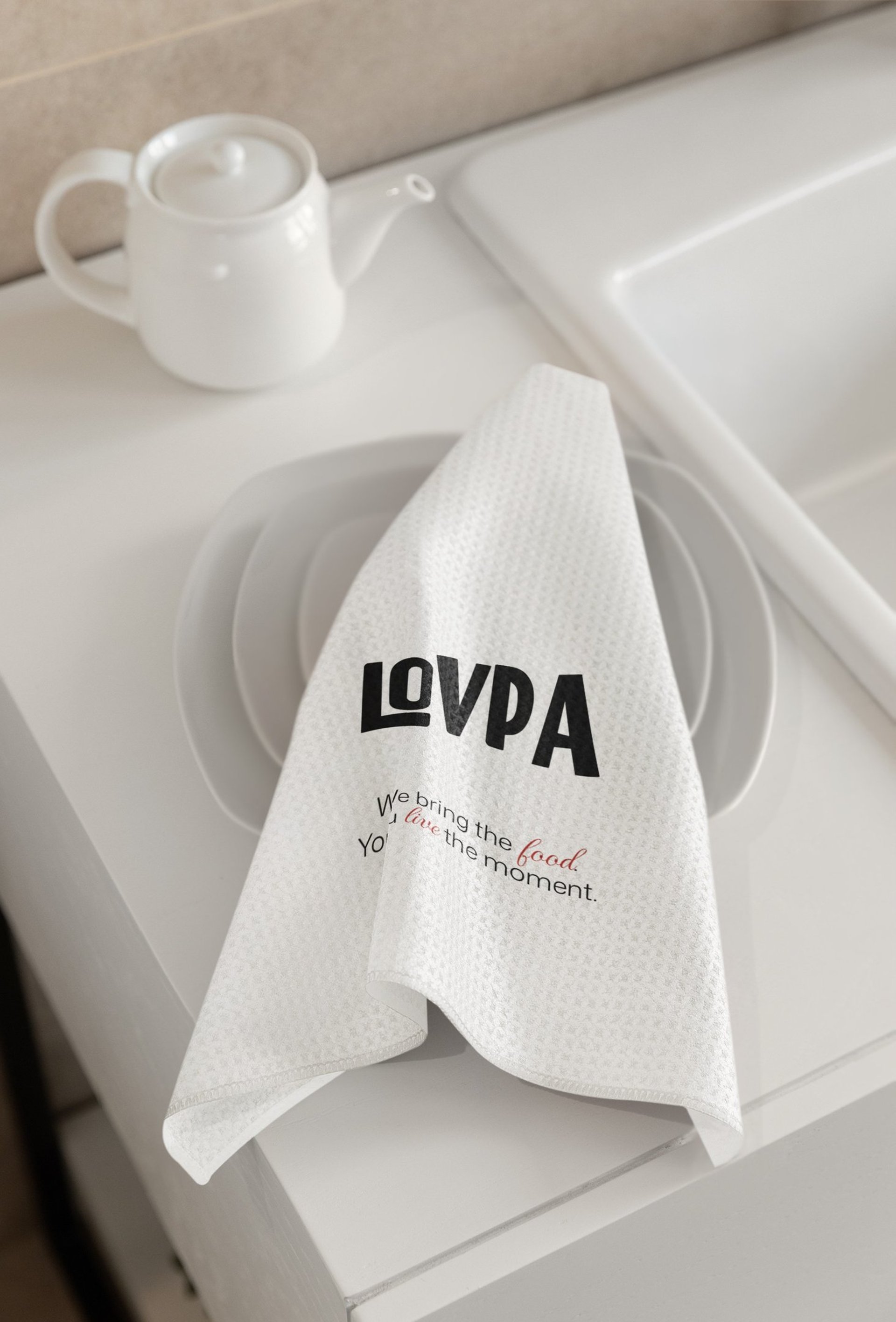
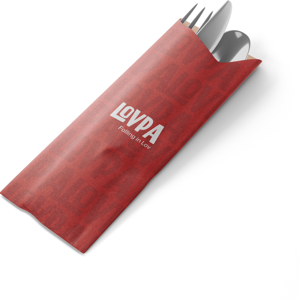
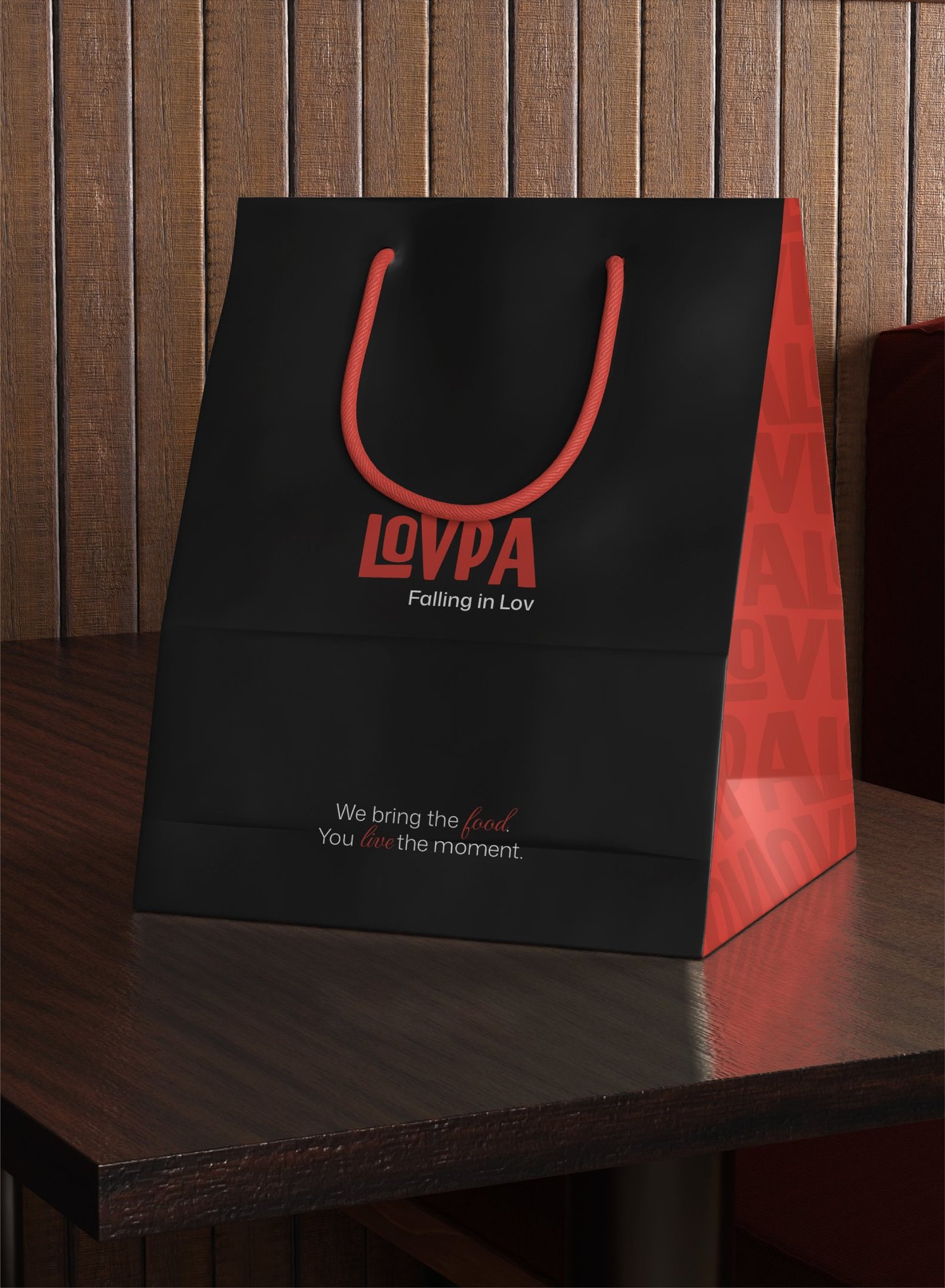
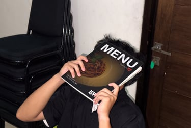
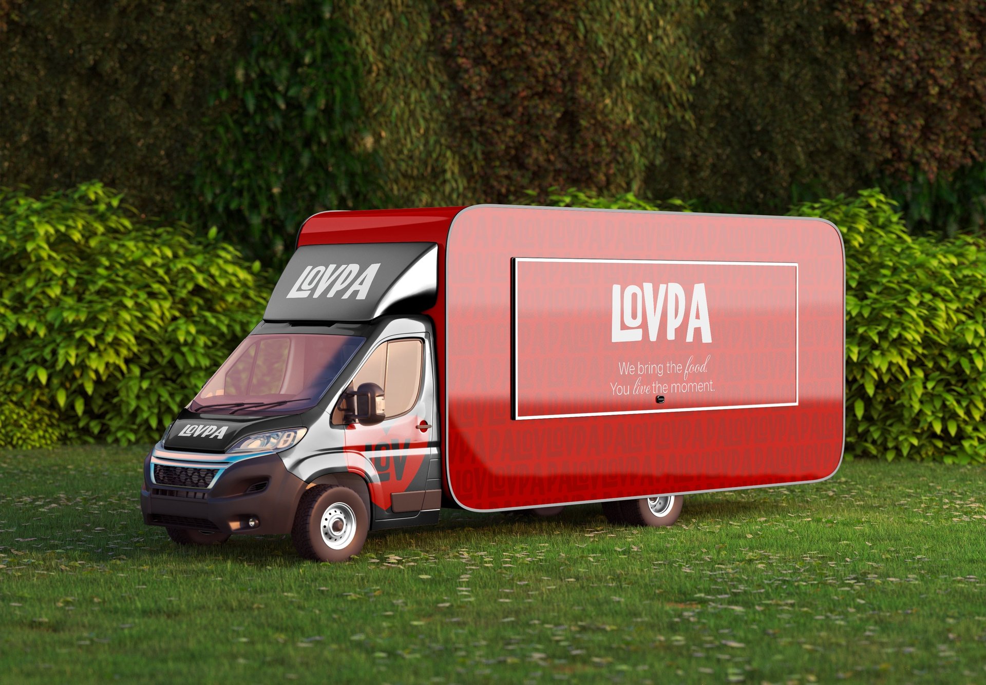
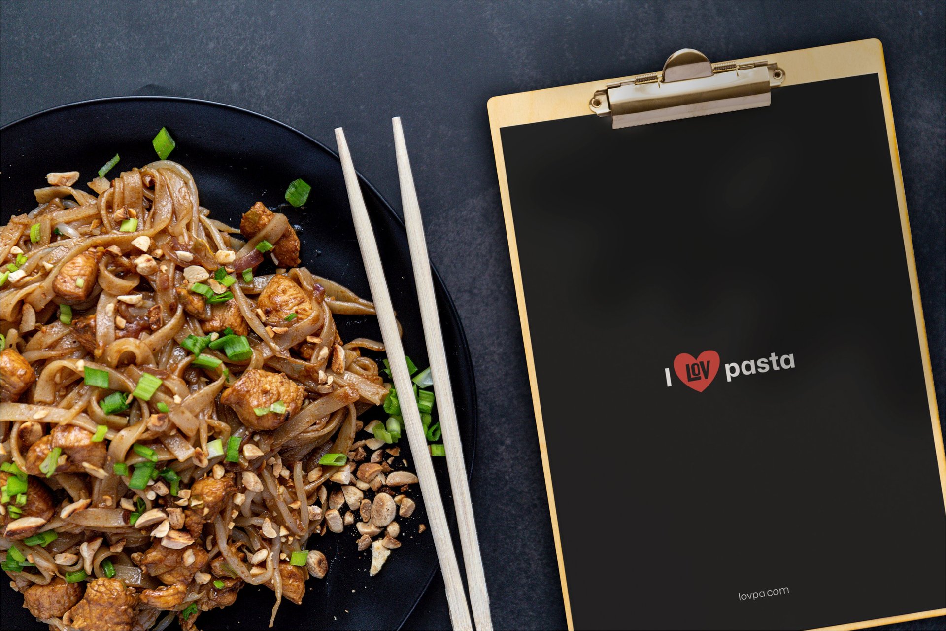
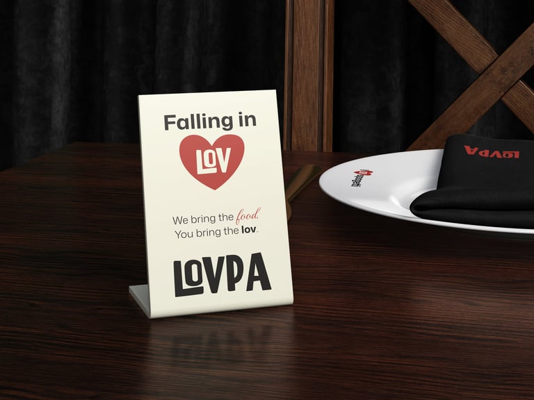
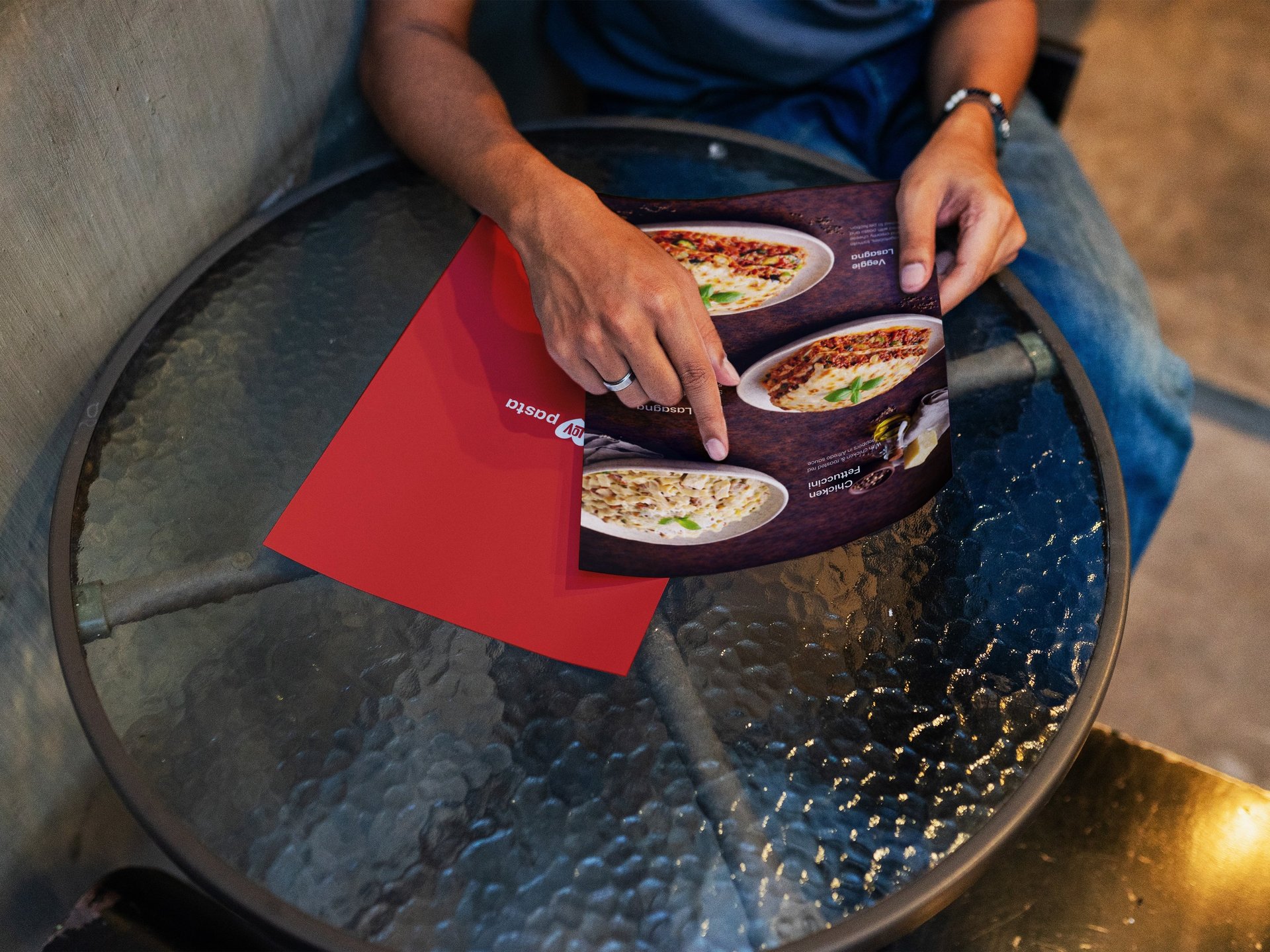
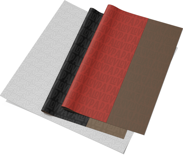
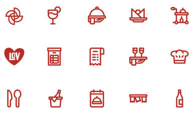
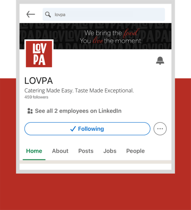
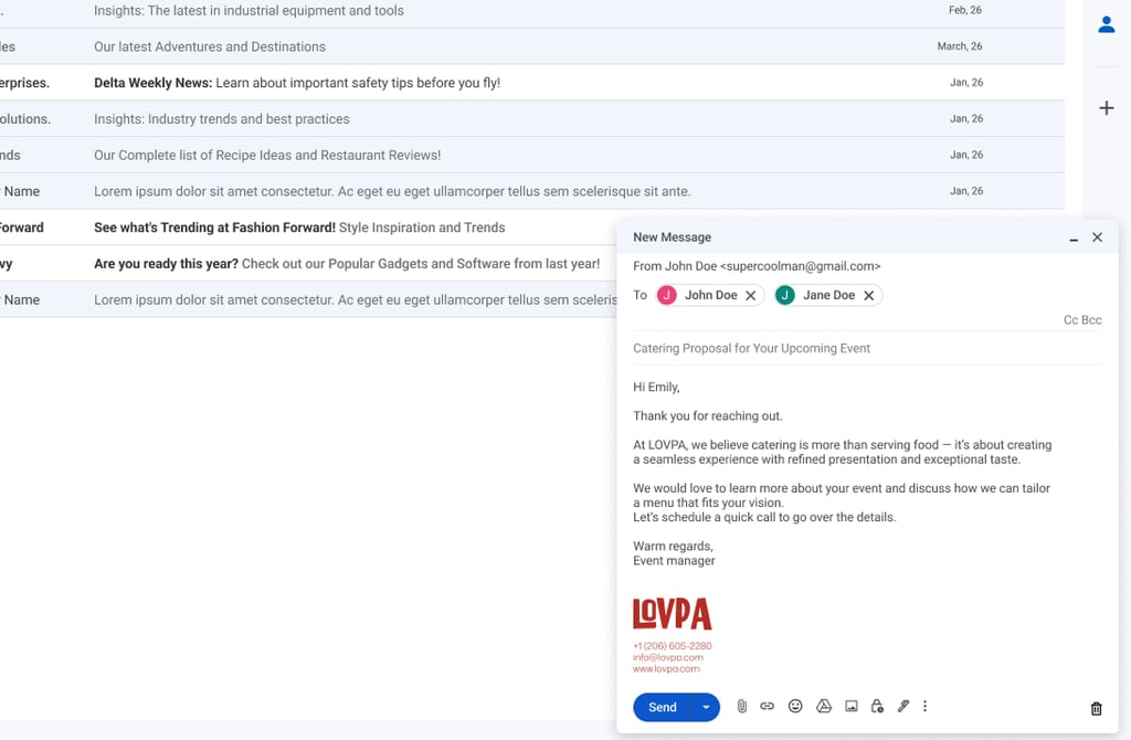
LOVPA uses a consistent set of functional icons and supporting graphic elements to enhance clarity across menus, packaging, and digital materials.
These elements serve practical purposes — helping communicate services, menu categories, event features, and catering details in a simple and recognizable way.
Their clean structure and minimal style ensure visual consistency while supporting the brand’s organized, professional, and premium character.
USABLE ELEMENTS

Logo vs Brand
Have you ever wondered what exactly separates logo design from brand design? It's a common mix-up, so let's clear things up.
Pages
Socials


© 2021 Kesewi Branding Consulting