
ATBC
PROJECTS
ATBC is a non-profit organization aiming to promote and increase the bilateral trade potential and investment levels between Turkic Countries and the United States.

YOU ARE IN PROFESSIONAL HANDS




Brand Identity Analysis
Problems: Scalability issue, Usability problems, Long Name, Balance issue, Use of different backgrounds
Solution: Shorter name, Modern, Memorable, Usable Elements
Analysis
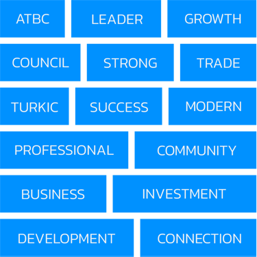
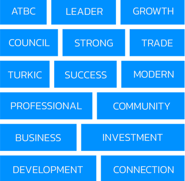
Keywords - Text


Keywords - Visual





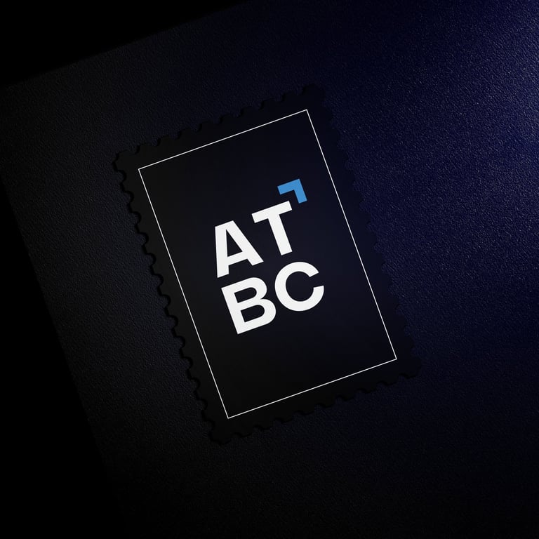
We've pinpointed essential characteristics that encapsulate the essence of the 'ATBC' brand, forming the basis for our fresh and innovative branding concept.
Keywords - Elements


Color Combination
Serifs aren't just aesthetic, they're easy to read in small and large font sizes. Serif fonts offer a timeless and traditional look to a brand which makes it look luxury and professional.
Font Style

VISUAL ELEMENT
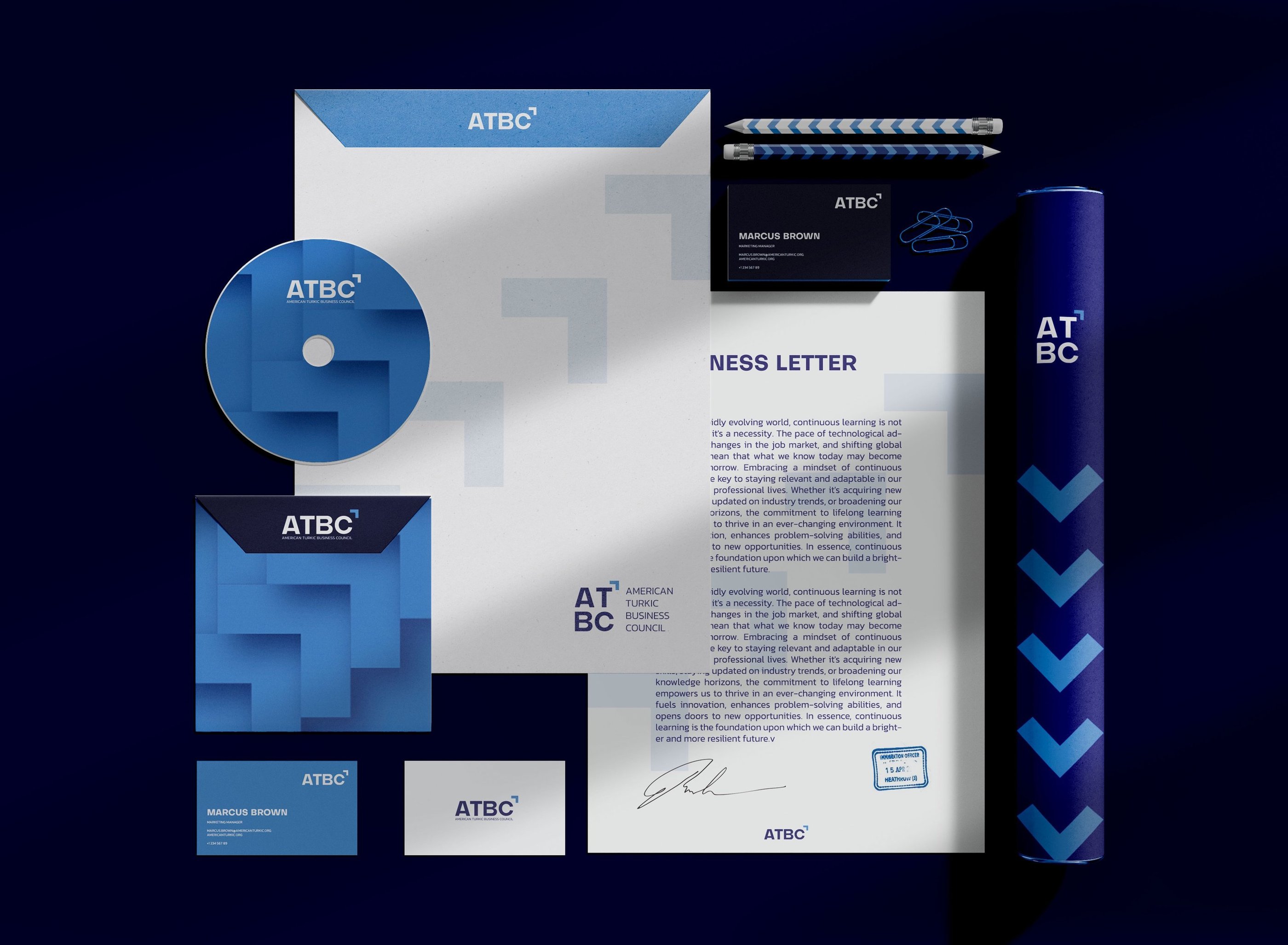
Subjectively, the visual identity builds brand connection. Simplifying with futuristic, professional, and directional elements enhances growth and boosts sales.


Brand Image
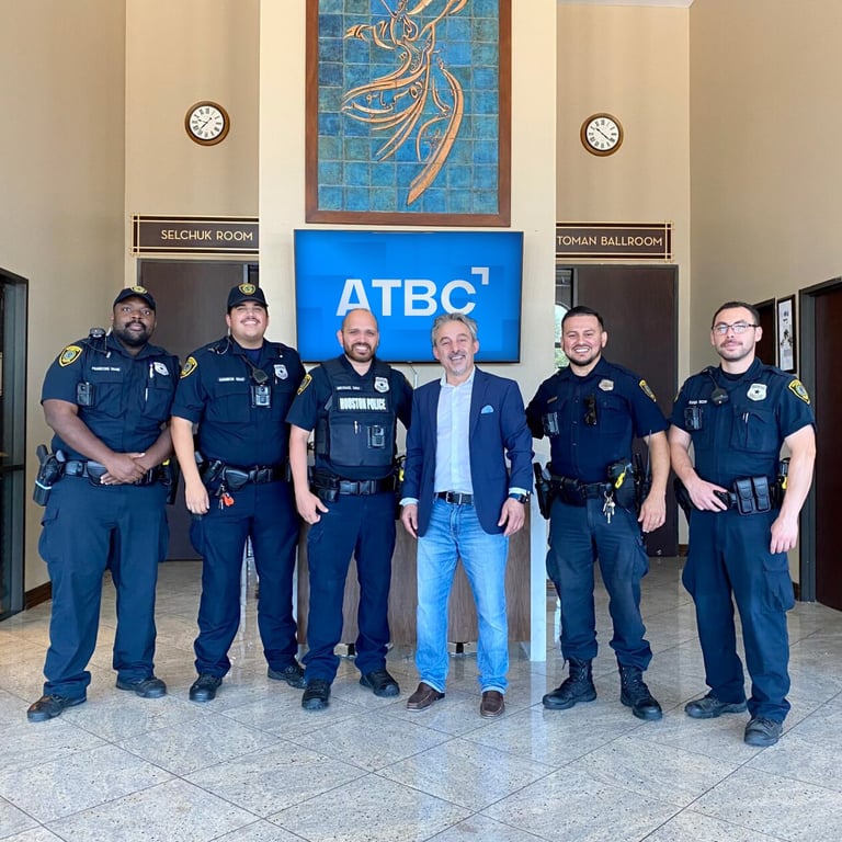
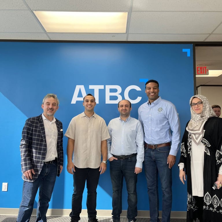
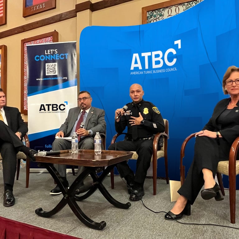
Brand Image is the customer's perception of a brand, evolving over time through interactions and experiences. It extends beyond product use, encompassing various forms of engagement.
Customers shape this perception through various interactions, not limited to product usage. These impressions develop over time, contributing to the overall image customers hold of the brand.





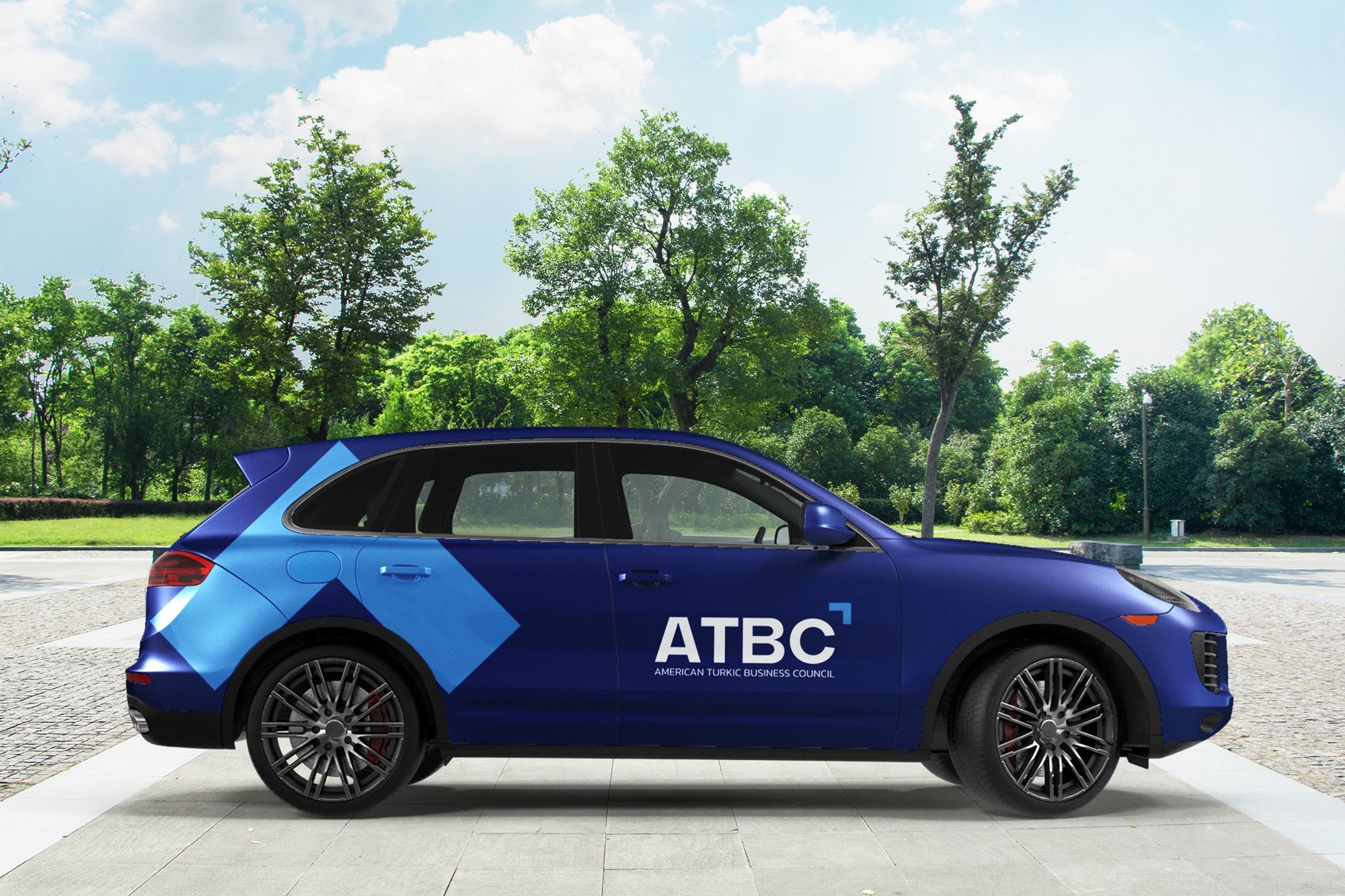

Concept
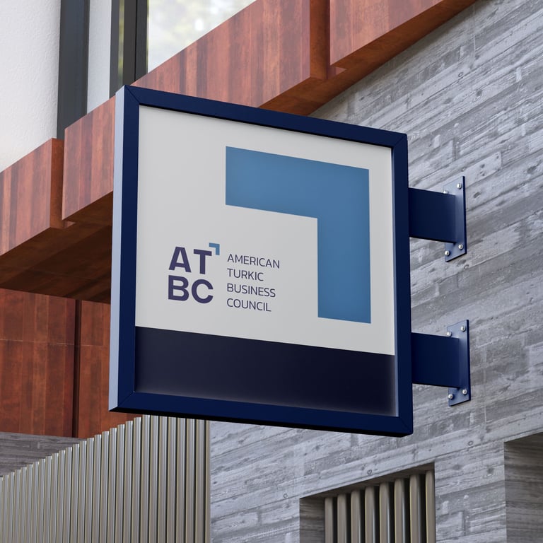
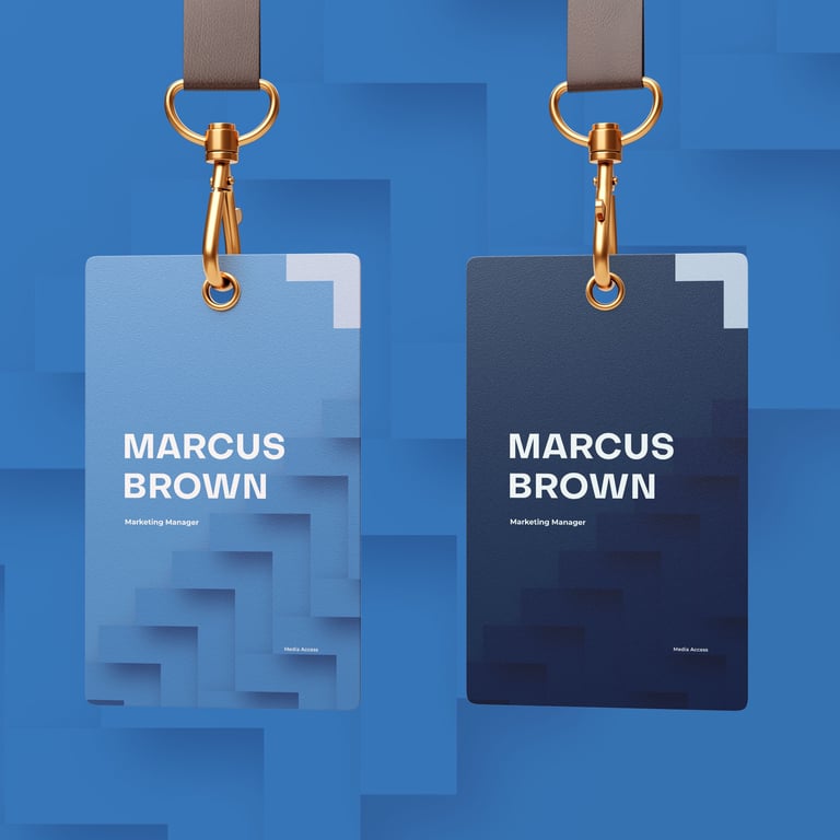
In the realm of business with a modern flair, once we've crafted a strong concept, we use this foundation to propel branding across websites, packaging, advertisements, and more!
Subjectively, the visual identity is pivotal for instilling a strong sense of connection, trust, belonging, and engagement with the brand. Exploring contemporary strategies for growth and heightened sales is integral in our approach.


Logo vs Brand
Have you ever wondered what exactly separates logo design from brand design? It's a common mix-up, so let's clear things up.
Pages
Socials
© 2021 Kesewi Branding Consulting
